A Limited Moisture Study
At its core, architecture in the Pacific Northwest is closely linked to moisture. The damp climate in Portland, Oregon has an impact on how we design new buildings as well as how we retrofit existing structures. Choices in construction, insulation, and flashing systems are always informed by our understanding of water. The success of any building envelope can be determined by how it performs against condensation, humidity, and water infiltration. Adding insulation to historic buildings is particularly challenging because the added material can change how a building envelope functions, leading to future moisture issues. At PMA we use WUFI to simulate and analyze how proposed retrofit strategies may impact the historic building envelope. For a recent project, we performed a limited moisture story of an unusual exterior brick wall that was to receive interior insulation. We studied how variations in insulative material and construction could impact the durability of both the brick and the interior wall structure.
The challenge when insulating a historic building is to protect the masonry from excessive moisture and cold. In uninsulated masonry walls, the building’s heating system warms and dries the masonry from the interior. If insulation is added, the masonry typically stays colder and wetter for longer periods of time, which can lead to deterioration. The intent of PMA’s study was to evaluate the masonry for future deterioration and to also identify any potential for condensation/moisture in the insulation cavity. WUFI was used throughout the design process to provide feedback on potential constructions and inform critical material decisions.
The building was built in 1921 and is unusual given that the original envelope consisted of a two wythe masonry wall with an interior plaster finish. A two wythe masonry wall is not common as it provides limited structure or protection from the elements. The renovation included an extensive seismic retrofit and the installation of new insulation to compensate for the existing wall’s limited structure. PMA was brought onboard to provide feedback on the building envelope detailing. We began our analysis by comparing the performance of the proposed envelope with that of the original building.
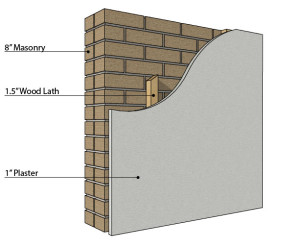
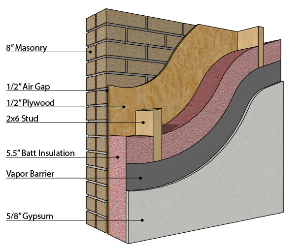
As shown in the illustrations above the existing construction (small drawing) was: 8” of masonry on the exterior, an airgap where wood lath separated the masonry from the plaster, and approximately 1” of plaster on the interior. In comparison the proposed construction (large drawing) consisted of: the existing 8” of masonry on the exterior, a 1/2″ airspace, 1/2″ inch plywood sheathing, 6” of fiberglass batt insulation, a vapor retarder, and 5/8” gypsum with paint on the interior. The first step in our analysis was to accurately model each of these constructions in WUFI. Accurate material modeling is especially challenging in historic buildings. WUFI uses five different material properties to calculate moisture and heat movement. While an extensive built-in database exists for new materials, significantly less information is available for historic materials. PMA often tests materials to determine their properties and adds them to our expanding database of historic materials. The scope of this project didn’t allow for additional material testing. However, we ran several iterations of the analysis with different historic masonry materials to determine a baseline for our analysis. The remaining materials were chosen from WUFI’s building material’s database.
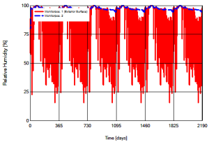
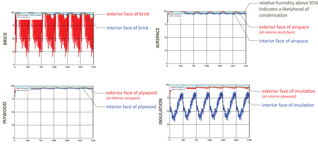
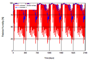 The results of the initial analysis indicated that as might be expected the masonry was not only exposed to longer periods of cool temperatures, it rarely was capable of fully drying. The two charts at the right show the relative humidity in the original construction and the proposed construction where each vertical line marks a calendar year. Note that a relative humidity above 95% indicates a likelihood of condensation. As can be seen in the original construction, during the wet months the relative humidity hovers at about 95%, but drops off significantly during the warmer months. Alternately in the proposed construction the relative humidity rarely drops below 95%, indicating that moisture is present in the masonry almost year round. When the individual layers are examined it becomes clear that in addition to considerable moisture in the masonry itself, water is likely to condense within the wall cavity. As seen in the series of charts below the relative humidity remains high through the airspace and plywood only dropping off between the exterior and interior face of the insulation.
 Given these initial results we suggested a redesign of the insulation system. The existing two wythe wall was not capable of adequately protecting the interior of the building, and the redesign had to accommodate for water infiltration through the masonry. Two options were discussed A) treat the masonry as a veneer wall and install waterproofing to the exterior face of the plywood as a drainage plane or B) install insulation that could be exposed to moisture and water. The constructability of Option A was significantly more complex than that of Option B so our initial analysis focused on Option B.
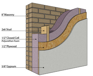
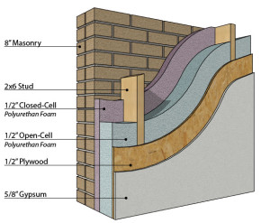 Spray foam was identified as an alternative to the original batt insulation because it can both serve as a vapor retarder and insulate even when exposed to moisture. Two design options were investigated to determine the extent of closed cell foam necessary to adequately protect the interior surfaces from moisture. As can be seen to the right we investigated a construction filled entirely with closed cell polyurethane foam vs. a cavity filled with a combination of closed and open cell polyurethanes. Additionally we looked at the condition of moisture/heat transfer at the perceived weakest point in the structure, where the structural framing was only barely (1/2”) separated from the masonry. The structural integrity of the seismic upgrade depended on a minimal distance between the framing and the existing masonry, but concerns existed as to whether the wood would be exposed to enough moisture to cause mold.
At the conclusion of the study the spray-foam hybrid option was chosen for further detailing and construction. The combination of closed and open cell foams effectively protected the interior from moisture and condensation. In each renovation scenario studied the exterior masonry was exposed to similar conditions; including increased moisture and cooler temperatures. Given every strategy resulted in similar conditions it was the combined performance of the hybrid system that stood out to the design team.
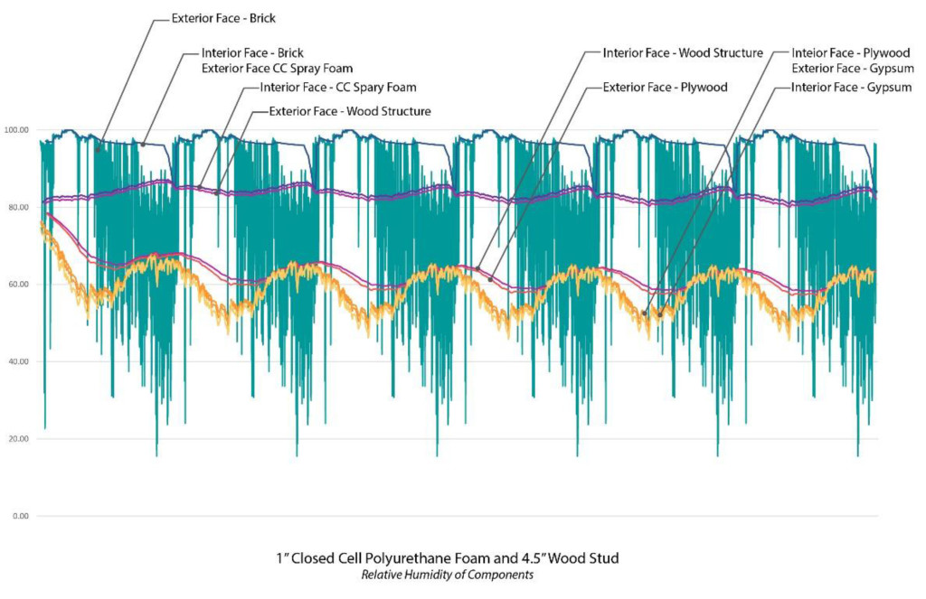
When the assembly is studied at the structural members, the interior components (plywood and gypsum) retain their low relative humidity. It is important to note that in this scenario the exterior face of the structural wood members are at above 80% relative humidity year round. These conditions may facilitate the growth of mold according to ASHRAE 160-2009. It is recommended that moisture protection be applied to the outer potion of these members.
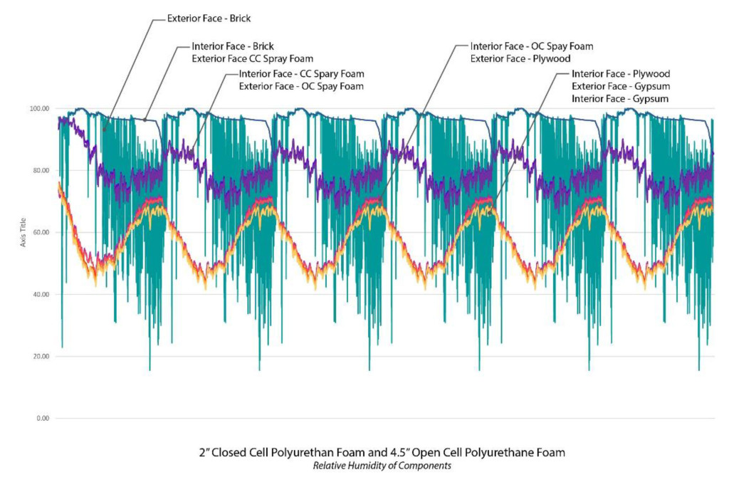
This chart shows the hybrid option of using both open and closed cell polyurethane foam to insulate and weatherproof the building. The relative humidity remains high at the exterior components, but is reduced to well below 80% on the interior components.
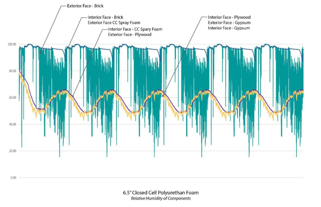
When only closed cell polyurethane is used to fill the cavity the performance is similar to the hybrid scenario. This chart shows that the outer components are constantly at a high relative humidity while the interior components remain more closely linked with the interior conditions of the building.
Ultimately, the project serves to show how an iterative approach to designing building envelope retrofits is critical to achieving an effective solution. By carefully modeling and simulating the initial proposed system we were able to provide critical feedback that led to a more effective and responsive design. In this case, fully understanding the unique two wythe wall system was essential to providing adequate moisture protection for the wall cavity. While a typical masonry wall is capable of preventing water intrusion, the minimal depth of this masonry wall proved insufficient. Our analysis uncovered this flaw and allowed the system to be redesigned to work more effectively. Unlike new construction where the entire envelope system is designed simultaneously, with historic buildings we must work backwards from the existing to create a cohesive design that responds to and compliments the original elements. WUFI serves as an essential tool in understanding the existing and investigating the new.
Written by Halla Hoffer, AIA / Associate

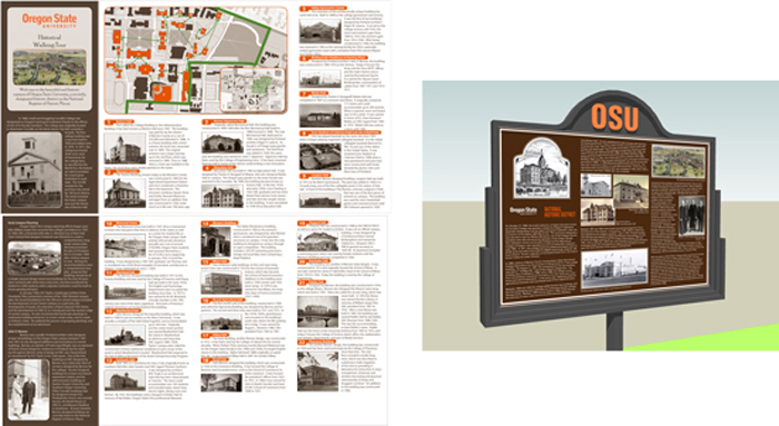
 PMA has been involved with several architectural planning projects that center on significant structures from the Mid-Century Modern era. These projects surveyed and documented hundreds of architecturally significant structures that revolutionized architecture and design throughout the 20th century. On the surface such planning projects can be difficult for a wide audience to understand and appreciate because the final project is not a new or renovated building(s). What better opportunity then, for graphic design to communicate and connect the significance of the project and its structures. For these projects, project logos and marketing collateral were designed as the visual symbols that communicate the entire identity of the projects. While both projects surveyed Mid-Century structures one focused on residential structures while the other did not. Both logos use form with text and color to help shape the sense of which type of mid-century modern structures were surveyed.
 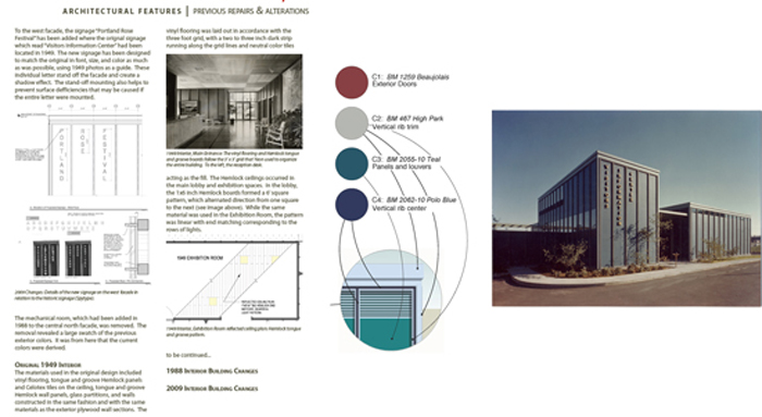 Following our planning projects centered on Mid-Century Modern architecture, PMA provided graphic design services for the renovation of the John Yeon designed Rose Festival Headquarters building (former Visitors Information Center). For this project, typography and color were the focal points for communicating the next chapter in this buildings life-cycle. The new graphics, color, and signage produced pay homage to the original design, while being entirely their own.
