Tag Archives: mid-century modern

Part II: Tropical Modernism in a Multicultural Context at the Docomomo US National Symposium

In PART I we discussed the University of Hawaii at Manoa campus (especially the stunning Jefferson Hall), presentations on traditional architecture to mid-century modernism and Asian influences on the built environment in Hawaii, and the Residences of Wimberly and Cook. For Part II we are hopping back into the Aloha Spirit by discussing the regal Hawaii State Capitol Building, presentations on historic preservation and how Hawaii was influential and integral to international tropical resort design.
hawaii-state-capitol-bldg
HAWAII STATE CAPITOL BUILDING
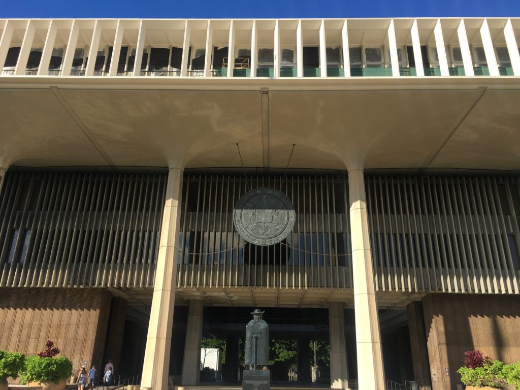
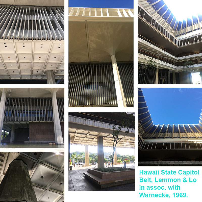
I have only been to about ten state capitols across the U.S., but the Hawaii State Capitol building is unlike any I have experience. It is a truly welcoming structure, which is something unique among monumental civic structures (looking at you Boston City Hall). The Hawaii State Capitol was designed by Belt, Lemmon & Lo in association with John Carl Warnecke. While design of the building began in 1961, construction didn’t break ground until 1965, and the building was formerly dedicated on March 15, 1969. The Hawaii State Capitol celebrated its 50th anniversary in 2019.

An excerpt from Democracy by Design. The Planning and Development of the Hawaii State Capitol, with text by Don J. Hibbard states it best:

“Monumentally presiding over an eight acre site mostly carpeted by lawn, the Capitol is surrounded by a pool of water, evoking Hawaii’s island situation. The truncated cones of the legislative chambers, clad in cast stone made of crushed lava rock, rise from the reflecting pool, reminiscent of the volcanic origins of the islands. Also rising from the water are forty columns, bereft of capitals, instead flaring out of their crown like coconut palms. Standing almost sixty feet in height, the columns form a peristyle and support the extra-large fourth story, which cantilevers out beyond the columns. Serving as a cornice, the fourth story is distinguished by its open work frieze of pre-cast fins set in groups of eight, recalling the eight major islands of Hawaii. Placed free of the windows, the fins serve as decorative elements as well as sun screens. The recessed second and third floors are suspended from the fourth story, which also serves as the roof of the capital, with the governor and lieutenant governor’s offices in penthouses on top of the roof. Rising above the penthouses, the blue crown of the central rotunda echoes a volcanic crater, a graceful interpretation of the traditional statehouse dome.” (1)
hawaii-state-capitol-building-details
PARADISE PARADIGMS
DeSoto Brown
Kiersten Faulkner

These two presentations were an interesting pair. DeSoto Brown presented in a style reminiscent of informational videos produced in the 1950’s and 1960’s that were designed to encourage travel to the islands of Hawaii by showing the Aloha Spirit and all Hawaii has to offer. All the photos presented were from the archives. It wasn’t until after his presentation that he mentioned a majority of the structures pictured have since been demolished or severely altered. Remember, Hawaii was aggressively built up only since post-World War II!
downtown-honolulu
This made for a great transition into Kiersten Faulkner’s presentation on the threats and challenges of preservation and tropical modernist design – how to preserve architecture from so recent in the past. Turns out the issues (for the most part) mainland preservationist have are the same Hawaii preservationists experience. Similar to Oregon and elsewhere, that 50 year historic threshold causes a lot of havoc at times. What happens when a resource is 46 years of age in integral to our built heritage, but threatened with demolition because, sorry it’s not 5-0 historic! Kiersten also described how there is anger and hurt around some mid-century resources (mainly spiritual structures) because they replaced older structures on the same site. Interestingly enough, Hawaii doesn’t have a leg-up on mainland solutions for the intersection of preservation, sustainability, and climate change. I was a bit surprised when I asked a colleague that worked in the preservation community in Hawaii if they did anything specific to mitigating resources going directly to the landfill from demolition since they were on an island. The full answer was “No.”

DESIGNING PARADISE
Don J. Hibbard
Ron Lindgren

Designing Paradise focused on resort design in post-war Hawaii, specifically how it influenced tropical resort design throughout the world. The design and development of the Mauna Kea Resort and Ed Killingsworth Hawaii resort designs: Halekulani, Kapalua Bay Hotel, Mauna Lani Resort, Ihilani Hotel, and renovation of the Kahala Hilton Hotel were discussed. Don and Ron explained how the distinctive and elegant approaches to resort design seen at Mauna Kea Resort and the others would ultimately set the standards for tropical resort design throughout Hawaii and the world.

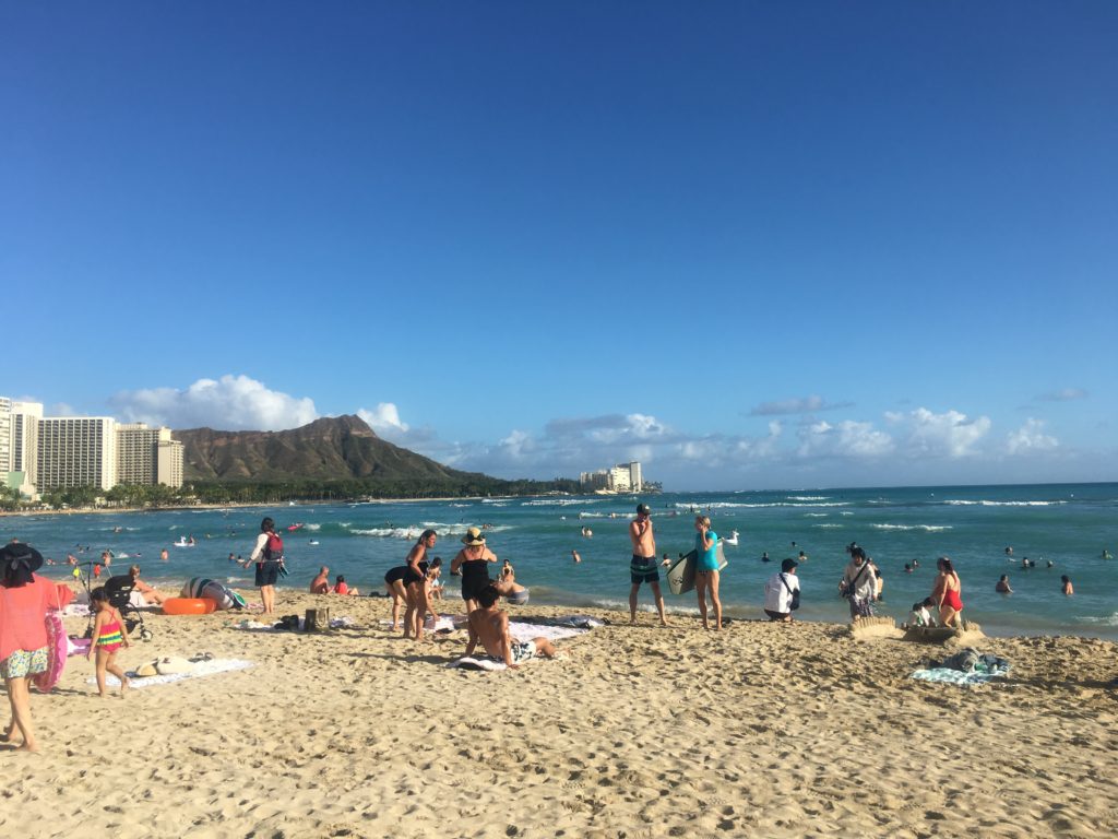
The Ed Killingsworth designs discussed were divine. The attention to detail Killingsworth incorporated into his creations was phenomenal to see and learn about. Those concrete spider legs that became a staple of his residential, commercial and resort designs are stunning architectural geometries for the eyes. Killingsworth was a planner for the City and County of Honolulu pre and post-World War II. While his resorts were interesting to learn about, Ron Lindgren discussed at length his residential designs in California.
waikiki-beach-diamond-head
Killingsworth personal residence was breathtaking. If only every house was designed with the level of attention, detail, and space planning that brings the indoors out and vice versa that Killingsworth executed. What caught my attention was how Killingsworth designed the kitchen at his personal residence in California. He had floating wood lower cabinets, which looked more like beautiful pieces of furniture than storage for kitchen-wares. Also, he did not use a backsplash – genius! Behind the floating cabinets with the kitchen sink, a full ceiling-to-floor window was used, including underneath the floating cabinets. This played a trick on the eye, with the abundance of natural light flooding from above and below the cabinets the space looked larger and lighter. Also, why are we SO obsessed with back-splashes and kitchen islands? His designs make the case for neither. His interpretations of lanai living was on full display in his California residence.

The Mauna Kea Resort. Laurance Rockefeller was the developer that brought the world to Kauna’oa beach, and ushered in a new era of tourism to Hawaii. The Mauna Kea Resort opened in the summer of 1965, and was designed by SOM in the most sophisticated mid-century style. Concrete has never looked as elegant as it disappears into the surrounding natural landscapes. It was the first resort along the coastline of Hawaii’s Big Island. Mauna Kea Resort also features a prominent art and artifacts collection. The contributions to the Big Island that Rockefeller enabled in the mid-century are still thriving today.
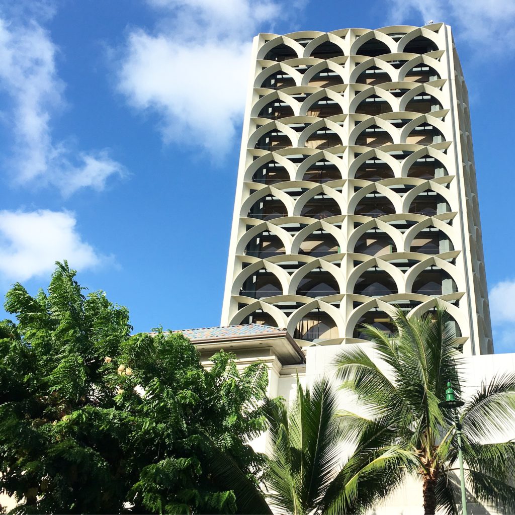
IBM-building-honolulu
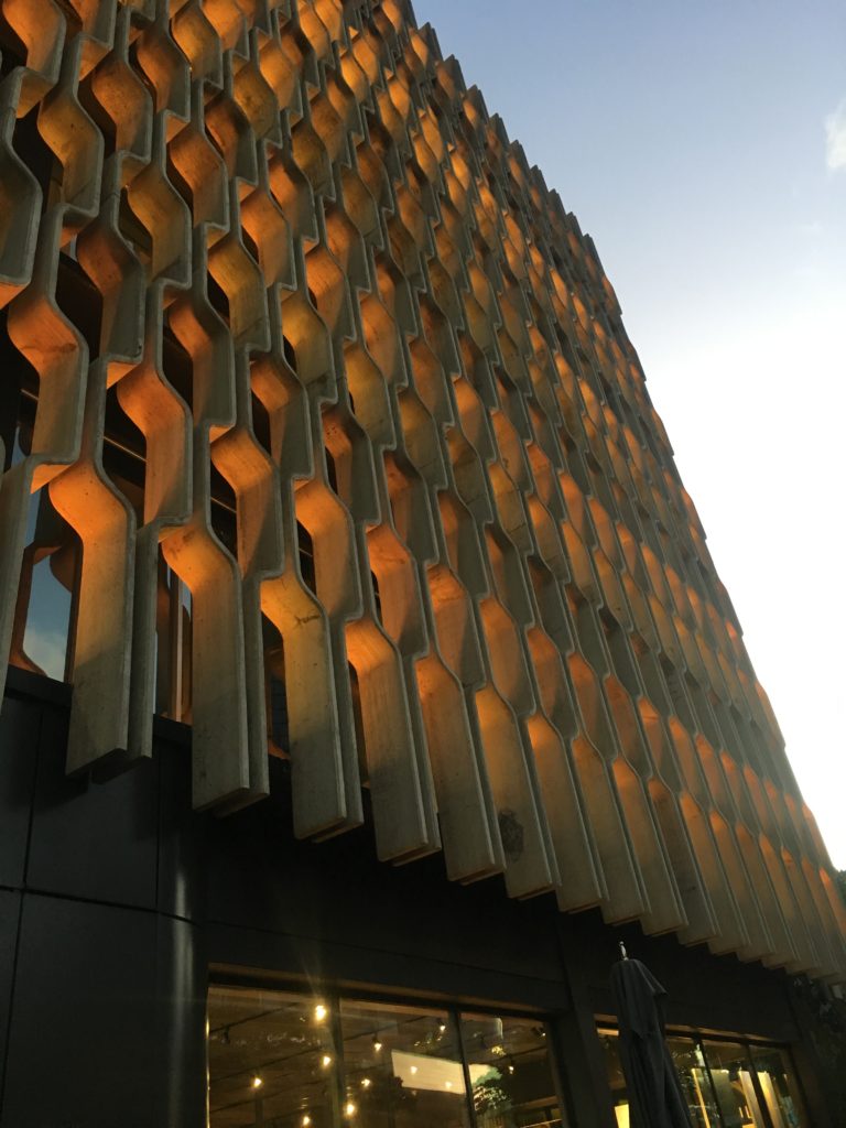
Tropical Modernism in a Multicultural Context at the Docomomo US National Symposium was a delight to experience. The closing reception was at the Ossipoff designed IBM building (1962). Talk about an iconic Honolulu mid-century building. The exterior façade grille is retro yet timeless architectural elegance. And, it was fitting to have the opening and closing receptions at two distinct mid-century buildings in Honolulu designed by one of the most prolific architect’s in Hawaii.

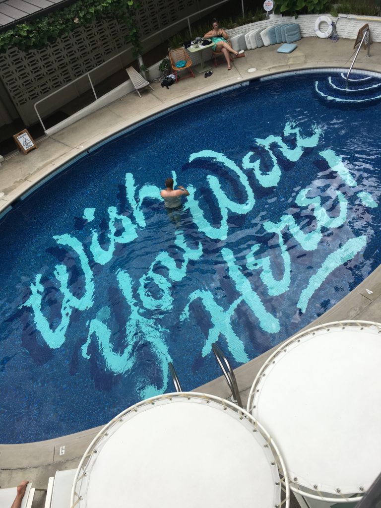
I wouldn’t be able to end this two part blog without mentioning the hotel that hosted several social events, part of the symposium programming: the Surfjack. From the beautiful lanai, delicious restaurant with fantastic mai tai’s, to the quaint yet stylish rooms, the POOL, and welcoming staff. The Surfjack felt like a home away from home in the heart of downtown Waikiki.

For designers, architects, planners, preservationists, and those generally interested in mid-century design, Docomomo US National Symposium is a MUST on your list of mid-century focused events.
surf-jack-hotel

Written by Kate Kearney, Associate.

1. The Hawaii State Foundation on Culture and the Arts in accordance with the recommendation of The Task Force to Plan and Coordinate the Celebration of the Fiftieth Anniversary of the Hawaii State Capitol. Democracy by Design. The Planning and Development of the Hawaii State Capitol, by Don. J. Hibbard. Honolulu, 2019.

PART I: Tropical Modernism in a Multicultural Context at the Docomomo US National Symposium

Tropical Modernism was showcased, explored, and celebrated at the sixth annual Docomomo US National Symposium in late September 2019. Docomomo US/Hawaii chapter hosted, and as the current Docomomo US/Oregon chapter president I had the opportunity to experience all things tropical and modern in Oahu, Hawaii.

Honolulu (2)-pmapdx

For those unfamiliar with the mouthful that is Docomomo (documentation for the conservation of the modern movement), it’s a national (technically international) non-profit dedicated to the preservation of modern architecture, landscape and design. At the Oregon chapter we take this mission a bit further by including art from the core era of modernism and one of the most controversial architectural movements: post modernism. But let’s get back to the oasis that is Oahu. First, if you have the opportunity to visit this island – DO IT. It is a multicultural, dense cosmopolitan city yet rural surf-town, absolute food heaven, post-war architectural wonderland where tropical resort design began, all rolled into one island that has weather far superior than what we ever get in the state of Oregon. Why do we all live in the cold and rain?!

The symposium kicked-off with a welcome reception at the Outrigger Canoe Club. The building is situated right along the Waikiki coast and was designed by Vladimir Ossipoff in 1941. Ossipoff had a prolific Honolulu-based firm, Ossipoff Snyder Architects. A common theme I was unware would take a central role throughout the symposium was about tropical outdoor/indoor living, or better known as lanai.

honolulu-beach

UNIVERSITY OF HAWAII AT MANOA
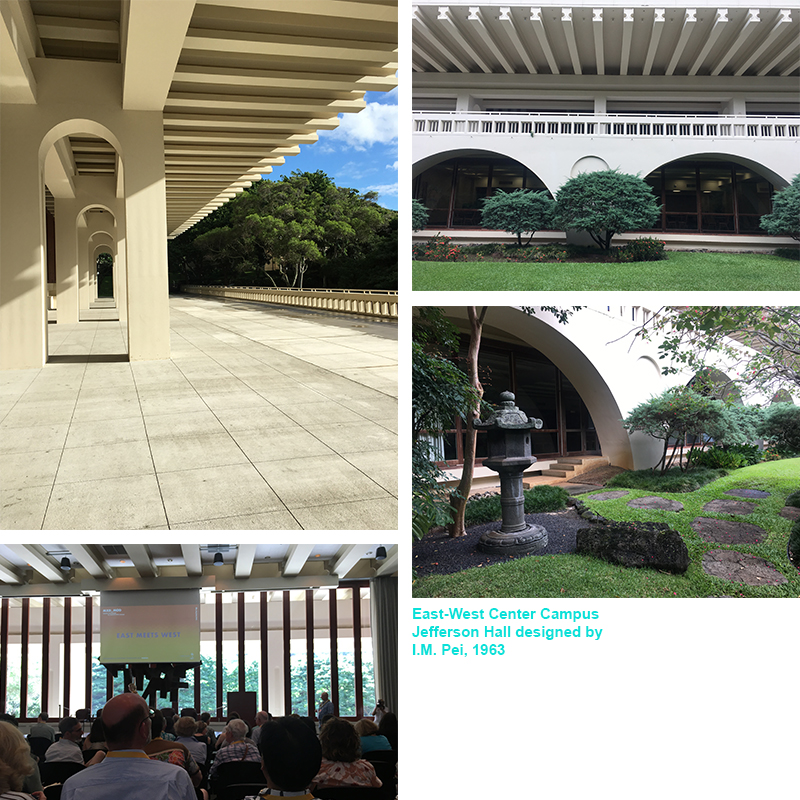
University of Hawaii at Manoa hosted the first day of symposium presentations at Jefferson Hall. While there are several mid-century buildings across the campus, Jefferson Hall is an architectural gem among them. Completed in 1963 and designed by Chinese-American architect I.M. Pei with Young & Henderson. Jefferson Hall was the last building constructed of the East-West Center (EWC) campus. The EWC helped put Hawaii on an international stage, connecting Asia and the West. Jefferson Hall in particular “combines the austere symmetry of the New Formalism with hints of Chinese traditional architecture to convey the links between Asia and the West envisioned by the center’s multiple champions and founders.” (1.)

HAWAII OVERVIEW – from traditional architecture to mid-century modernism
Glenn Mason
Graham Hart

Bit perplexed that native Hawaiian architecture was breezed over and barely mentioned. The presentation began with thatched houses, then quickly jumped to the first Western-style frame houses being shipped to Hawaii in the 1820s. These were the type of structures the Missionaries were accustomed to. From there we learned that basalt quarries were developed in the 1880s, and the California Gold Rush really opened up west coast trade to Hawaii. For the first time Douglas Fir was shipped from the mainland to Hawaii. Mason then explained that while Hawaii had designers, they did not have architects, but architects from Australia or the mainland came to Hawaii and contributed to the beaux-arts and neo-classical styled structures. It wasn’t until the early 1900’s that a regional style began to express itself in Hawaii, and across the mainland. Hawaii regional style elements include: double pitched roof, lanai, local materials, and an overhang roof.

Towards the end of the 1930s change thinking happens and international style references begins to be expressed in architecture. Hawaii sees an influx of younger architects from Europe that were schooled in modernist design. The late 1930s had a stream of construction on military bases (several designed by Albert Kahns office), but by the time of WWII, 99% of architects on the island went to work for the military. From the 1930s through the 1960s there is a shift in the architecture vocabulary in Hawaii. It begins with regional style with a hint of modern, then modern used to reinterpret regionalism. Modern architects of note in Hawaii from that era:

Vladimir Ossipoff
Peter Wimberly
Lemmon, Freeth, Haines, and Jones
Edwim Bauer
Alfred Preis
Johnson & Perkins

The shift in the architecture vocabulary in Hawaii continues from the 1940s through the 1970s. Now we begin to see the environmental influences on modernism, even though rural landscapes are being transformed into cosmopolitan centers with smaller, steep, tight sites or housing. Materials used for modern design now includes concrete, cast concrete, lava rock, coral, local woods, and aggregates. Modern architecture in Hawaii also embraces the natural environment. This is most reflective in architect’s obsessions with lanai. This obsession found its way from residential homes to large developments. The East-West Center (1962-1963) at the University of Hawaii Manoa, designed by I.M. Pei, is a phenomenal example of a monumental, institutional piece of architecture that embraced the lanai.

Jefferson-Hall-001

ASIAN INFLUENCES
Alison Chiu and Alissa Carson
Lorraine Minatoishi
Luca Guido

This group of presentations focused on different facets of Asian influences and how the contributions were interwoven in post-war architectural design throughout Hawaii. Lorraine Minatoishi focused on Japanese temple architecture influence of modern design post-war. There were distinct temple styles developed throughout their history in Hawaii:

Japanese Traditional Style (late 1800s – early 1900s)
Plantation Style (late 1800s – early 1900s)
Hawaii Eclectic Style (early 1900s – 1950s)
East-West Style (1918 – 1950s)
Post-War Modernism (led by second-generation Japanese architect Niser)
Post-War Traditional

Luca’s presentation took it a step further by discussing an obscure architect from the mid-century modern era, Bruce Goff, and how he also influenced local architects to Hawaii. I had not heard of Bruce Goff like most, but Luca Guido explained why this figure in the realm of modernism was obscured until now.

RESIDENCES OF WIMBERLY AND COOK
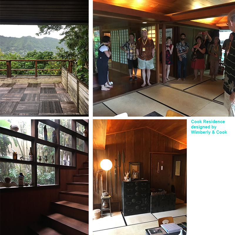
Following presentations at the University of Hawaii and a self-guided walking tour of other mid-century campus resources, I chose to attend the Residences of Wimberly & Cook Tour. Pete Wimberly of Wimberly & Cook designed two residences situated above the Manoa Valley. Wimberly designed some of the most iconic mid-century modern buildings in Hawaii. Wimberly came to Hawaii in 1940, and post-war his career flourished. His designs embodied tropical modernism, spaces that blurred indoor and outdoor living. The residential designs we toured both featured indoor/outdoor living, natural cross-ventilation, elegant interior details and finishes, and a smart use of natural light. However, they were completely different in essence, aesthetic, style, and state.
Cook-Residence-PMAPDX
The Japanese style pavilion house was like walking into a meticulously cared-for time capsule. There wasn’t even dust on the book shelves that displayed artifacts collected and arranged by the original homeowner! However, there were a few signs of wear-and-tear on the interior Japanese style floor mats, kitchen cabinets along their frames, and slight dry-rot peppered across the original wood deck. Otherwise the home was pristinely maintained. Wimberly’s private residence across the street was a different story.

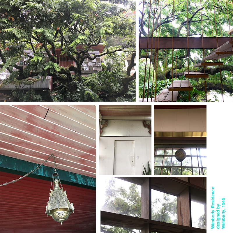
Wimberly’s private residence was constructed in 1945. This is an insane date for residential construction due to World-War II ending the same year, and the majority of architects/contractors in Oahu were working on military projects. With the Japanese style pavilion home, you enter by walking down slightly winding stone steps. With Wimberly’s private residence, you enter by climbing up stone steps that deliver visitors to a small landing, and then up more exterior stairs. The second set of stairs (wood planks suspended by cables) makes for a swoon-worthy entry sequence that looks like something Dwell or Architectural Digest would gobble up for a feature article.
Wimberly-Residence-PMAPDX
From the now faded red door, redish-pink painted wood paneled ceilings, decorative animal sculptures situated within the header above the door that leads from the dining area into the kitchen, to ornate light fixtures and various metal finishes throughout the space, Wimberly’s private residence utilized design elements that reflected the multicultural diversity of Hawaii. The residence is also quintessential mid-century design: natural cross-ventilation, sliding wall panels to completely open up or section off the main-floor living, dining and lounge areas, and a technological savvy (for its time) kitchen. From the perspective of how we design kitchens today, it is real sad and small, save for the to-die-for view of the lush tropical garden from the kitchen window over the sink.

Wimberley’s private residence also showed signs of being well lived-in, yet not maintained with any desired vigor. The wood framed windows on either side of the structure are rotting like the planks along the entry façade deck, and there are several cracked panes of window glass. Structural settling has made itself known, and the kitchen is retro in a manner no one would want for daily use. Most of the interior painted walls or ceilings have faded into softer hues of their original bold colors. And, when we visited, it looked as though someone was living there, yet possibly setting up an estate sale for interior items. There were some true mid-century interior design gems scattered in the clutter piled up from the floor I wish I could have packed in my suitcase for the return trip.

Hope you enjoyed PART I: Tropical Modernism in a Multicultural Context at the Docomomo US National Symposium! In Part II we will discuss the Hawaii State Capitol, and presentations on Historic Preservation in Hawaii and Tropical Resort Design.

Written by Kate Kearney, Associate.

1. Shen, Haigo and Irene. Tropical Modernism At University of Hawaii At Manoa. Docomomo US National Symposium, Oahu, Hawaii, September 2019.

Analysis: Best Practices for Providing Effective Daylight in Mid-Century Modern Structures

DOCOMOMO_OREGON and the Northwest Chapter of the Association for Preservation Technology recently held an Energy Conservation Symposium that explored issues facing mid-century modern buildings: How can modern historic buildings comply with today’s energy conservation standards? Is it possible to maintain the integrity of the historic building materials and aesthetics while also meeting new energy conservation requirements?

At PMA we believe that while challenging, it is possible to maintain the integrity of these historic mid-century modern buildings and meet new energy conservation requirements. In an effort to explore this possibility, we submitted an abstract for the symposium, and Halla Hoffer, AIA, subsequently presented on Best Practices for Providing Effective Daylight in Mid-Century Modern Structures.
on Best Practices for Providing Effective Daylight in Mid-Century Modern Structures


BACKGROUND
Effective daylighting can reduce both lighting and cooling loads while improving user comfort, satisfaction, and health. Despite plentiful glass, using daylight in mid-century modern building can be challenging. Glare and uneven light distribution can cause user discomfort and pose challenges to effectively daylighting spaces. Frequently, artificial lighting is used to balance lighting in spaces over lit by the sun, negating any potential energy savings. For existing buildings, the available methods to provide effective daylighting are limited by the existing constructions and configuration. To both preserve existing structures and provide ample daylight a critical question must be answered – what are the best practices for improving daylight in existing buildings? This study provides insight to daylighting existing structures, specifically, how light can be controlled and distributed in mid-century modern buildings with plentiful glazing.

1963 RESIDENTIAL TOWER
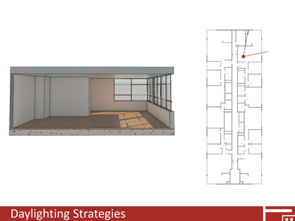
This study explores and analyzes how common daylighting strategies can be implemented on existing mid-century modern structures. The study focuses on a sixteen-story 1963 residential tower in Portland, Oregon, and explores how interior reflectivity, interior/exterior light shelves, shading, and glazing can impact daylight availability and distribution. The study looks at a variety of ways each strategy can be implemented and analyzes the results to determine best practices based on daylight distribution/availability, glare, lighting loads, and heating/cooling loads.
on Best Practices for Providing Effective Daylight in Mid-Century Modern Structures

TOOLS USED FOR SPECIFIC ANALYSIS
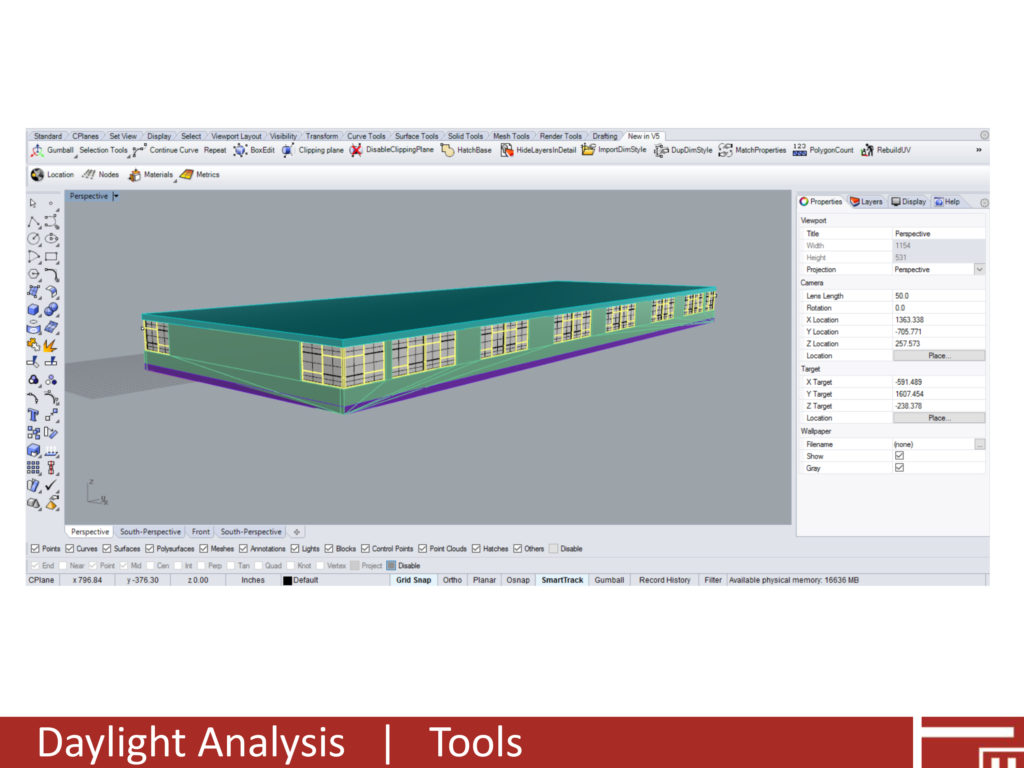
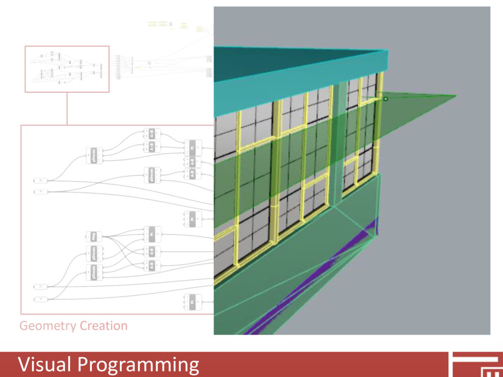
Emerging tools and technologies provide effective methods of analyzing hundreds of different daylighting simulations. Applications such as Grasshopper and Dynamo, which are visual programming environments for Rhinoceros 3D and Revit respectively, allow users to explore a variety of different design interventions and determine optimal solutions. Prior to starting the daylight analysis, we began with a “base geometry” of the existing conditions that we modeled in Rhinoceros 3D. We then developed a Grasshopper file to create daylighting interventions. For this study the interventions consisted of interior light shelves and exterior shading devices based on numerical inputs for shelf depth and height. Using Grasshopper in lieu of traditional 3D modeling allowed us to systematically test multiple variations of intervention geometry. In addition to studying how new geometries would impact daylighting we also studied how existing/new materials could impact daylighting performance.
on Best Practices for Providing Effective Daylight in Mid-Century Modern Structures

The daylighting analysis was performed using DIVA for Rhino, a plug-in that performs daylighting and energy analysis directly in Rhino. DIVA also offers several Grasshopper nodes, allowing the analysis to be controlled and managed directly in Grasshopper. For this analysis the primary results we extracted and used to measure performance included:

  • Annual Daylight: Percentage of time space receives at least 300 lux. This value can be mapped over the area under analysis. Typically, areas that receive 300 lux at least 50% of the time have the potential for daylighting.
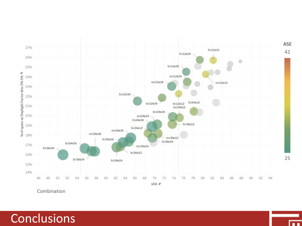
  • Spatial Daylight Autonomy (sDA): Percentage of a space that receives 300 lux for at least 50% of the annual occupied hours. This metric provides a single number for quickly determining daylight potential. A value over 55 indicates that daylighting will be at a minimum nominally accepted by occupants. A value over 75 denotes a space where daylighting will likely be preferred by occupants.
  • Annual Sunlight Exposure (ASE): Percentage of a space that receives over 1,000 lux for at least 250 hours per year. High values indicate that the space may be overlit and cause glare/discomfort.
  • Daylight Factor: A ratio comparing light levels on the interior of the structure to the light levels on the exterior. Typically, a value under 2% indicates that the space cannot be adequately daylit, a value between 2%-5% is preferred for daylighting, and a value over 5% indicates that the space is well daylight, but may be overlit.
  • on Best Practices for Providing Effective Daylight in Mid-Century Modern Structures

    CONCLUSIONS
    Reflective interior surfaces can have a significant impact on daylight distribution.

    Without any shading there is a high probability for glare according to ASE and DF values.

    Interior light shelves alone can reduce the ASE values and the probability of glare.

    Interior light shelves alone are not as effective as exterior shading devices in reducing glare.

    A combination of reflective interior materials, interior light shelves, and exterior shading devices is the most effective method to provide adequate levels and even distribution of light.


    Written and presented by Halla Hoffer, AIA, Assoc. DBIA / Associate

    Abstract: Best Practices for Providing Effective Daylight in Mid-Century Modern Structures

    When we think of energy conservation standards for our built environment an increasing amount of existing buildings do not comply with today’s standards. A large portion of these existing buildings are from the mid-century modern era. Additionally, mid-century modern buildings are approaching historic status, if not already there. This status compounds finding the best way to integrate current energy standards because aesthetic impacts to a historic resource must be kept to a minimum. At PMA we believe that while challenging, it is possible to maintain the integrity of historic mid-century modern buildings while meeting new energy conservation requirements. In an effort to explore this possibility, we have submitted an abstract for an upcoming Energy Conservation in Mid-Century Modern Buildings Symposium presented jointly by APT Northwest and DOCOMOMO_Oregon.
    window-detail
    ABSTRACT: BEST PRACTICES FOR PROVIDING EFFECTIVE DAYLIGHT IN MID-CENTURY MODERN STRUCTURES
    Effective daylighting can reduce both lighting and cooling loads while improving user comfort, satisfaction, and health. Despite plentiful glass, using daylight in mid-century modern building can be challenging. Glare and uneven light distribution can cause user discomfort and pose challenges to effectively daylighting spaces. Frequently, artificial lighting is used to balance lighting in spaces over lit by the sun, negating any potential energy savings. For existing buildings, the available methods to provide effective daylighting are limited by the existing constructions and configuration. To both preserve existing structures and provide ample daylight a critical question must be answered – what are the best practices for improving daylight in existing buildings? This study provides insight to daylighting existing structures, specifically, how light can be controlled and distributed in mid-century modern buildings with plentiful glazing.

    Emerging tools and technologies provide effective methods of analyzing hundreds of different daylighting simulations. Applications such as Grasshopper and Dynamo allow users to explore a variety of different design interventions and determine optimal solutions. This study explores and analyzes how common daylighting strategies can be implemented on existing mid-century modern structures. The study focuses on a 1963 residential tower in Portland, Oregon, and explores how interior reflectivity, interior/exterior light shelves, shading, and glazing can impact daylight availability and distribution. The study looks at a variety of ways each strategy can be implemented and analyzes the results to determine best practices based on daylight distribution/availability, glare, lighting loads, and heating/cooling loads.

    Speaker Bio
    Halla Hoffer, AIA, Assoc. DBIA
    Associate / Peter Meijer Architect, PC

    Halla is passionate about rehabilitating historic and existing architecture by integrating the latest energy technologies to maintain the structures inherent sustainability. Halla joined PMA in 2012 and was promoted to Associate in 2016. She is a specialist in energy and environmental management, as well as building science performance for civic, educational, and residential resources. Halla meets the Secretary of the Interior’s Historic Preservation Professional Qualification Standards (36 CFR Part 61).
    olympia-logo-web

    Olympia Mid-Century Modern Survey

    Peter Meijer Architect developed a Reconnaissance Level Survey within the City of Olympia of approximately 400 residential properties built between 1945–1965. As part of the process, PMA identified those resources eligible for National Register of Historic Places listing.

    In conjunction with the survey work, PMA, in collaboration with City of Olympia, presented the findings to the City of Olympia Heritage Commission and general public. Products included complete Department of Archeology and Historic Preservation (DAHP) short forms and entry into the DAHP database, a written report summarizing survey findings, photographs of each resource, and historical and geographic context overview. All work was completed in accordance with DAHP’s “Standards for Reconnaissance-Level Survey.”

    To see the full report, please visit: Architectural Survey of Olympia’s Mid-Century Homes

    Indigenous Mid-Century Religious Architecture of Oregon

    During the 1960s Oregon architects, led by the Portland Archdiocese, created significant examples of unique mid‐century churches and religious structures in collaboration with local craftsman, artists, and influenced by European examples, resulting in a unique indigenous religious Modern Oregon style.

    Indigenous Mid-Century Religious Architecture of Oregon

    Oregon has several examples of unique mid-century churches and religious structures. Oregon is also rich in mid-century religious architecture that are unique examples of the community and/or church leadership’s interest in combining modern architecture with modern art.
    During the late 1930’s Oregon architects were seeking ways to meet both the liturgical programs of their clients yet express the architecture using materials evocative of the Northwest.

    Watzek-houseGreatly influenced by the 1936 publication of John Yeon’s Watzek House, Oregon architects began to experiment with wood skins and “Mt. Hood” entry facades reminiscent of Yeon’s design. The idea that wood was symbolic of Northwest character continued through the 1950s and 1960s mid-century modern aesthetics. Local architects like Francis Jacobberger, McCoy & Bradbury, Pietro Belluschi, and others crafter their designs from outside to inside using local species of wood while simultaneously using wood to express the structural elements.
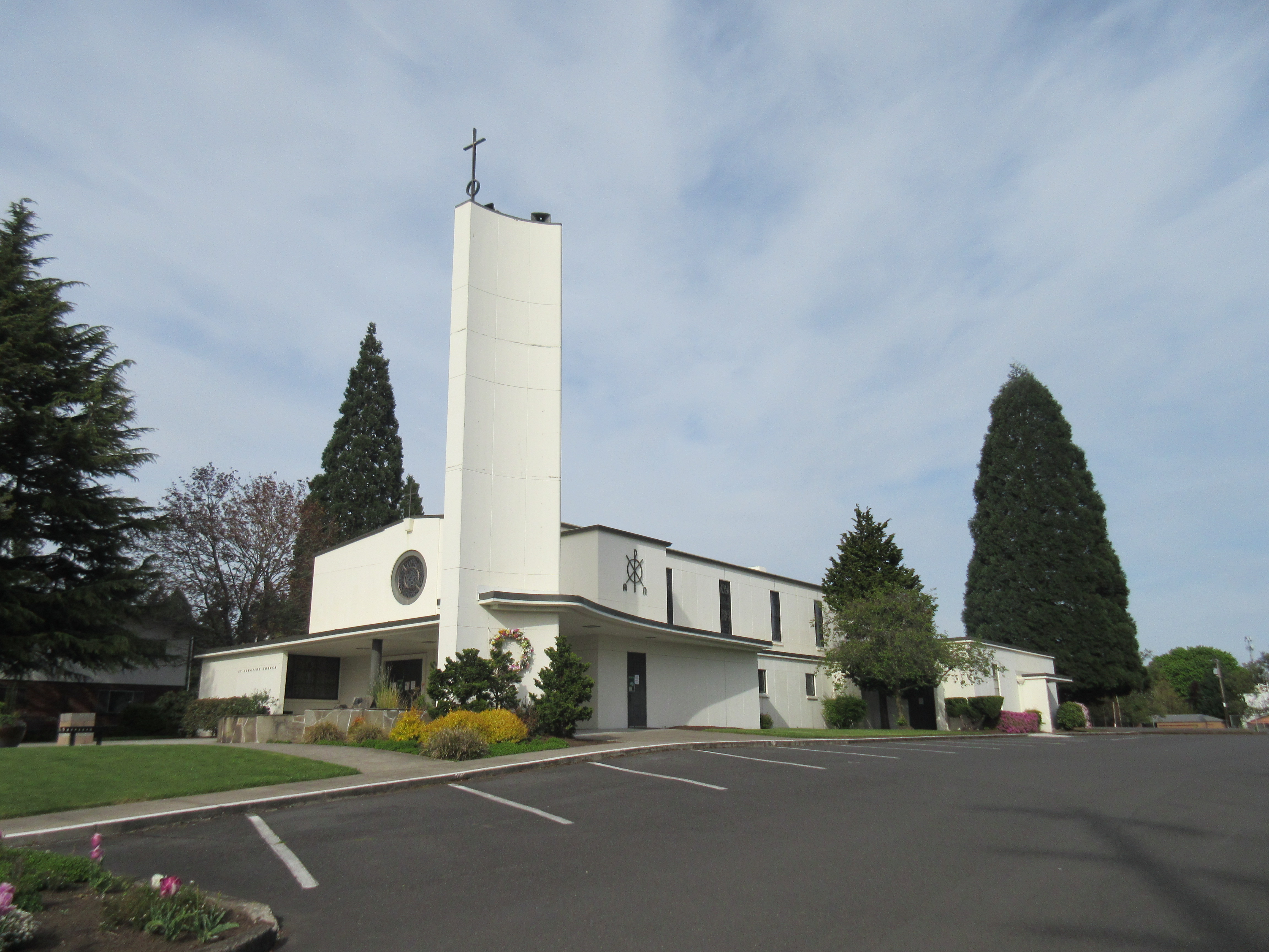
    During the 1950s and 1960s, architectural journals devoted pages and images to the increasingly innovative use of concrete as both a structural element and aesthetic material. Local Oregon firms too experimented with concrete. John Maloney’s 1950 design for St. Ignatius is executed entirely of formed concrete. The exterior, interior, and the bell tower are unabashedly presented as an aesthetic material worthy of religious structure. Maloney deliberately painted the interior white to match the exterior and emphasize the versatility and economy of concrete, the new material of choice.

    Queen of Peace
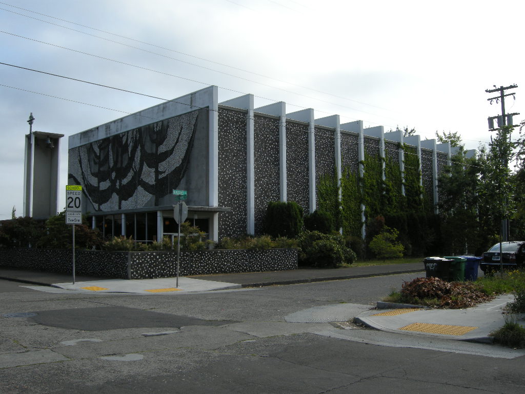
    One of the most unique indigenous examples of Oregon religious architecture is the Queen of Peace in north Portland. Queen of Peace combines both the engineering daring of concrete with the creative influences from local artists. Queen of Peace is created with clay, river stone, and stunning minimalist concrete structure.

    120715 N Portland Church 001

    Queen of Peace was influenced by Friar John Domin who served the Portland Archdiocese as a priest for 57 years, as a pastor of several parishes, a high school art teacher, and volunteer at the Art Institute of Portland. As Chairman of the Sacred Art Commission of the Archdiocese of Portland, he actively engaged in the design process of churches and chapels. He worked with architects and hired ingenious liturgical artists who worked in a variety of media to enhance churches with stunning sacred art. ” (Sanctuary for Sacred Arts website)

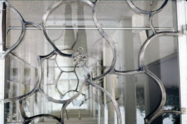
    bronze-entry-doors-queen-of-peaceWell known Oregon artists, including Ray Grimm, a ceramists, created the dominating Tree of Life mosaic on the west façade. LeRoy Setziol, the “Father of Wood Carving in Oregon,” created the wood Stations of the Cross and baptismal font. Surprisingly Setziol was commissioned to execute the stained glass windows as well. And Lee Kelly, one of Portland’s best known metal sculptors, enriched the church with delicate displays of metal work both on the interior and exterior. Queen of Peace is a marvelous collaboration of architecture, art, and technical daring creating a wonderful display of Oregon indigenous mid-century religious architecture.


    Written by Peter Meijer AIA, NCARB, Principal. This post is an excerpt from Peter’s presentation at this year’s DoCoMoMo_US National Symposium: Modernism on the Prairie. Peter is the President and Founder of DoCoMoMo_US Oregon Chapter. For more information, please visit: DoCoMoMo-US

    Sustainable Housing: High Desert Design

    Eco-Huts for Warm Springs Tribes

    Warm-Springs-ProForma-pmapdx-designProjects that integrate building science, stewardship planning, and place design are simultaneously exciting and challenging. Any one of the three core concepts can drive the decision making process resulting in a number of solutions. Our current concepts for minimalist eco structures, or “Huts” in the beautiful High Desert of Eastern Oregon are a fantastic challenge.
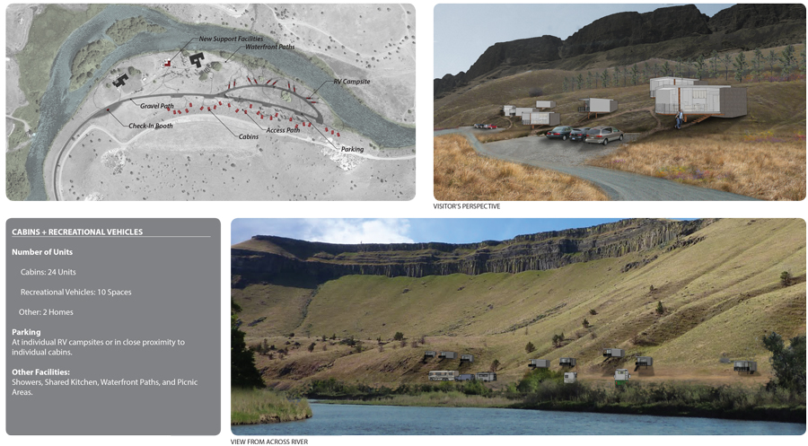
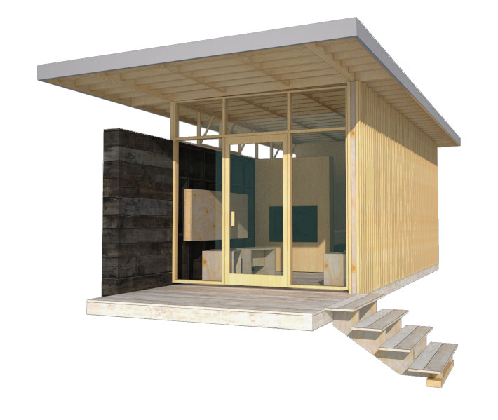
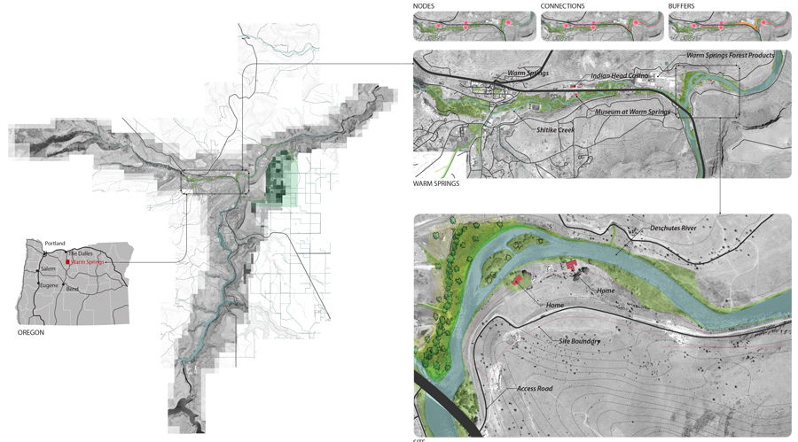
    PMA was provided an opportunity to create temporary Eco-Huts for both the avid fly fishing community and also the vacationer seeking solitude and natural beauty. The site is nestled on the right bank along a gentle curve of the Deschutes River adjacent to the Warm Spring Tribe Reservation. The site topography has a shallow slope towards the river with basalt escarpments forming the river valley. Landscape species include juniper, white pines, native grass, lavender, and wild flowers.

    Warm-Springs-ProForma-pmapdx-designWorking with the The Confederate Tribes of Warm Springs, PMA created a prototype model, easily constructed and assembled off site (test fit), then transported to the site and efficiently erected. The prototype was designed to be economical and constructed from lumber from the local lumber mill that produces products from high desert pines. A contemporary design style was chosen to harmonize with existing mid-century Belluschi homes on the property. Both the Belluschi homes and the Eco-Huts stand in contrast with the landscape and topography.
    Elevation-pmapdx-design

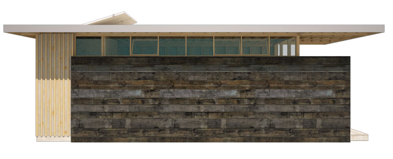
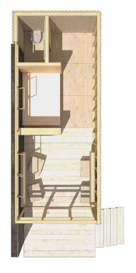
    Perspective-pmapdx-designConceived to have minimal footprints on the land, the Huts rest on piers elevating the floor above the land and accommodating the undulating landscape. A modular dimension was chosen permitting variation in the Eco-Hut sizes. The floor, walls, and roof planes are built off-site and tilted in place. Exterior stained wood material varying from plywood to sawn boards were chosen to harmonize with the High Desert landscape and be of minimal maintenance to the Tribes. Plywood panels are dressed with battens and either in-set from the wood framing or installed flush to the exterior. Sawn mill boards are stained dark desert grey and applied horizontally to create solid side walls atop of which are placed ribbon windows. The primary entry and view wall is a wood frame window and door façade. A deep roof overhang protects the interior from solar gain. Interiors are exposed panel faces or stained mill boards. Partial height walls denote areas of more privacy. The process of assembling the Eco-Huts on-site and disassembling them in the future determined the material pallet of dimensional lumber and pre-assembled wood window walls. The prototype incorporates modular concepts enabling variation in floor plan and amenities in direct response to the Owner’s request for market flexibility.
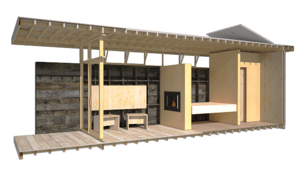
    Section-pmapdx-designInherent in our design approach for the Eco-Huts is the creation of design solutions that emphasize the uniqueness of Place. The concept includes Land Restoration and Land Stewardship. PMA’s goals when designing the prototypes was to help enhance the natural beauty of the river edge by integrating a built structure into the landscape that has minimal disturbance to the site and will leave no footprint when removed. Willows, sedges, and juniper will be planted to provide riparian cover along the Deschutes River in an effort to increase fish habitat and mitigate flooding. The plantings will also help mitigate visual impact from the river. The lumber mill site’s river edge offers an opportunity to create an employee park and river restoration replacing equipment storage and log staging. The Eco-Huts offer an opportunity to test the integration of stewardship planning and place design.
    Plan-pmapdx-design

    Written by Peter Meijer AIA,NCARB, Principal

    Graphic Design and Architecture

    Graphic design is a communication tool that plays an important role in architectural design. At its most fundamental level, graphic design visually communicates information with typography, color, and form. It also, and perhaps more importantly, influences our interaction with and the identity of place and space. From way-finding signage, supergraphics, branding, material and texture, to motion-graphics, graphic design helps integrate word and content with architecture.

    Graphic design is used to visually communicate and reinforce the sense of identity for architectural projects – including both new design, renovation, and planning projects. From logo design, visitor orientation and infographics, graphic design is an integral part to the sense of place. It affects the overall experience with the visitor, public, or inhabitant. It is also dependent on the architectural design. Think of the range of materials and its finishes used through-out a building. Graphic design must be intentional, otherwise chaos results in color, type, and form within the design struggling against the architectural design, materials and texture.

    OSU-Example-pmapdx-graphic-design
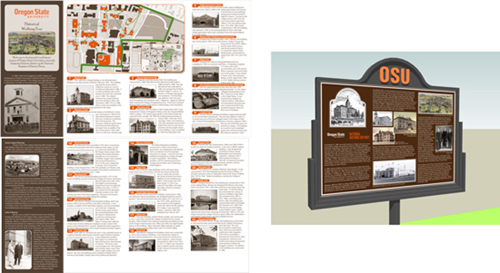
    PMA has had the pleasure of incorporating graphic design into projects. The most notable projects have included graphic design for way-finding signage and project branding. For Oregon State University (OSU) PMA created a campus-wide Historic Preservation Plan which included a Historic District, and the design of historic district signage, interpretive panels, and a campus walking tour brochure. We use way-finding signage daily to quickly distinguish different spatial areas, direction, and to distinguish landmarks. The way-finding signage produced for OSU was created to distinguish the campuses Historic District from other campus areas, which included a walking tour of its historically significant campus buildings. Color was utilized as the mnemonic devise to distinguish the Historic District, while also seamlessly integrating with existing OSU colors.

    MCM-Logos-Example--pmapdx-graphic-designPMA has been involved with several architectural planning projects that center on significant structures from the Mid-Century Modern era. These projects surveyed and documented hundreds of architecturally significant structures that revolutionized architecture and design throughout the 20th century. On the surface such planning projects can be difficult for a wide audience to understand and appreciate because the final project is not a new or renovated building(s). What better opportunity then, for graphic design to communicate and connect the significance of the project and its structures. For these projects, project logos and marketing collateral were designed as the visual symbols that communicate the entire identity of the projects. While both projects surveyed Mid-Century structures one focused on residential structures while the other did not. Both logos use form with text and color to help shape the sense of which type of mid-century modern structures were surveyed.
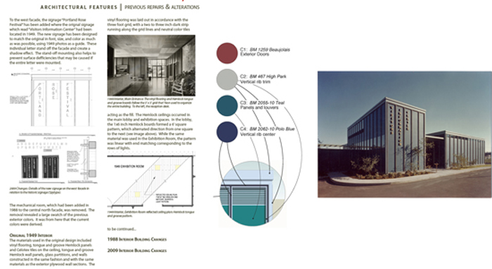
    John-Yeon-Example-pmapdx-graphic-design Following our planning projects centered on Mid-Century Modern architecture, PMA provided graphic design services for the renovation of the John Yeon designed Rose Festival Headquarters building (former Visitors Information Center). For this project, typography and color were the focal points for communicating the next chapter in this buildings life-cycle. The new graphics, color, and signage produced pay homage to the original design, while being entirely their own.
    Graphic design is an essential component to architectural design. It is a visual communication tool that utilizes typography, color, and form as a way to influence our interaction with and provide a sense of identity of place and space. Graphic design can solve important issues such as spatial orientation within a space, or by using graphic tools to communicate story-telling and identity. For a more in-depth look at our projects incorporating graphic design, please visit our OSU and STL Modern project pages.

    Written by Kate Kearney, Marketing Coordinator

    STL MODERN logo PMAPDX

    St. Louis Modern Movement Survey

    PMA collaborated with the St. Louis Cultural Resource Office and Missouri SHPO to conduct a multi-tiered thematic survey of Modern Movement non‐residential architecture built between circa 1945 and 1975 in the City of St. Louis city limits.

    Five project objectives were established and successfully completed:
    • Reconnaissance Level historic resources Survey (RLS) for 200 selected non-residential properties constructed between 1945-1975.
    • A broader understanding of the historic themes and resources associated with
    the Modern Movement in St. Louis by writing three historic context statements in conjunction with the survey.
    • An expanded property list of approximately forty (40) properties and present it to
    the public for input (informational handouts provided pictured above).
    • An Intensive Level Survey (ILS) of twenty-five (25) properties.
    • A survey report that provides the City of St. Louis with baseline historic resource data for future preservation planning and land use planning. The results of the project will contribute to the body of knowledge regarding modern resources in St. Louis.

    PMAPDX-planning

    GA Building Historic Report for Pre-Design

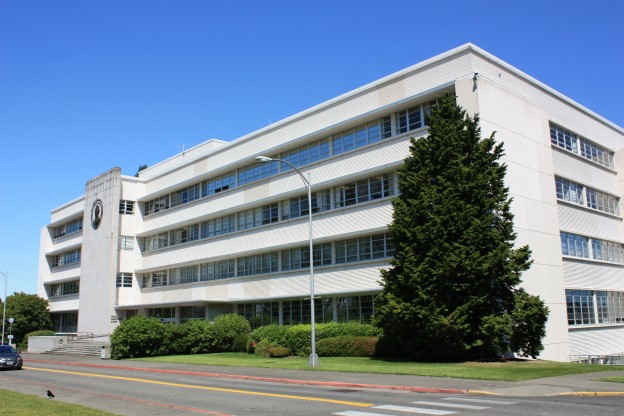
    Constructed in 1956, the General Administration Building in Olympia, WA, is a historically significant building for both its Modern architectural design, and for its representation of Washington State capitol growth following World War II, specifically the re-centralization of government to Olympia in 1954.

    PMA was the Historic Architect on the project team retained to perform the General Administration Building Pre-Design Update for the Department of Enterprise Services, Olympia. PMA conducted a historic assessment of the building, including the preparation of a Historic Report. The report described and prioritized the character-defining features of the General Administration Building, and provided insight on how preservation regulations and historic design review could impact a major renovation to the building. Recommendations were provided with preservation strategies specific to the building.

    Review an excerpt of our historic analysis of the GA Building:
    GA Building Report Historic Analysis Excerpt