Tag Archives: blog

Part II: Tropical Modernism in a Multicultural Context at the Docomomo US National Symposium

In PART I we discussed the University of Hawaii at Manoa campus (especially the stunning Jefferson Hall), presentations on traditional architecture to mid-century modernism and Asian influences on the built environment in Hawaii, and the Residences of Wimberly and Cook. For Part II we are hopping back into the Aloha Spirit by discussing the regal Hawaii State Capitol Building, presentations on historic preservation and how Hawaii was influential and integral to international tropical resort design.
hawaii-state-capitol-bldg
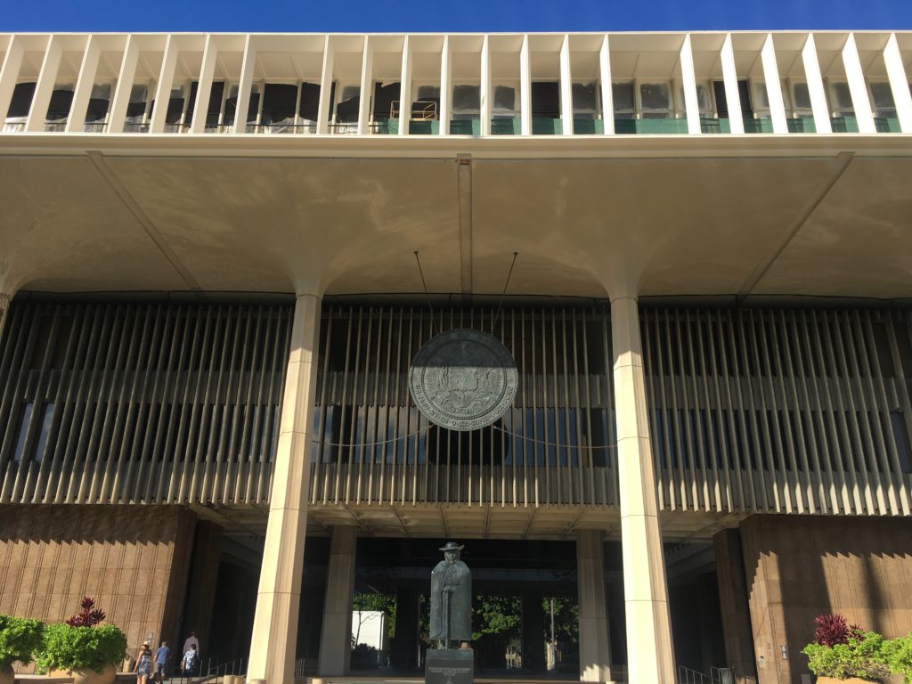
HAWAII STATE CAPITOL BUILDING
I have only been to about ten state capitols across the U.S., but the Hawaii State Capitol building is unlike any I have experience. It is a truly welcoming structure, which is something unique among monumental civic structures (looking at you Boston City Hall). The Hawaii State Capitol was designed by Belt, Lemmon & Lo in association with John Carl Warnecke. While design of the building began in 1961, construction didn’t break ground until 1965, and the building was formerly dedicated on March 15, 1969. The Hawaii State Capitol celebrated its 50th anniversary in 2019.

An excerpt from Democracy by Design. The Planning and Development of the Hawaii State Capitol, with text by Don J. Hibbard states it best:

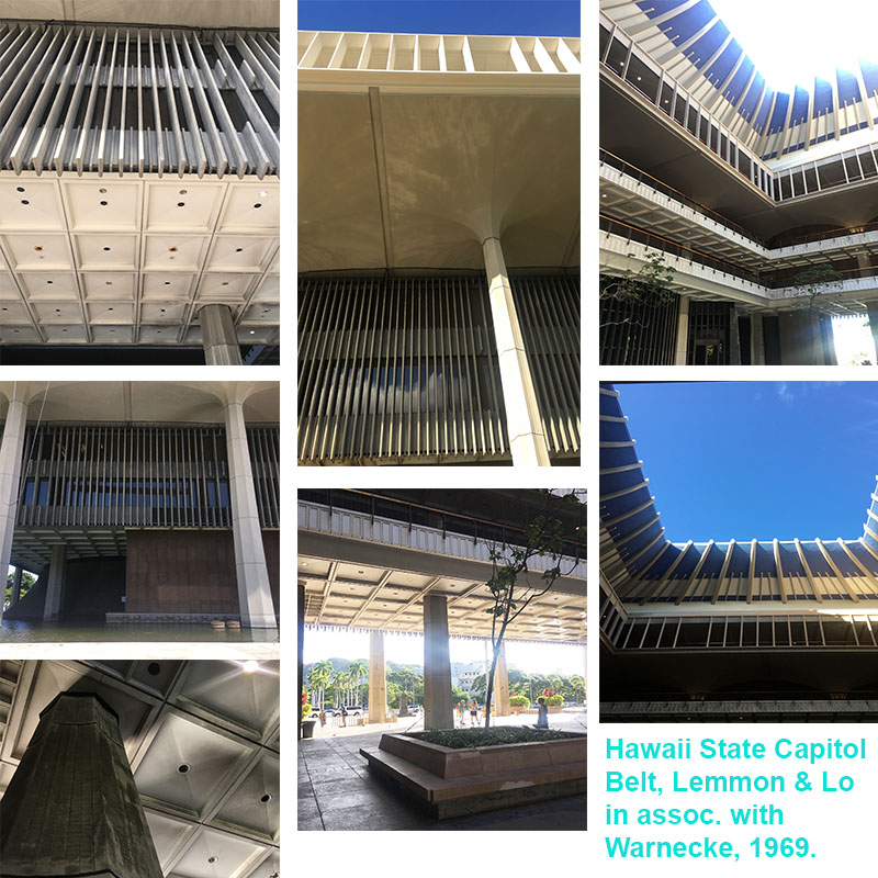
“Monumentally presiding over an eight acre site mostly carpeted by lawn, the Capitol is surrounded by a pool of water, evoking Hawaii’s island situation. The truncated cones of the legislative chambers, clad in cast stone made of crushed lava rock, rise from the reflecting pool, reminiscent of the volcanic origins of the islands. Also rising from the water are forty columns, bereft of capitals, instead flaring out of their crown like coconut palms. Standing almost sixty feet in height, the columns form a peristyle and support the extra-large fourth story, which cantilevers out beyond the columns. Serving as a cornice, the fourth story is distinguished by its open work frieze of pre-cast fins set in groups of eight, recalling the eight major islands of Hawaii. Placed free of the windows, the fins serve as decorative elements as well as sun screens. The recessed second and third floors are suspended from the fourth story, which also serves as the roof of the capital, with the governor and lieutenant governor’s offices in penthouses on top of the roof. Rising above the penthouses, the blue crown of the central rotunda echoes a volcanic crater, a graceful interpretation of the traditional statehouse dome.” (1)
hawaii-state-capitol-building-details
PARADISE PARADIGMS
DeSoto Brown
Kiersten Faulkner

These two presentations were an interesting pair. DeSoto Brown presented in a style reminiscent of informational videos produced in the 1950’s and 1960’s that were designed to encourage travel to the islands of Hawaii by showing the Aloha Spirit and all Hawaii has to offer. All the photos presented were from the archives. It wasn’t until after his presentation that he mentioned a majority of the structures pictured have since been demolished or severely altered. Remember, Hawaii was aggressively built up only since post-World War II!
downtown-honolulu
This made for a great transition into Kiersten Faulkner’s presentation on the threats and challenges of preservation and tropical modernist design – how to preserve architecture from so recent in the past. Turns out the issues (for the most part) mainland preservationist have are the same Hawaii preservationists experience. Similar to Oregon and elsewhere, that 50 year historic threshold causes a lot of havoc at times. What happens when a resource is 46 years of age in integral to our built heritage, but threatened with demolition because, sorry it’s not 5-0 historic! Kiersten also described how there is anger and hurt around some mid-century resources (mainly spiritual structures) because they replaced older structures on the same site. Interestingly enough, Hawaii doesn’t have a leg-up on mainland solutions for the intersection of preservation, sustainability, and climate change. I was a bit surprised when I asked a colleague that worked in the preservation community in Hawaii if they did anything specific to mitigating resources going directly to the landfill from demolition since they were on an island. The full answer was “No.”

DESIGNING PARADISE
Don J. Hibbard
Ron Lindgren

Designing Paradise focused on resort design in post-war Hawaii, specifically how it influenced tropical resort design throughout the world. The design and development of the Mauna Kea Resort and Ed Killingsworth Hawaii resort designs: Halekulani, Kapalua Bay Hotel, Mauna Lani Resort, Ihilani Hotel, and renovation of the Kahala Hilton Hotel were discussed. Don and Ron explained how the distinctive and elegant approaches to resort design seen at Mauna Kea Resort and the others would ultimately set the standards for tropical resort design throughout Hawaii and the world.

The Ed Killingsworth designs discussed were divine. The attention to detail Killingsworth incorporated into his creations was phenomenal to see and learn about. Those concrete spider legs that became a staple of his residential, commercial and resort designs are stunning architectural geometries for the eyes. Killingsworth was a planner for the City and County of Honolulu pre and post-World War II. While his resorts were interesting to learn about, Ron Lindgren discussed at length his residential designs in California.
waikiki-beach-diamond-head
Killingsworth personal residence was breathtaking. If only every house was designed with the level of attention, detail, and space planning that brings the indoors out and vice versa that Killingsworth executed. What caught my attention was how Killingsworth designed the kitchen at his personal residence in California. He had floating wood lower cabinets, which looked more like beautiful pieces of furniture than storage for kitchen-wares. Also, he did not use a backsplash – genius! Behind the floating cabinets with the kitchen sink, a full ceiling-to-floor window was used, including underneath the floating cabinets. This played a trick on the eye, with the abundance of natural light flooding from above and below the cabinets the space looked larger and lighter. Also, why are we SO obsessed with back-splashes and kitchen islands? His designs make the case for neither. His interpretations of lanai living was on full display in his California residence.

The Mauna Kea Resort. Laurance Rockefeller was the developer that brought the world to Kauna’oa beach, and ushered in a new era of tourism to Hawaii. The Mauna Kea Resort opened in the summer of 1965, and was designed by SOM in the most sophisticated mid-century style. Concrete has never looked as elegant as it disappears into the surrounding natural landscapes. It was the first resort along the coastline of Hawaii’s Big Island. Mauna Kea Resort also features a prominent art and artifacts collection. The contributions to the Big Island that Rockefeller enabled in the mid-century are still thriving today.
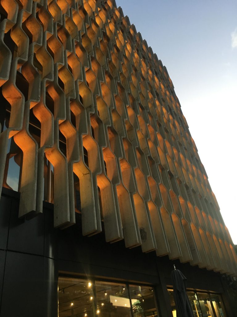
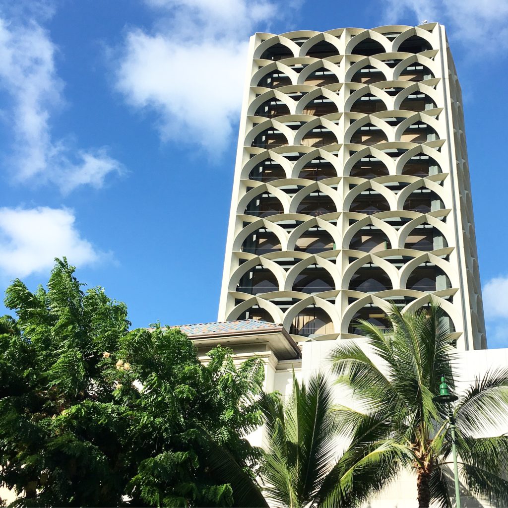
IBM-building-honolulu
Tropical Modernism in a Multicultural Context at the Docomomo US National Symposium was a delight to experience. The closing reception was at the Ossipoff designed IBM building (1962). Talk about an iconic Honolulu mid-century building. The exterior façade grille is retro yet timeless architectural elegance. And, it was fitting to have the opening and closing receptions at two distinct mid-century buildings in Honolulu designed by one of the most prolific architect’s in Hawaii.

I wouldn’t be able to end this two part blog without mentioning the hotel that hosted several social events, part of the symposium programming: the Surfjack. From the beautiful lanai, delicious restaurant with fantastic mai tai’s, to the quaint yet stylish rooms, the POOL, and welcoming staff. The Surfjack felt like a home away from home in the heart of downtown Waikiki.

For designers, architects, planners, preservationists, and those generally interested in mid-century design, Docomomo US National Symposium is a MUST on your list of mid-century focused events.
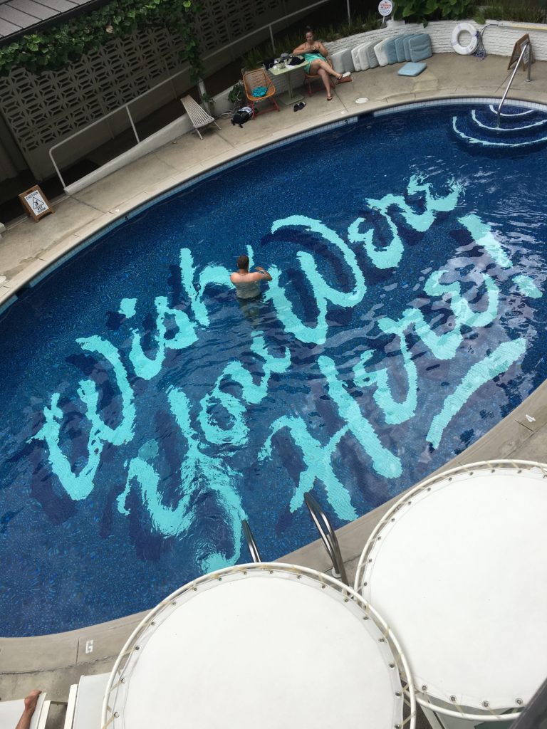
surf-jack-hotel

Written by Kate Kearney, Associate.

1. The Hawaii State Foundation on Culture and the Arts in accordance with the recommendation of The Task Force to Plan and Coordinate the Celebration of the Fiftieth Anniversary of the Hawaii State Capitol. Democracy by Design. The Planning and Development of the Hawaii State Capitol, by Don. J. Hibbard. Honolulu, 2019.

PART I: Tropical Modernism in a Multicultural Context at the Docomomo US National Symposium

Tropical Modernism was showcased, explored, and celebrated at the sixth annual Docomomo US National Symposium in late September 2019. Docomomo US/Hawaii chapter hosted, and as the current Docomomo US/Oregon chapter president I had the opportunity to experience all things tropical and modern in Oahu, Hawaii.
Honolulu (2)-pmapdx

For those unfamiliar with the mouthful that is Docomomo (documentation for the conservation of the modern movement), it’s a national (technically international) non-profit dedicated to the preservation of modern architecture, landscape and design. At the Oregon chapter we take this mission a bit further by including art from the core era of modernism and one of the most controversial architectural movements: post modernism. But let’s get back to the oasis that is Oahu. First, if you have the opportunity to visit this island – DO IT. It is a multicultural, dense cosmopolitan city yet rural surf-town, absolute food heaven, post-war architectural wonderland where tropical resort design began, all rolled into one island that has weather far superior than what we ever get in the state of Oregon. Why do we all live in the cold and rain?!

The symposium kicked-off with a welcome reception at the Outrigger Canoe Club. The building is situated right along the Waikiki coast and was designed by Vladimir Ossipoff in 1941. Ossipoff had a prolific Honolulu-based firm, Ossipoff Snyder Architects. A common theme I was unware would take a central role throughout the symposium was about tropical outdoor/indoor living, or better known as lanai.

honolulu-beach

UNIVERSITY OF HAWAII AT MANOA
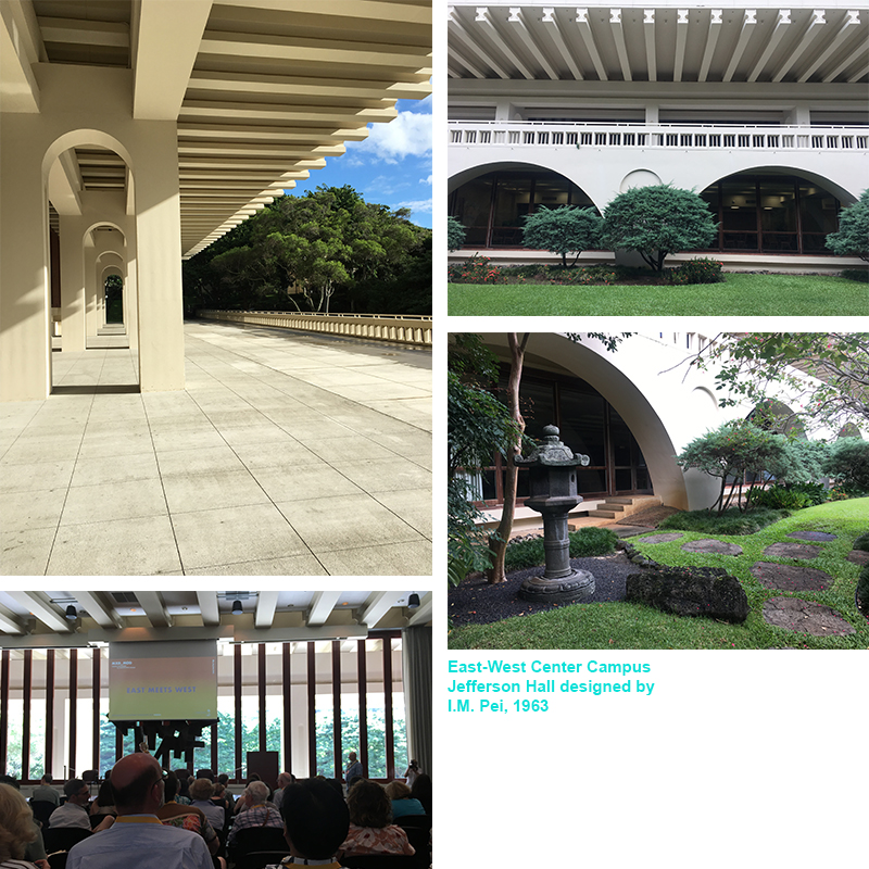
University of Hawaii at Manoa hosted the first day of symposium presentations at Jefferson Hall. While there are several mid-century buildings across the campus, Jefferson Hall is an architectural gem among them. Completed in 1963 and designed by Chinese-American architect I.M. Pei with Young & Henderson. Jefferson Hall was the last building constructed of the East-West Center (EWC) campus. The EWC helped put Hawaii on an international stage, connecting Asia and the West. Jefferson Hall in particular “combines the austere symmetry of the New Formalism with hints of Chinese traditional architecture to convey the links between Asia and the West envisioned by the center’s multiple champions and founders.” (1.)

HAWAII OVERVIEW – from traditional architecture to mid-century modernism
Glenn Mason
Graham Hart

Bit perplexed that native Hawaiian architecture was breezed over and barely mentioned. The presentation began with thatched houses, then quickly jumped to the first Western-style frame houses being shipped to Hawaii in the 1820s. These were the type of structures the Missionaries were accustomed to. From there we learned that basalt quarries were developed in the 1880s, and the California Gold Rush really opened up west coast trade to Hawaii. For the first time Douglas Fir was shipped from the mainland to Hawaii. Mason then explained that while Hawaii had designers, they did not have architects, but architects from Australia or the mainland came to Hawaii and contributed to the beaux-arts and neo-classical styled structures. It wasn’t until the early 1900’s that a regional style began to express itself in Hawaii, and across the mainland. Hawaii regional style elements include: double pitched roof, lanai, local materials, and an overhang roof.

Towards the end of the 1930s change thinking happens and international style references begins to be expressed in architecture. Hawaii sees an influx of younger architects from Europe that were schooled in modernist design. The late 1930s had a stream of construction on military bases (several designed by Albert Kahns office), but by the time of WWII, 99% of architects on the island went to work for the military. From the 1930s through the 1960s there is a shift in the architecture vocabulary in Hawaii. It begins with regional style with a hint of modern, then modern used to reinterpret regionalism. Modern architects of note in Hawaii from that era:

Vladimir Ossipoff
Peter Wimberly
Lemmon, Freeth, Haines, and Jones
Edwim Bauer
Alfred Preis
Johnson & Perkins

The shift in the architecture vocabulary in Hawaii continues from the 1940s through the 1970s. Now we begin to see the environmental influences on modernism, even though rural landscapes are being transformed into cosmopolitan centers with smaller, steep, tight sites or housing. Materials used for modern design now includes concrete, cast concrete, lava rock, coral, local woods, and aggregates. Modern architecture in Hawaii also embraces the natural environment. This is most reflective in architect’s obsessions with lanai. This obsession found its way from residential homes to large developments. The East-West Center (1962-1963) at the University of Hawaii Manoa, designed by I.M. Pei, is a phenomenal example of a monumental, institutional piece of architecture that embraced the lanai.

Jefferson-Hall-001

ASIAN INFLUENCES
Alison Chiu and Alissa Carson
Lorraine Minatoishi
Luca Guido

This group of presentations focused on different facets of Asian influences and how the contributions were interwoven in post-war architectural design throughout Hawaii. Lorraine Minatoishi focused on Japanese temple architecture influence of modern design post-war. There were distinct temple styles developed throughout their history in Hawaii:

Japanese Traditional Style (late 1800s – early 1900s)
Plantation Style (late 1800s – early 1900s)
Hawaii Eclectic Style (early 1900s – 1950s)
East-West Style (1918 – 1950s)
Post-War Modernism (led by second-generation Japanese architect Niser)
Post-War Traditional

Luca’s presentation took it a step further by discussing an obscure architect from the mid-century modern era, Bruce Goff, and how he also influenced local architects to Hawaii. I had not heard of Bruce Goff like most, but Luca Guido explained why this figure in the realm of modernism was obscured until now.

RESIDENCES OF WIMBERLY AND COOK
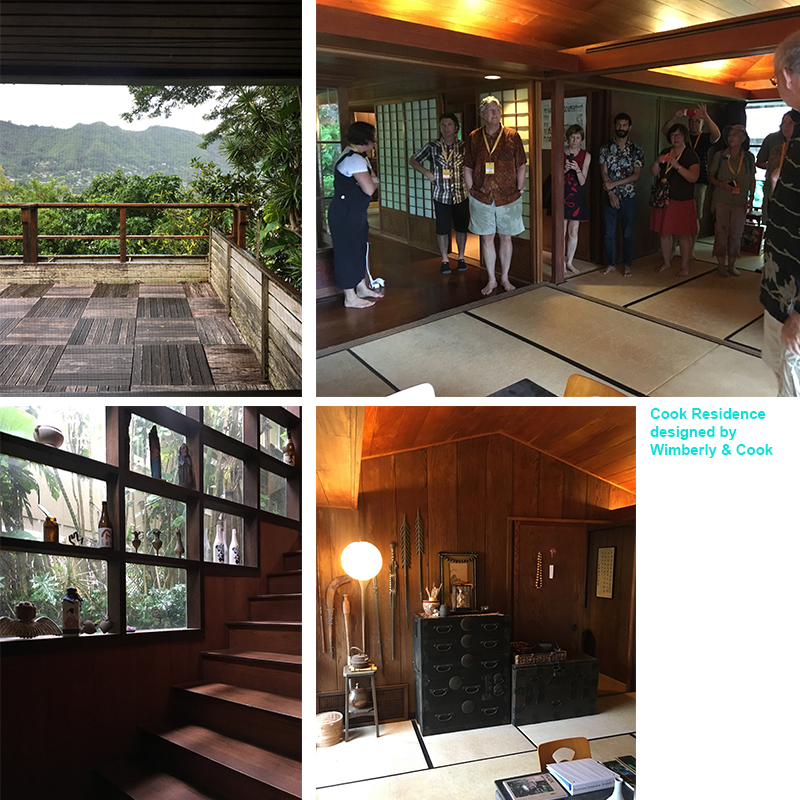
Following presentations at the University of Hawaii and a self-guided walking tour of other mid-century campus resources, I chose to attend the Residences of Wimberly & Cook Tour. Pete Wimberly of Wimberly & Cook designed two residences situated above the Manoa Valley. Wimberly designed some of the most iconic mid-century modern buildings in Hawaii. Wimberly came to Hawaii in 1940, and post-war his career flourished. His designs embodied tropical modernism, spaces that blurred indoor and outdoor living. The residential designs we toured both featured indoor/outdoor living, natural cross-ventilation, elegant interior details and finishes, and a smart use of natural light. However, they were completely different in essence, aesthetic, style, and state.
Cook-Residence-PMAPDX
The Japanese style pavilion house was like walking into a meticulously cared-for time capsule. There wasn’t even dust on the book shelves that displayed artifacts collected and arranged by the original homeowner! However, there were a few signs of wear-and-tear on the interior Japanese style floor mats, kitchen cabinets along their frames, and slight dry-rot peppered across the original wood deck. Otherwise the home was pristinely maintained. Wimberly’s private residence across the street was a different story.

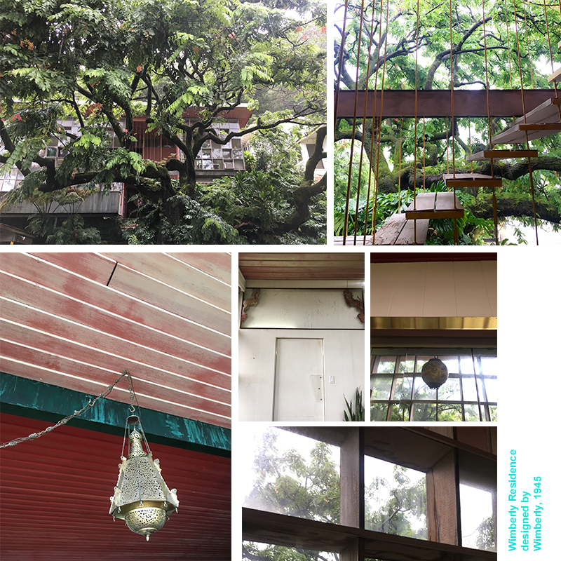
Wimberly’s private residence was constructed in 1945. This is an insane date for residential construction due to World-War II ending the same year, and the majority of architects/contractors in Oahu were working on military projects. With the Japanese style pavilion home, you enter by walking down slightly winding stone steps. With Wimberly’s private residence, you enter by climbing up stone steps that deliver visitors to a small landing, and then up more exterior stairs. The second set of stairs (wood planks suspended by cables) makes for a swoon-worthy entry sequence that looks like something Dwell or Architectural Digest would gobble up for a feature article.
Wimberly-Residence-PMAPDX
From the now faded red door, redish-pink painted wood paneled ceilings, decorative animal sculptures situated within the header above the door that leads from the dining area into the kitchen, to ornate light fixtures and various metal finishes throughout the space, Wimberly’s private residence utilized design elements that reflected the multicultural diversity of Hawaii. The residence is also quintessential mid-century design: natural cross-ventilation, sliding wall panels to completely open up or section off the main-floor living, dining and lounge areas, and a technological savvy (for its time) kitchen. From the perspective of how we design kitchens today, it is real sad and small, save for the to-die-for view of the lush tropical garden from the kitchen window over the sink.

Wimberley’s private residence also showed signs of being well lived-in, yet not maintained with any desired vigor. The wood framed windows on either side of the structure are rotting like the planks along the entry façade deck, and there are several cracked panes of window glass. Structural settling has made itself known, and the kitchen is retro in a manner no one would want for daily use. Most of the interior painted walls or ceilings have faded into softer hues of their original bold colors. And, when we visited, it looked as though someone was living there, yet possibly setting up an estate sale for interior items. There were some true mid-century interior design gems scattered in the clutter piled up from the floor I wish I could have packed in my suitcase for the return trip.

Hope you enjoyed PART I: Tropical Modernism in a Multicultural Context at the Docomomo US National Symposium! In Part II we will discuss the Hawaii State Capitol, and presentations on Historic Preservation in Hawaii and Tropical Resort Design.

Written by Kate Kearney, Associate.

1. Shen, Haigo and Irene. Tropical Modernism At University of Hawaii At Manoa. Docomomo US National Symposium, Oahu, Hawaii, September 2019.
Overview of Architectural Styles in Oregon: 1840s to 1970s

The City of Gresham applied for and was granted a CLG grant from the State Historic Preservation Office to increase community interest in historic preservation. The City felt that a presentation focused on architectural styles would likely to generate interest among the community. They contacted PMA to provide a power-point presentation geared towards citizens with no planning or architecture background, but also useful for City staff and historians. PMA
presented an overview of Oregon Architectural Styles. We used local Gresham area examples with state-wide examples in the presentation to highlight the residential and commercial styles most likely to be seen in the Gresham area.
Picture1-gresham-styles-presentation

USE, TYPE, STYLE
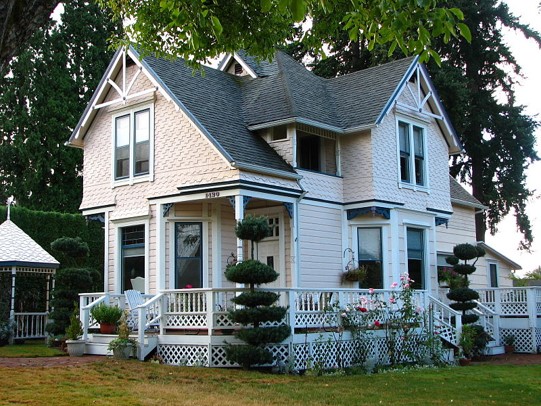
It is difficult to understand style without an appreciation of the ways style can be overlaid on various types and uses of buildings. The USE of a building is its primary function. For instance, a church (use) might have a hall with steeple (types or forms) and be Neoclassical (style). The use or purpose of a building is strongly linked to its form, but even within a category of use such as residential, one might find various types such as “apartment block,” “bungalow,” or “four-square.”

TYPE just means the basic form, so it is useful for historians to categorize these forms into expected sizes or arrangements of volumes. An apartment block is generally a simple rectangular building with several apartment units and a shared entry. A bungalow is simply a small house, one or 1.5 stories, horizontal in expression. Bungalows are often Craftsman in style, but a handful of other styles are sometimes used with a bungalow type. A four-square is a larger house, typically 2 or 2.5 stories, consisting of a somewhat square footprint with 4 rooms on each floor, and a broad front porch with columns or posts.

The building’s STYLE is determined by the architectural and ornamental details and exterior features applied to the basic structure. Styles change with the times. In fashion and out of fashion, some endure longer. The timeline included is generally reflective of Oregon architectural fashions. However, style also can be affected by technology- for example, the development of steel frame buildings allowed for a new style to emerge: Modernism. Older bearing-wall masonry construction only allowed for small windows set between structural wall areas. A proliferation of new building types, such as the geodesic dome, occurred in the Modern era.

We categorize buildings by type, use, and style when doing a survey of resources in a particular area. The data can be compared quickly and easily to data from other surveys, so we can see the patterns and history of development emerging in any particular area.

STYLISTIC TIMELINE OF ARCHITECTURAL STYLES IN OREGON
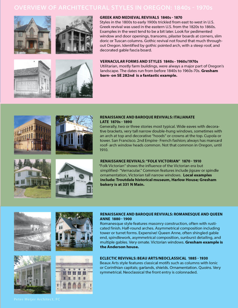
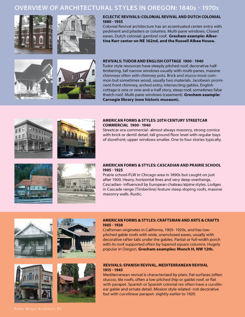
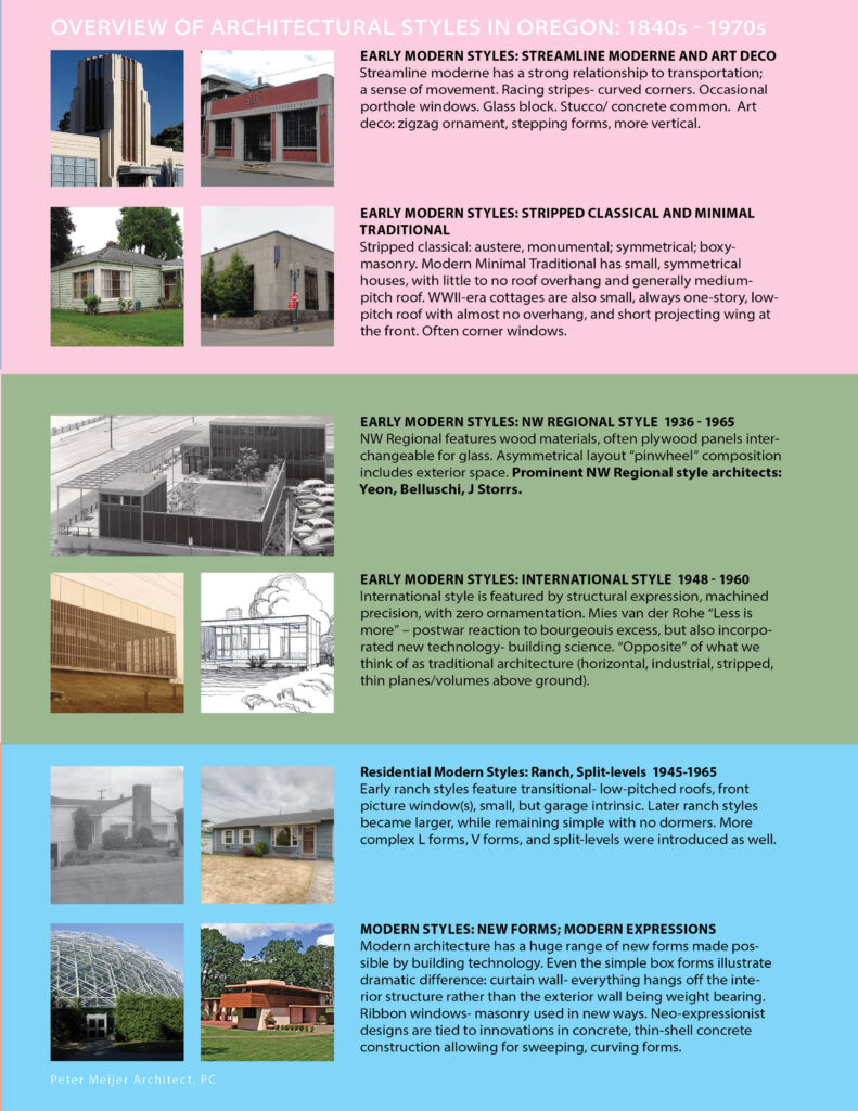
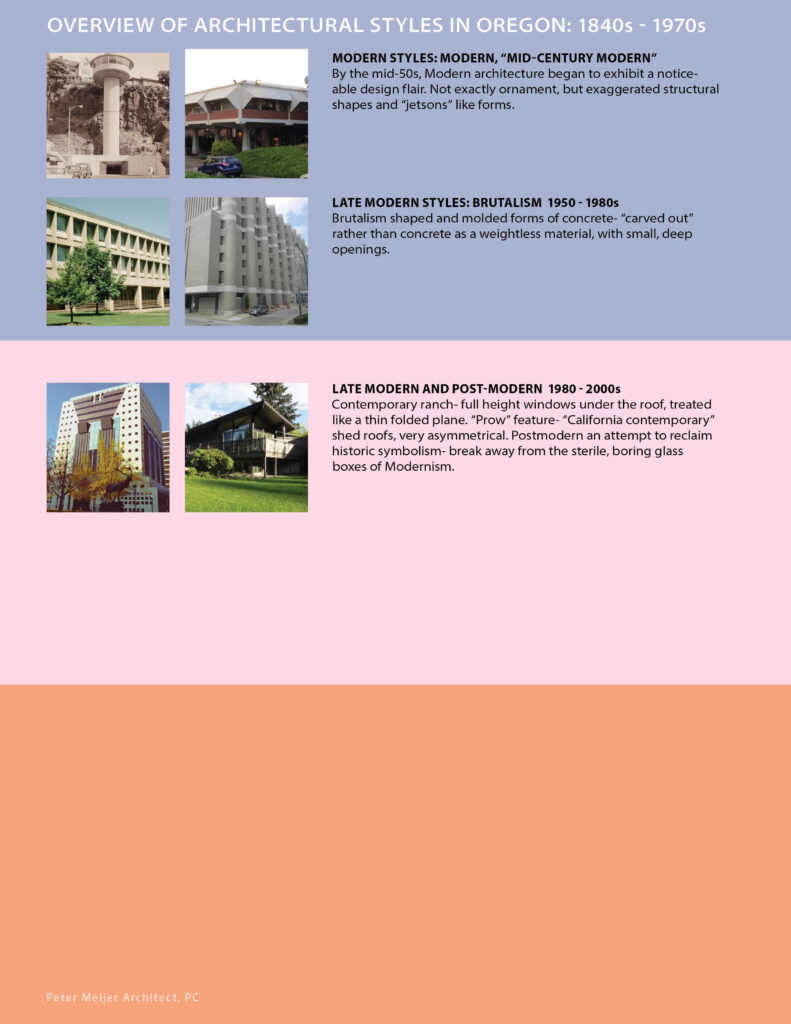
From Vernacular Forms and Styles, to Renaissance Revivals, Northwest Regional Style and Post Modern, Oregon has a robust and diverse vocabulary of architecture. The stylistic timeline below is meant as a broad overview, highlighting key attributes per style listed, to help you identify your local Gresham area, greater Metro area, and and PNW regional architectural resources.

overview-architecture-styles-oregon-peter-meijer-architect

overview-architecture-styles-oregon-peter-meijer-architect

overview-architecture-styles-oregon-peter-meijer-architect

overview-architecture-styles-oregon-peter-meijer-architect

The Form and Function of Lighting Design

When we experience an interior architectural space, lighting plays a large role in setting the mood and functionality of a space. No matter an existing, modern or historic building, light of a space is a critical aspect of great interior design. Lighting elements can be designed to enhance the space and architectural details, set the mood, and compliment furniture, color schemes, and art work. For spaces without an abundance of natural light, lighting design becomes even more critical design consideration. For a recent project, PMA designed lighting schemes for two historic four-story tall interior atriums.

The existing atriums utilize natural light from skylights above; however the original design provided no artificial overhead lighting in the space. During the winter months or at dusk and night, the light quality of space relies on the little ambient light from the skylights or artificial light from the surrounding rooms and halls. The light during these times is inadequate for the necessary function of the space. PMA was tasked with providing a lighting solution that would sensitively address the historic nature of the atriums and provide adequate visibility in the space.
pmapdx-lighting-design-004
Defining the Project Challenges
The concepts for our lighting schemes were based on the intended function of each identical space. The focus of the design and specified need of the client was to provide lighting for evening social gatherings, networking, and overall entertaining. Lighting needed to be adequate enough for speakers presenting to a crowd and for listeners to be able to read any related literature. Therefore, it was crucial to design lighting schemes that could provide ample lighting for evening events without compromising the historic integrity and ambiance of each space. To provide a solution for our clients’ challenge, we considered the following when approaching our design for the lighting schemes:

  • How to provide power to the source of lighting without compromising the historic elements.
  • Designing for large volumes of vertical space: hanging lighting within the atrium versus lighting from the top; how the light travels in the space, how it casts down shadows, the reflections off the floor and other surfaces.
  • One atrium exhibits permanent hanging sculptures and art; the lighting design required minimal approach to integrated and highlight the sculpture without distracting from it.
  • Designing for and highlighting the atriums’ architectural details, like the cornices, in addition how to hide or incorporating other non-historic architectural details like the structural support columns.
  • pmapdx-lighting-design-002
    Methodology for Design Solutions
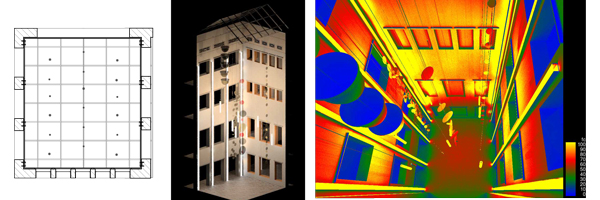
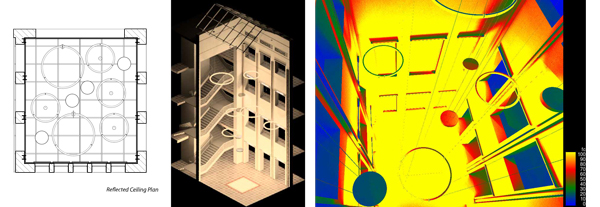
    The prominent design goal was to increase overall light levels through a refined, modern scheme that would provide juxtaposition to the historic architectural elements and hanging sculpture. As in any historic project, it is important to avoid solutions that are faux historic, competing with, compromising, or confusing the original historic character. The few pragmatic design parameters defined by the client allowed for design freedom to provide several unique, distinct solutions. While creating our designs, PMA experimented with the type of fixtures (down lights, sconce, defused) and placement of these fixtures within the large volume of the atriums. PMA explored these options in a Revit model of the atrium spaces, which enabled evaluation of the design solutions through lifelike renderings that portrayed the quality and levels of light. Illuminance studies of lux levels provided a way to evaluate each design and provide refinement to meet necessary levels defined by the function of the space. Some lighting design options included:

  • Design lighting to highlight and contrast architectural features from surroundings, for example placing fixtures in the cove of architecture cornices located above openings within the atrium.
  • One atrium has a glass block floor element which could be illuminated from below to provide a dramatic light feature.
  • Accenting the verticality of the space with defused ribbon lighting set within the non-historic structural C-channels. This would transform these elements into elegant vertical lines leading the eye to the above skylights.
  • Pendant lights interspersed between sculptures would provide orbs of light to highlight elements of the sculpture. These fixtures would provide defused-light with optional downlights within the same fixture.
  • Suspended down lights at top of atrium with lights accenting sculptures from above and side.
  • Wall sconces to accents light and wash the atrium walls and columns; this would provide an overall glow to the space.
  • pmapdx-lighting-design-001
    pmapdx-lighting-design-003
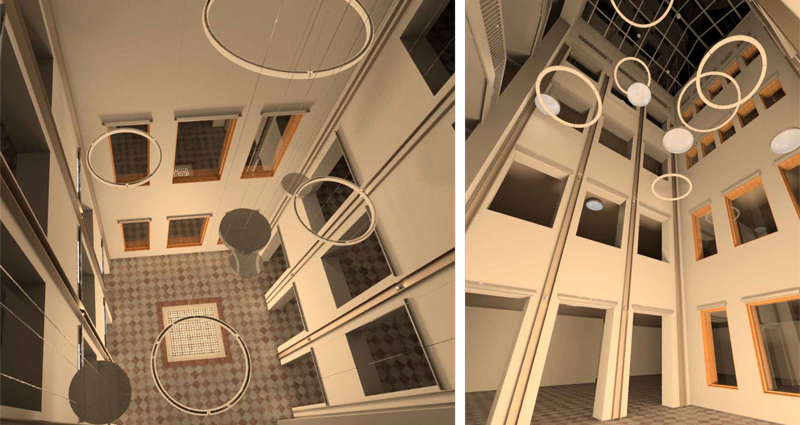
    Scheme 1 unified serval lighting design ideas to provide different light level options in the space. Wall sconce lights provide general illumination of the space. Large circular hanging fixtures consist of defused tube lights and large circular defused downlights. Each group of fixture types can be controlled independently and dimmed to provide the ambience desired.

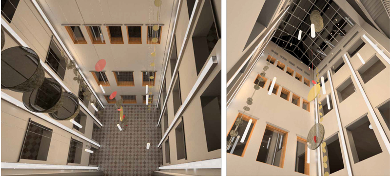
    Scheme 2 specifically works with the sculptures in the second atrium space. Vertical ribbon lights provide ambience illuminance of the space while concealing non-historic structural elements. Pendant lights hang interspersed within the sculptural elements. These have a defused light with an option for downlights. Each grouping of fixtures can be illuminated together or separately depending on the quality of light needed.

    Scheme 3 was chosen by the client and until announced must remain confidential. Stay tuned for the reveal.


    Written by Hali Knight.

    Means and Methods of Architectural Design

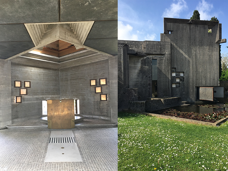
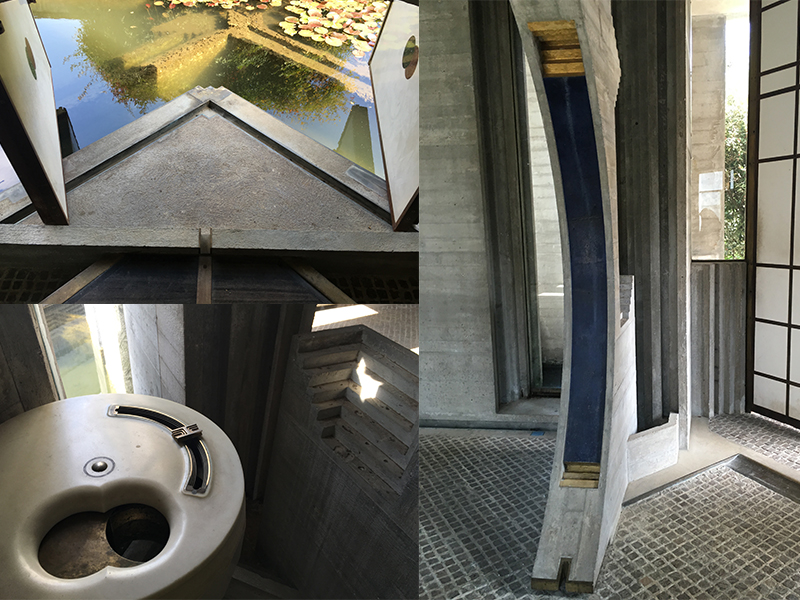
    On a recent trip to Italy, I couldn’t help but contemplate the progression of architecture styles across time and contemporary architecture’s divergence/evolution from past practice. Architecture, alongside art, has long reflected contemporary trends, culture, and politics. More than ever, contemporary architecture reflects our societies’ obsession with technology, efficiency, and value-engineering. As I stood within the walls of Carlos Scarpa’s Brion Cemetery, taking in the attention to detail and crafted experience of the space, I wondered if architecture would ever return to this level of craft, detail, and whimsy. It is hard to image Carlos Scarpa’s intricate and unique detail being created in the architectural world today. From my perception, the art of architecture on a mass scale is being transformed to a systems and science of architecture where unique, non-functioning, artful details are being abandoned as superfluous and cost prohibited.
    Means-Methods-Architectural-Design-001
    A Paradigm Shift
    Great works of historic architecture were conceived by pen and paper as artistic minds envisioned each space on iterative gestural pages; translated from enigmas to sketches to drawings to reality. Materials were crafted by hand and details seamlessly integrated within each trade’s identity. Today’s paradigm shift toward Building Information Modeling (BIM), factory production, and intelligent building systems have transformed the means and methods of the tradition discipline. Traditional detailing known by each trade has been lost to time as architects and builders move to new systems. The design process has continued to evolve and transitioned to computer based iterative processes. This creates a new dialog where the computer program itself has an influence over the design.

    Architectural contemporary styles are named for the processes in which they were designed, such as Diagramism, Revitism, Scriptism, and Subdivisionism. These processes include designing in CAD, BIM, and other 3D programs, which can predominantly drive the design style and form. Architects and designers need to be aware of how architectural design is affected by each program’s restrictions and work flow tendencies. There can be a detachment for the final goal of the built form as we go down the virtual rabbit hole. The benefit of 3D modeling is that it allows designers to more fully comprehend form and its intersection with the overall building systems. However, if the design process is pushed into modeling without a strong concept, the objective can be easily replaced with creating a well-organized and systematic Building Information Modeling, instead of holistic architectural design.
    Means-Methods-Architectural-Design-002
    Architectural Design and BIM
    BIM designs are based primarily of component systems that create efficient, intelligent, and informative models. Designers can easily draw schedules and quantities that greatly speed up processes, however in the design process, focusing on components can also create a disassociation from the whole building and design concept. The translation of an artistic gesture of a material or space can easily be lost in the clunky world of 3D representation and restrictions.

    I am certainly a proponent of BIM, but I am also an advocate of preserving the art and craft of architecture. BIM is a terrific for understanding buildings in their 3D form as a composition of components and systems. BIM’s intelligence allows for continued updating of schedules and quantities, allowing for time efficiency. However, these components are limited to the software’s modeling options and the designer’s skill at modeling. The virtual world is still not an accurate representation of all the properties of building materials or their structural capabilities. In other words, BIM cannot be a means from the start to the end. Our profession is obligated to continue to push for high design standards and syndicate and extrapolate. I continue to see architecture that either allows BIM to drive design or prioritizes efficiency and value-engineering over quality of design. As BIM evolves within architecture as a means to design, I hope it can assist designers in their creative process and challenge our profession’s boundaries.

    Written by Hali Knight, Architect I

    Sources
    Prospect Magazine
    Archdaily
    DI

    Using Revit for Historic Architecture

    Revit is used widely for designing new architecture and for documentation of existing structures. When first looking at Revit one may assume that it is tailored for use with contemporary designs. The default ‘Families’ (the term Revit uses to describe all types of elements from furniture to windows, doors, annotation symbols, wall constructions, etc.) are all generic to new construction. Despite the pre-set generic components, Revit’s strength lies in the ability to create custom ‘Families’ and its capability of tracking both three dimensional design as well as linked information about components. When used correctly Revit can be a powerful tool for building assessment and historic renovation. At PMA we have found several tools in Revit that can help us accurately show historic elements, track information about conditions, show repair strategies, and graphically present data.
    Revit-RecordingData
    When working on historic structures it can be very important to accurately show existing elements. We often need to indicate exact pieces of terra cotta that require replacement or how a stone entry stair is configured so that the cost for replacement stones can be correctly estimated. We frequently create custom ‘Families’ to accurately show historic detailing. ‘Families’ of all types can be created to refine a model and add historic detail. Some of the common custom elements that we create include windows with historically accurate profiles, stacked walls that let us show terra cotta banding and differentiation in materials/wall thicknesses, complex historic roof structures, and custom patterns that match existing stonework. By adapting the generic Revit ‘Families’ and creating our own we are able to accurately represent historic features and structures.

    Capabilities
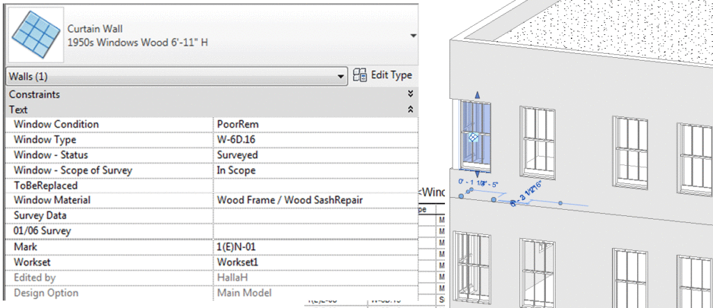
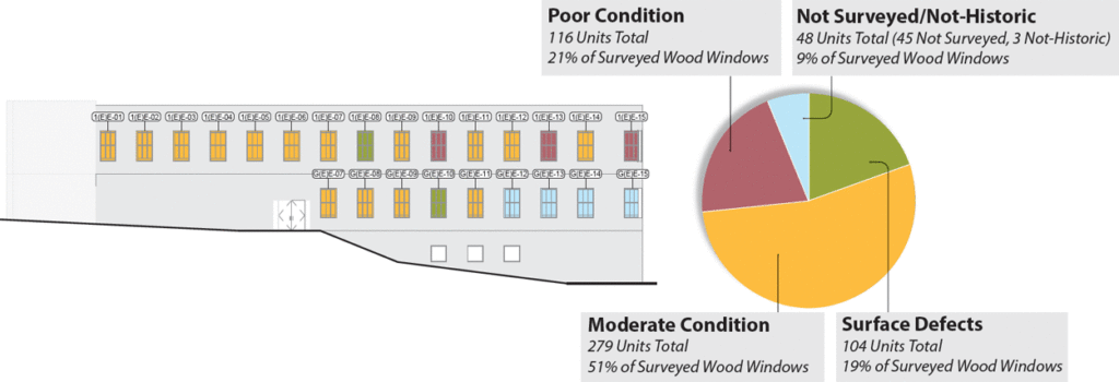
    One of Revit’s most useful capabilities is its ability to record and track information about building components. Unlike earlier drafting and 3D modeling applications, Revit can store information about material finishes, specification references, and much more! In Revit you can assign ‘Parameters’ to ‘Families’. ‘Parameters’ are used in a variety of different ways – but one of the most useful we’ve found is their ability to track the condition of specific building elements. For example, when we perform window surveys we can assign ‘Parameters’ to all of the modeled windows that describe the typical deficiencies observed. For each individual unit we can then record what deficiencies were discovered in the field. Once all of the information has been added to the Revit model you can create schedules in Revit to describe the condition of each window unit and total quantities. The information can be extracted from Revit and into spreadsheet software to analyze the data, present trends, and identify repair scopes for individual units.
    Revit-Filters
    Using Fliter’s
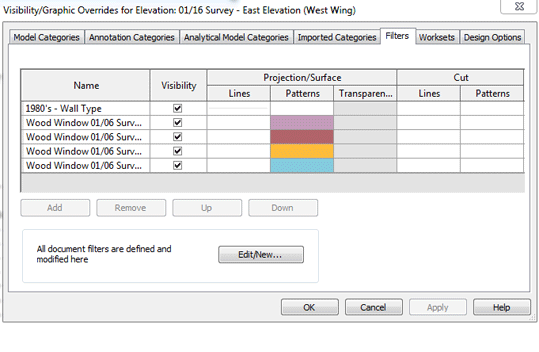
    Revit’s ‘Filter’s’ function is another tool that we use in conjunction with ‘Parameters’ to better understand and present information that we’ve recorded in the field. Filters allow one to alter the graphics for components based on their ‘Parameter’ values. For example we commonly use ‘Filters’ to graphically show the condition of a building’s windows after a survey. We do this by creating a condition ‘Parameter’ where a value can be assigned to each window, for example, good, moderate, and poor. We can then use filters to highlight all of the windows in good condition green, those in moderate condition yellow, and those in poor condition red. Unlike a window schedule which may require some analysis – the color coded elevations Revit can create with ‘Filters’ are easy to understand and an excellent tool for presentations.

    At PMA we have found Revit to be an invaluable tool that we use day to day for a variety of uses including 3D modeling, displaying point clouds, rendering, tracking information, and presenting data. Revit is a capable tool and with a little creativity one can tailor the application to complex historic projects. The ability to create complex custom ‘Families’ that track data about the structure make it possible for our office to efficiently record, analyze, and present date we observe in the field – bringing projects all the way through development, documentation of construction documents, and construction itself.

    Review our ongoing building envelope project that utilizes Revit.

    Revit-PresentingResults


    Written By Halla Hoffer, Associate, Architect I

    Portland’s Architectural Heritage from the Recent Past

    In March 2015, we wrote about PDX Post Modern and Mid-Century Modern architecture, which to our eyes was being referenced by local architectural firms for their new designs located at the Burnside Bridgehead and elsewhere. A year later and the City of Portland is continuing to build, build, build especially around the Burnside Bridgehead. In addition, cries for the demolition of a Post Modern icon of architecture: Michael Grave’s designed, Portland Public Service Building, have turned into a proposed $200 million design-build project. Has Portland come to appreciate its architectural heritage from the recent past?

    PoMo-Portland

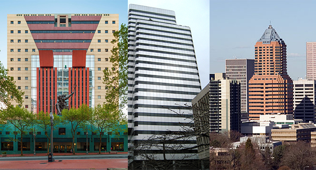
    Portland Building, PacWest Center, Koin Tower

    Before definitively answering, let’s look at efforts to repair and utilize some of Portland’s recent past architectural resources.
    DoCoMoMo_Oregon, a local chapter of DoCoMoMo_US, is a non-profit organization dedicated to promoting the interest, education, and advocacy of the architecture, art, landscape, and urban design of the Modern Movement. Recently the Board voiced concerns for the type of alterations proposed for the late modern (post modern!) PacWest Center designed by Hugh Stubbins & Associates / Skidmore, Owings & Merrill, which underwent a Design Advice. John Russell, the original developer of the project who chose Hugh Stubbins as the architect, from a shortlist that included Philip Johnson and Minoru Yamasaki, provided testimony that agreed with the design team that the retail in the building isn’t currently working, but that the building’s design isn’t the major contributor. Overall, the Design Commission encouraged the design team to treat the PacWest Center like a historic building, and use the Secretary of the Interior’s Standards as an approach for the renovation.

    The Koin Tower, designed by ZGF Partnership in 1984, is one of the most prominent buildings in Portland’s downtown rising sky-line, and an example of Post Modern architecture. It is Post Modern with whimsical lines and historical references to Gothic, Spanish, and Deco architectural characteristics. (King, 106) However, unlike the Post Modern Portland Building (interiors designed by ZGF), the Koin Tower has been accepted for its architectural whimsy in a place with a known tag line, “Keep Portland Weird.”

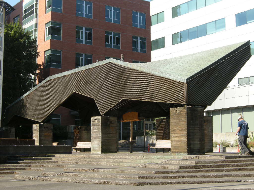
    And on a smaller scale that truly connects to placemaking, the Lovejoy Fountain Pavilion designed by Charles Moore in 1962 as part of Lawrence Halprin’s fountain sequence was thoughtfully restored in 2012.

    Appreciating the Recent Past
    So, has Portland come to appreciate its architectural heritage from the recent past? While these four examples offer a glimpse of optimism towards the maintenance and rehabilitation of architecture from the recent past, there is still an uphill battle towards the preservation and rehabilitation of Post Modern, Modern, and historic architectural resources. This is not an argument to save every resource, but it’s our responsibility to our present and future communities to have places rich in architectural resources from different movements of history- architecture rich in diversity. For architectural diversity contributes to our place making, culture, and identity. Let’s Keep Portland Architecture Weird by both adding to and maintaining and rehabilitating.

    Lovejoy Pavilion

    Lovejoy Pavilion

    Written by Kate Kearney, Marketing Coordinator

    ———————————————————-
    King, Bart. An Architectural Guidebook to Portland. 2nd ed. Corvallis: Oregon State University Press, 2007. Print.

    Post Modern Building Materials Part One

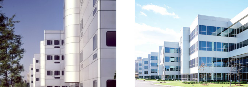
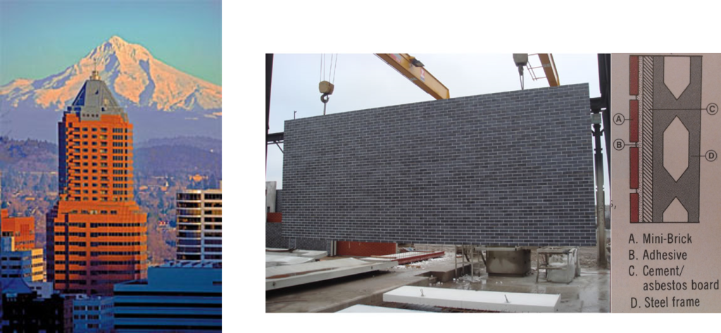
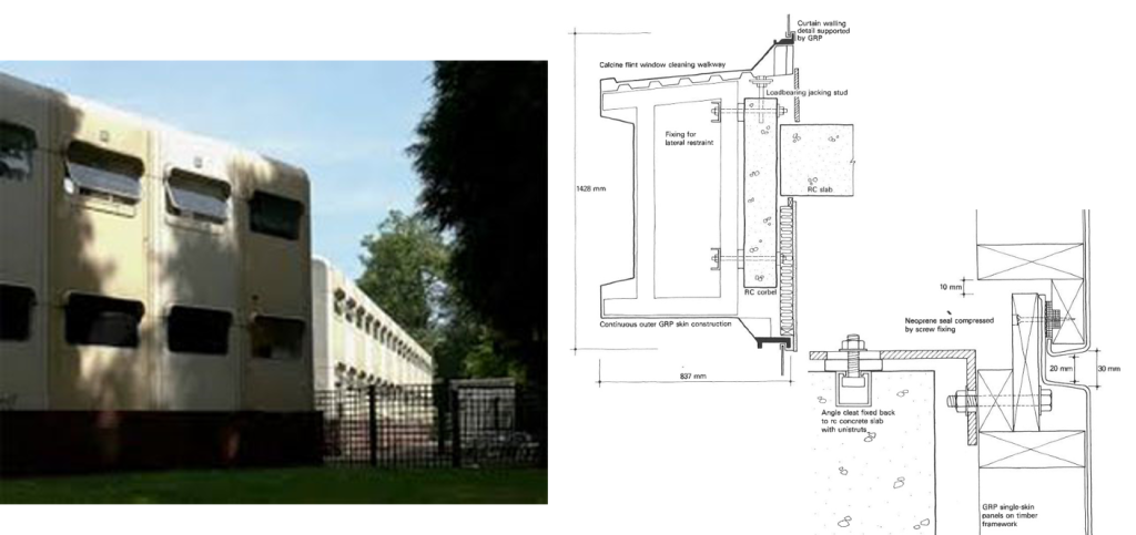
    Advances in science and material properties have always played a role in the development of building products. Postmodernism fueled the advent of several new building materials including Glass Reinforced Polyester (James Stirling, Olivetti Training Center, c.1972), Insulated Exterior Metal Panel Systems (Richard Meier, Bronx Development Center, c.1979), Dupont’s Fabric Tensile Structures (University of Florida Gainesville, O’Connell Center, c.1980), polycarbonate sheets (Kalwall, et.al.), pre-fabricated brick panel systems, and many other new construction technologies.

    richard-meier-bronx-development-center

    Richard Meier, Bronx Development Center, 1977


    Post Modern Building Materials and Life-Cycle
    Like any new technology or building material, the life span of postmodern materials is now known but there is a lack of case studies and journalistic papers describing the failure mechanisms, and more importantly, how to repair, retain, or preserve the exterior materials. On one level there is an inherent impermanence of the original materials based on a default decision making process that limited a building’s longevity to a twenty-five (25) year life-cycle. On another level, the façade of the Postmodern building incorporates building systems or individual components that are neither produced nor assembled currently in similar manners due to improvements in technology and building envelope science. In either case, the process and method of building envelope repair could dramatically or minimally impact the exterior character of Postmodern structures.
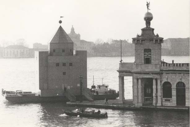
    aldo-rossi-theatro-delmondo-venice

    Aldo Rossi, Theatro Delmondo, Venice 1982


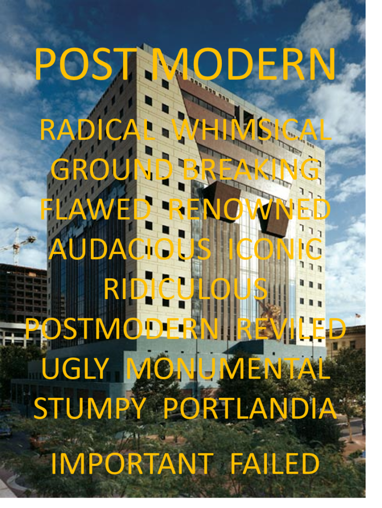
    There are some Postmodern structures, despite the polarizing opinions regarding the aesthetic values, that are iconographic examples of the high-end of Postmodern style. Included with those structures named above, are the Portland Building (Michael Graves, c. 1984), Piazza d’Italia (Charles Moore, 1982), and Theatro Delmondo, (Aldo Rossi, Venice 1982) to name a few. Rossi’s Theatro Delmondo poses an even more challenging theoretical debate as to whether or not to preserve or repair the structure since the theater was built as a floating temporary stage set.

    Rehabilitation and Postmodern materials
    The rehabilitation of Postmodern materials is compounded by the lack of physical or chemical stability in the original product (e.g. color fading or material breakdown by UV light); changing urban context and surrounding development; inadequate original construction means and methods, and lack of precedence – Postmodern buildings are just now reaching the end of their design life-cycle. Proposals to improve envelope performance are challenged in finding products that will improve performance and retain the aesthetics of a Postmodern building. Given these challenges, is the proper repair, rehabilitation, or conservation of Postmodern structures to retain the appearance of insubstantial material installed incorrectly? Or should any new work, often entailing proposals for replacing the building facades, to discount the design appearance and fix the problems regardless of the impact.

    zgf-koin-center-materials

    ZGF, Koin Center, 1982


    Moving forward, there are precedents set by the early and current challenges associated with mid-century modern structures that can be followed. For example, circa 1960 glass curtain wall upgrades have created methods to retain the exterior appearance while upgrading the thermal efficiency of the system or conversely, left the existing original curtain wall in place and upgrade the mechanical system and distribution system as both more cost effective and more energy efficient over the life of the building. The solutions towards postmodern materials will similarly be led by research, initiative, and innovation. Engaging the manufactures in the dialogue is essential, particularly when replacing a failed product is critical to retaining the building design character.
    james-stirling-olivetti-training-center-materials

    James Stirling, Olivetti Training Center, 1972


    Unique Challenges
    There are unique challenges with Postmodern buildings, but as is the case with all new materials and systems, developing a strategy of research, methodology, and documentation will result in extending the life-cycle of these provocative structures.
    pomo-text

    Portland Building

    Written by Peter Meijer, AIA, NCARB / Principal

    PMAPDX 2015 Year in Review

    HAPPY HOLIDAYS!!

    PMAPDX-Holiday-2015

    Wishing you a holiday season filled with cheer and delight from Peter Meijer Architect.

    As we look back over the past year and reflect on our completed, on-going, and upcoming projects, we’d like to take the opportunity to say we have truly enjoyed collaborating and communicating with you.

    2015 PROJECT HIGHLIGHTS
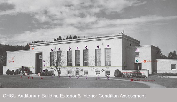
    OHSU-2015-PMAPDX


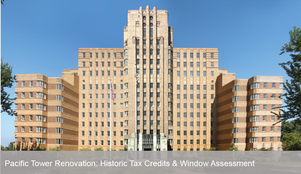
    Pacific-Tower-Rehabilitation-PMAPDX


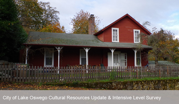
    City-of-LO-CRU-ILS-PMAPDX

    PMA HAPPENINGS
    Peter Meijer AIA, NCARB, was a Presenter at the RCI, Inc. 2015 Symposium on Building Envelope Technology. He presented on, When Field Performance of Masonry Does Not Correlate with Lab Test Results. PPS Grant High School was the case study presented.

    Kristen Minor, Preservation Planner, is the newest member of the City of Portland Historic Landmarks Commission.

    When Field Performance of Masonry Does Not Correlate with Lab Results

    First presented at RCI 2015 Symposium on Building Envelope Technology, Nashville, TN

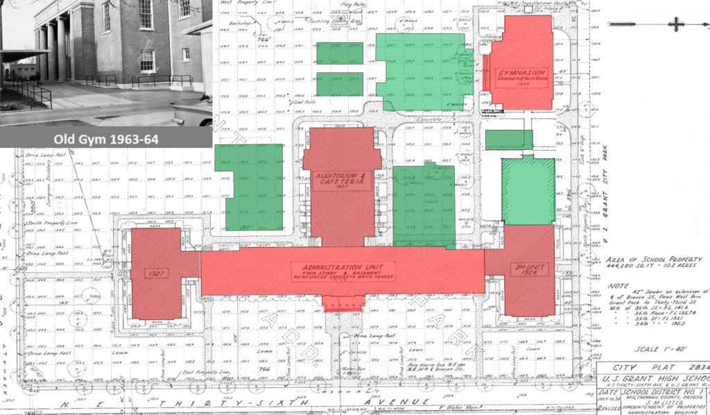
    grant-hs-alterations-over-time

    Background
    When it was completed, Grant High School was typical of the high schools constructed by Portland Public Schools in the pre-World War II era. In addition to being an extensible school, including educational buildings constructed between 1923 and 1970, the school was also reflective of fire-proof construction through its use of a reinforced concrete structure with brick in-fill. (Portland Public Schools, Historic Building Assessment, Entrix, October 2009)

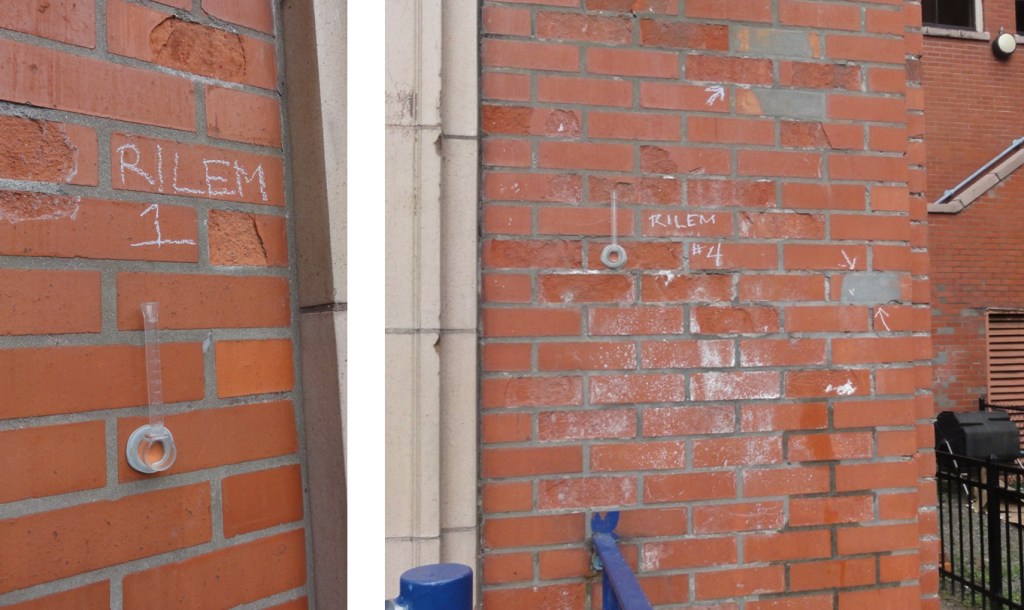
    Over the last fifteen years, Portland Public Schools (PPS) noted an accelerated degree of masonry face spalling on the original 1923 main building and 1923 Old Gym particularly when adjacent to concentrated sources of surface water. Other areas of spalling were not as obvious including protected wall surfaces. The masonry spalling was not occurring on later additions including the north wing (circa 1925), south wing (circa 1927), and auditorium building (circa 1927). Upon closer visual examination, it was observed that individual units were failing in isolated protected areas of the wall surface. Failures in such areas could not be accounted for under direct correlation of heavy water intrusion and typical failure mechanisms.

    The failure of the brick was potentially due to a number of separate or cumulative conditions including 1) excessive water uptake by the brick; 2) sub-fluorescence expansion of salts in the masonry, 3) freeze thaw; 4) low quality of the original 1923 brick; and 5) the application of surface sealers preventing water migrating to the exterior surface.

    grant-hs-multi-surface-deficiencies

    Field Investigation
    In order to determine if the damage to the masonry was deeper than the surface, several wall-lets, an invasive exterior wall opening, were performed confirming the assembly of a multi-wythe masonry wall constructed in a typical fully bedded bond course with interlocking headers and no cavities between the first three brick courses. Hooked shaped, 3/32” gage, steel wire masonry ties in alternating courses and approximately twelve inches (12”) on center ties were found to be in good condition with no deterioration. The absence of corrosion on the in place brick wire ties indicated that little moisture was present inside the multi-wythe wall.

    As a result of the hypothesis and field observations, it was prudent to conduct a series of lab tests to the brick, mortar, and patch materials to assist in the determination of 1) the quality of the brick; 2) the physical composition of the brick; 3) the quantity of naturally occurring compounds in the masonry and mortar, particularly salts in the masonry; and 4) the quality of the mortar. The findings would help narrow the potential cause of the spalling and lead to a more focused repair and maintenance process. Bricks were removed for testing of Initial Rate of Absorption (IRA – a test for susceptibility to water saturation) freeze thaw testing, and petrographic analysis, a way to determine the inherent properties of the clay and manufacturing process. Both pointing and bedding mortar samples, as well as, the previous patching material were removed and also tested. To rule out damage caused by maintenance procedures, faces of the brick material were sent to determine if sealants were used on the brick and, if present, determine the sealant chemical makeup. The presence of a surface coating may lead to retention of water within the brick and thus prevent natural capillary flow, natural drying, and water evaporation.

    grant-hs-field-testing

    Testing & Results
    Samples sent to the lab for coating assessment were analyzed via episcopic light microscopy, and Fourier- Transform Infrared Spectroscopy (FTIR) per ASTM D1245 and ASTM E1252. The results found no hydrocarbon or organic formulations used on the surface of the brick refuting the hypothesis of a surface sealer.

    Following modified ASTM standards, a 24-hr immersion and 5-hr boil absorption test on the brick were performed. The brick have a very low percent of total absorption at 9.5% for the 5-hr boil and 7.5% for the 24-hr test. The maximum saturation coefficient is 0.79 which is 0.01 over the maximum requirements for Severe Weathering bricks recommended for Portland climate (ASTM C216-07a Table 1). The Initial Rate of Absorption (IRA) is 5.7g/min/30in2 which equates to a very low suction brick or brick with low initial rates of absorption. The freeze thaw durability tests resulted in passing performance. All of these tests refuted the hypothesis that freezing temperatures were the cause of masonry spalling.

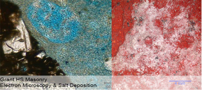
    A brick material analysis was performed in general conformance with ASTM C856, ASTM C1324 (masonry mortar) and included petrographic analysis, chemical analyses, x-ray diffraction and thermogravimetric analysis. Samples were analyzed under a polarized light microscope for information such as materials ratio and presence or absence of different deterioration mechanisms. These tests were used to assess the overall quality of material, presence of inherent salts, excessive retempering, cracking, ettringite formation, and potential alkali‐silica reactivity.

    grant-hs-electron-microscopy-salt-deposition

    The Petrographic Characterization resulted in the most unusual findings and the most relevant results related to the observed failures. The polarized light microscope indicated carbonate based salt crystals seeping into the masonry from the mortar. No sulfate based salts, typically associated with the clays used for making brick, were present. Furthermore the inherent properties of the brick showed very small rounded voids and interconnected planer voids. Planner voids result from poor compaction during the raw clay extrusion process prior to firing.

    Performance of brick in the field is a result of both material properties and resistance to micro-climates within the brick’s capillary void structure which cannot be repeated in the lab. Studies have shown a connection between small voids in the material property and susceptibility to longer water retention near the surface. With natural absorption properties, the brick is taking in a small quantity of water in very small pores. 24-hour immersion results are very low (7.5%). Publication of more in-depth studies correlates maximum saturation values for brick with low 24-hour immersion values. The effect of low immersion values and small quantities of absorbed water may increase the susceptibility in brick with small pore structure to freeze thaw failure.

    The presence of salt migration out of the mortar and into the brick, plus small pore structure and low immersion values, combining with a cleavage plane resulting from manufacturing are contributing to the Grant High School brick spalls. Brick with smaller pores are less capable of absorbing the expansive forces of freezing water and drying salts. Interlaced pores creating linear plains parallel with the face of the brick create stress failure points resulting in surface spalling. Since the characteristics of the brick resulted from the firing and manufacturing process, the brick will remain susceptible to the failure mechanisms.

    Conclusion
    Field observations of masonry failures generally correspond with known failure mechanisms. However, it is not unusual that further analysis is necessary to confirm in-field performance and that typical laboratory test results are in conflict with in-situ performance.

    The best corrective action is to minimize the amount of surface water and proper mortar joints and mortar composition. Additional spalls are likely to occur in the future due to the accumulation of expansive forces over a long period of time. Replacement of the spalled bricks is recommended over further patching. Leaving spalled brick in place will continue to worsen the condition over time and affect adjacent brick.

    grant-hs-present-day


    Written by Peter Meijer, AIA, NCARB, Principal