Tag Archives: design

Five Questions with PMA Intern Madison Irwin

PMA’s internship program provides students and recent graduates the opportunity to gain hands-on experience working in the dynamic fields of architecture and historic preservation. Our firm is dedicated to reinvesting into our existing built environment, with a focus on building material science and historic preservation. Since March 2021, Madison Irwin has been an intern with PMA. Her internship has focused on the intersection of net-zero research, approaches to sustainability, and historic preservation. Madison holds a Masters of Architecture from the University of Kansas and is currently completing her Masters of Science, Historic Preservation from the University of Oregon.

PMA intern Madison Irwin

Describe the focus of your internship at PMA. What aspects of your internship opportunity have you enjoyed most?
I enjoyed researching materials and how they relate to new and existing buildings. I learned how old materials could be used in new ways and vice versa. How we should apply an old material in a new space brings up a lot of discussion about preservation theory and my philosophy. At PMA, I was able to learn more about this tension between old and new, and how people view them differently. Tricia, Preservation Planner, and Peter, Principal-in-Charge, made these conversations interesting. They placed these conversations within the context of Portland, Oregon.

Working with Hali, Associate, and Halla, Associate-Principal, provided more of an architectural experience, especially in the realm of sustainability. The most exciting thing I researched was embodied carbon. It places the importance of using old spaces, especially if there is no reason not to use these existing spaces. It was inspirational and helped me narrow down a thesis topic for school.

Has your internship changed your perspective on historic preservation, or working with existing resources?
Yes, most definitely! It has made me more motivated to use existing places and even existing materials. There will always be a layer of history and meaning to materials, regardless of people’s care. It’s sad but true. Knowing this, I feel inspired to try and save as much as possible.

While working at PMA, I was able to work with architects and preservationists who care, very deeply, for these places that have layers of history and meaning, and there is an extra layer of sustainability and affordability that PMA advocates for. If a building means nothing to one person, the amount of carbon that was saved from being emitted or the low construction cost might be more meaningful to that person. Preservation in architecture is a way of retaining as much history as possible while making sure the resource is reused in an impactful way for the community it continues to serve.

There is more than one way to save a building and there is more than one reason to save it. It gave me a sense of opportunity.

How has your internship experience influenced your studies as you return to school to complete your thesis?
My time at PMA impacted my writing skills and how I will ultimately approach my thesis. My writing has always been something I’ve struggled with, and while I had to work through a lot of writing revisions, I also learned that it’s a forever struggle. I will always be working to improve my writing.

My thesis will look at the overlap of preservation, sustainability, and affordability, with embodied carbon being the ultimate argument to save old places. This evolved from research that I conducted at PMA.

Do you have a favorite aspect about architecture or historic preservation?
I especially love the tension between old buildings and new buildings. To see a house built in 1912 next to an ADU built in 2018 is a much more complex story. I find it more compelling than a neighborhood where everything is perfect like it was frozen in time. A layered history is more accurate to how people live their lives. Our own homes are made up of hand-me-downs from parents, grandparents; as well as the latest technologies, fashions, and books.

It sounds eclectic, it might be messy, and some people might be upset to see this new 2018 ADU in the backyard of a historic home. Some people might say, tear down the historic home! I think it comes from our society thinking that there’s no way for the two to live together. The mentality of purity is so dangerous and erases the unique, the different, the excluded.

Exploring this concept has helped me better understand how communities develop and reflect the whole history of an individual lot or a whole neighborhood. Resistance or encouragement to the ebbs and flows of developments also helps to understand the people who live in that community.

As a Kansas City native, we have to ask, what is your favorite style of BBQ?
I am unfortunately a vegetarian at the moment so I don’t get to eat my favorite, which is baby back ribs (with lots of sauce and pickles). But the grillers in KC are coming up with fun substitutes for us veggies. My favorite is a pulled jackfruit sandwich. It tastes like its own thing but is also a great replacement if you ever crave a pulled pork sandwich, with a lot of sauce, of course!

A Practical Guide to Preservation Terminology

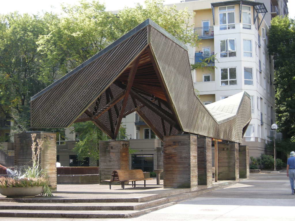
Lovejoy Pavillion 001

There are some instances when the English language enjoys sparking debate, confusion, and often apathy, look no further than the “10 items or less” vs. “10 items or fewer” conversation around the grocery check-out aisle. In the preservation field, we have our own niche conversation – the difference between the terms: preservation, rehabilitation, restoration, and reconstruction. Like with grocery store grammar, these four preservation terms hold undoubtedly different definitions and should be used correctly, but even when used incorrectly, we all still understand what you mean.

Let’s take a second a clarify what these four words do mean. As a preservationist, I turn to the source for these terms, the United States Department of the Interior.

Preservation is defined as the act or process of applying measures necessary to sustain the existing form, integrity, and materials of an historic property. Preservation, keeping a building at a particular moment in time.

Rehabilitation is defined as the act or process of making possible a compatible use for a property through repair, alterations, and additions while preserving those portions or features which convey its historical, cultural, or architectural values.

Restoration is defined as the act or process of accurately depicting the form, features, and character of a property as it appeared at a particular period of time by means of the removal of features from other periods in its history and reconstruction of missing features from the restoration period. Restoration, pin points a time in the building’s history and is accurate to only that time.

Reconstruction is defined as the act or process of depicting, by means of new construction, the form, features, and detailing of a non-surviving site, landscape, building, structure, or object for the purpose of replicating its appearance at a specific period of time and in its historic location. Reconstruction, recreates missing parts of a property through interpretation with plenty of research to back-up the choices.
Mercy Corps North Facade (Viewing Southeast)
PRACTICAL APPLICATION
I’ve found that the most common error is using preservation or restoration when the person almost always means rehabilitation. For me, much of my work focuses on rehabilitation, especially when a project seeks funding through local, state, or federal incentives like Historic Tax Credits. Aside from the definitions above, the most defining difference between preservation, restoration, and rehabilitation comes down to creative license.

When it comes to creativity and executing an artistic or architectural vision, rehabilitation is essentially synonymous with adaptive-reuse or repositioning. Rehabilitation, retains character but acknowledges a need for alterations in order to keep the property in use. When a building that was historically a school but is converted into a hotel or an office building becomes apartments, that’s rehabilitation. Even improving an existing use can be a rehabilitation project.

In the end, I like to associate each of these terms with what they will mean for their respective scope of work on a project. As mentioned, rehabilitation means a creative process that balances the historic character with modern needs. Preservation is essentially thoughtful maintenance so that the existing resource does not get wholly improved, but also is prevented from falling apart. Restoration and reconstruction are the most technically and scientifically involved requiring sufficient historic research and materials knowledge to justify the choices of retaining or rebuilding a resource. Unfortunately I don’t know of any mnemonic devise or other short cut to help clarify these four words, but hopefully a better understanding of their meaning will lead to fewer instances of their misuse.


Written by Tricia Forsi, Preservation Planner

Mentoring with Your Street, Your Voice (YSYV)

When it comes to after-school programs, Your Street, Your Voice (YSYV) is a trailblazer for Oregon “high school students of targeted identities to learn about careers in the built environment, and use design as a tool for social and environmental justice”. [1] The program asks students to consider how they might redesign their neighborhoods through the lens of equity and inclusion activism, and uses the context of a design studio as a catalyst for conversations. YSYV not only empowers students by connecting them directly with design professionals from a variety of backgrounds, it pays them for their participation as a testament to the value of their voice in shaping the built environment.

PPS-Madison-HS-PMAPDX-Lecture

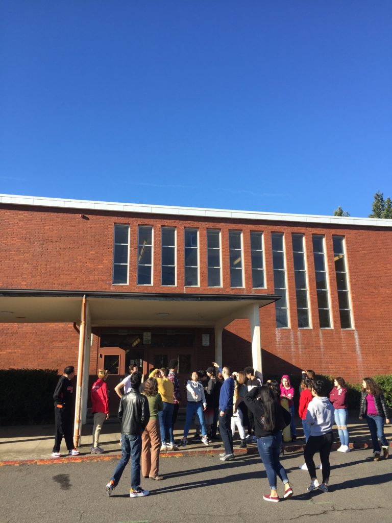
PMA preservation at PPS Madison High School, 2019.


MENTOR EXPERIENCE
Participating in YSYV as a mentor was important to me because, as an architectural designer, my goal is to provide long-term solutions to challenges for clients and the communities they serve. Providing solutions is increasingly difficult when we as designers do not have the personal lived experience(s) of the persons we are designing for. Empathy for the end user is integral to successful design. Mentoring with YSYV provided me an opportunity to see design challenges from different perspectives. As I grow in my career, I want to encourage a more diverse incoming generation of designers in any way that I can, and I want them to know that I have just as much to learn from them as they do from me.

As I worked with students to develop their projects and listened at their final presentations, I was so impressed with the scope of their consideration for current issues. For instance, some students who chose to redevelop a park accounted for the safety and security of protestors who might use that space to gather. It was inspiring to see how individuals lived experiences were reflected in their projects, and how they chose to address issues that directly affect them. Many of the proposals were also realistic and attainable for the communities they targeted, an extremely important facet of making design accessible to everyone. Many students carried out this work despite technology-related hinderances that were out of their control. For instance, poor internet connections prevented several students from turning on their video during Zoom sessions, which directly impacted their ability to share and develop their projects with their peers and mentors. Despite the obstacles created and exacerbated by the pandemic, and subsequently remote learning, the students were able to create an extremely supportive, safe, and open virtual environment in which to share their opinions and ideas. It gives me incredible hope and anticipation for the near future of the AEC industry.

HOW TO SUPPORT YOUR STREET, YOUR VOICE
If you are interested in supporting Your Street, Your Voice and other associated programs, visit their website to sign up as a mentor or make a donation. I plan to participate in future sessions, and I am beyond excited to see where this experience takes these young, talented designers. If nothing else, I hope I can be a resource to students who are considering and have questions about the fields of architecture and historic preservation.

1. About. (n.d.). Retrieved December 24, 2020, from https://www.yourstreetyourvoice.com/about

Written by Skyla Leavitt, architectural designer.

Mid-Century School Design and Its Role in the Pursuit of Education

Schools come in all shapes and sizes. They are one-story and two-story. Schools serve young children, teenagers, and adults alike, and they are designed in all manner of style. In most instances, schools appear to be historic because of these architectural features. However, there is another yard stick with which to measure school building’s role in architectural history. As with all things, time changes our understanding and perspective, and educational theory is no different. Each school building reflects modern thought and beliefs of the era.

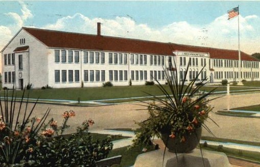
When imagining a school that is two-stories, designed in a classical, Spanish, or other revival style with a central corridor flanked by classrooms, it is likely to be a school from the Progressive era of education. The Progressive Era spans from the end of the nineteenth century to World War II. During this period, there was a shift from informal education to an organized system structed by putting age groups into grade levels and creating a curriculum based on intellectual rigor and mental discipline.
progressive-era-school-design-oregon-pmapdx
EARLY TWENTIETH CENTURY SCHOOL DESIGN
By the early twentieth century, school buildings were becoming more specialized and standardized as educators pushed for more control of school design. Plan books and design guides for educational buildings were introduced. There was a movement to make schools a healthier environment, improving ventilation and illumination. H-plan schools were introduced to bring more light and air into classrooms. Early twentieth-century school buildings typically featured traditional architectural styles, monumental designs, symmetrical facades, oversized entrances, and rectangular plans. Designed as civic monuments, the architectural focus was on building a school that would be a source of community pride. [1]

However, despite various applied stylistic details on the exteriors, the interiors were generally the same. The classroom was the basic building block for the school building, stacked vertically and horizontally to form a school. Classrooms were identical and all featured fixed desks facing the teacher at the front of the room with windows along one wall providing a single-direction light source. The emphasis was on order and authority. [2]
mid-century-school-design-oregon-pmapdx
In 1918, the federal Office of Education published Cardinal Principles of Secondary Education. It established a list of seven key elements that education should encompass: command of basic skills, health, family values, vocation, civic education, worthy use of leisure time, and ethical character. Clearly influenced by Progressive ideals, the publication emphasized personal development rather than academic criteria. [3] It developed seven tenets of Progressive education: freedom to develop naturally; interest in the motive of all work; the teacher as a guide, rather than task-master; scientific study of pupil development; greater attention to conditions that affect a child’s physical development; co-operation between school and home to meet the needs of child-life; and the Progressive as a leader in educational movements. Progressive educational ideals were being widely implemented in schools by the 1930s. [4]

There was a considerable lack of new schools constructed between 1930 and 1945, due to a lack of funding during the Great Depression and lack of available building materials during World War II. Educators at the 1947 National Conference for the Improvement of Teaching recommended a ten-billion-dollar building program over the next decade to meet the classroom demand, estimating that “between 50 and 75 percent of all school buildings were obsolete and should be replaced immediately.” [5] At the time, general consensus among educators was that the lifespan of a school was 25 to 50 years after which new teaching methods and technology made it obsolete. Moreover, the population of the United States was increasing at a faster rate than schools could keep up with and soon overcrowded schools became commonplace. New schools were desperately needed, and like the previous Progressive era schools reflected education theory of the day, so too did mid-century schools.
mid-century-school-design-oregon-pmapdx
MID-CENTURY SCHOOL DESIGN AND PLANNING
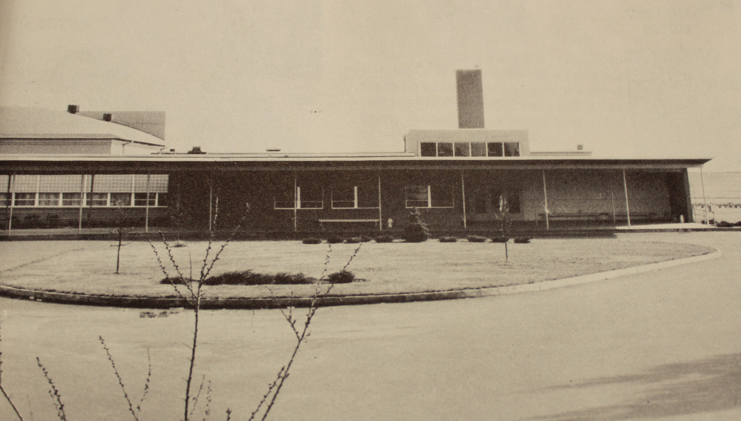
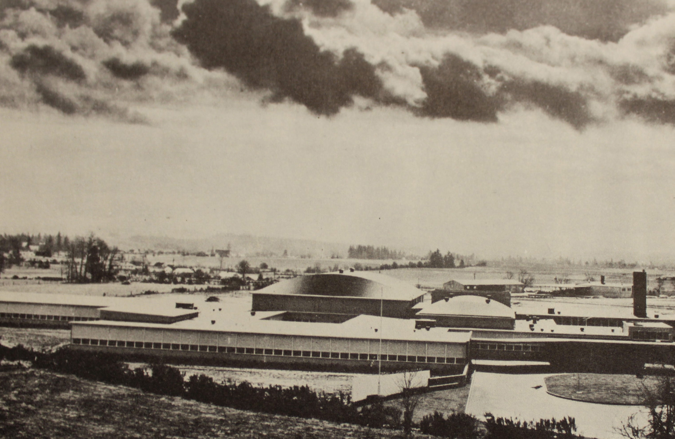
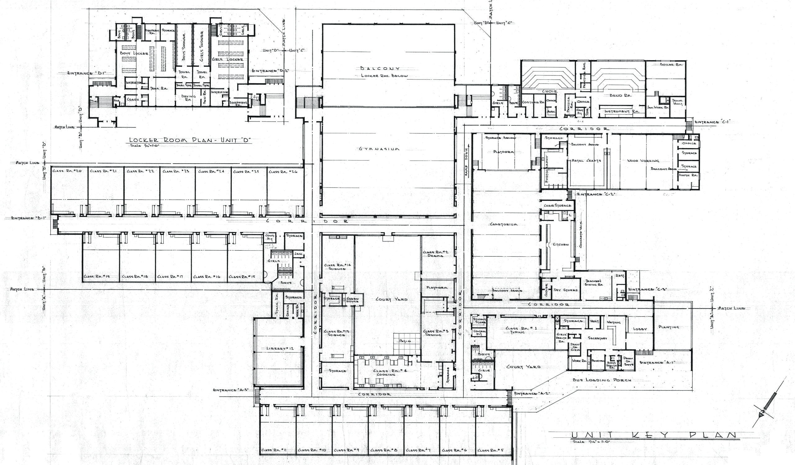
After World War II, schools stopped serving just the physical and educational needs of students but took interest in nurturing students’ emotional development. Schools of this era were typically long and low, one-story buildings designed in the International style with enormous windows, light-filled courtyards, and a decentralized floorplan.

According to mid-century educators, successful school planning required balancing three primary concerns: environment, education, and economy. The district needed to provide the best possible environment for students and teachers in order to facilitate learning while working within the limitations of the budget. [6] New schools had to meet both physical needs – sanitary, safe, quiet, well-lit – and emotional needs – pleasant, secure, inspiring, friendly, restful. In the Northwest, most schools reflected regional style by incorporating an interior courtyard. [7] During this period, the progressive theory of education was common. This theory was based on the concept that education should include the general welfare of students, not just their intellectual development, and that students should aspire to individuality not conformity. Teachers were encouraged to have a democratic classroom where they worked collaboratively with students rather than lecturing, and assignments were active and engaging rather than reading and watching. Additional topics were added to the curriculum that would better prepare students for the next phases in their lives, these topics included woodshop, home economics, and physical education. The general welfare of students was better minded and encompassed hot lunches, health services, and changes to disciplinary actions. [8]

The other hurdle for school districts was the rising cost of construction in the post-War era. For example, in 1930, $100,000 would buy a ten-room school, in 1940, it would buy an eight-room school and in 1950, it would buy a four-room school. [9] Fortunately for school district budgets, many communities wanted modern design schools rather than the neo-classical or art deco designs from previous decades, and these modern designs were less expensive to build. Mid-century schools and houses utilized new technologies, materials, and mass production methods to meet the demand for affordable and fast construction. [10] Classrooms also featured extensive built-ins that included sinks, slots for bulky roles of paper, and coat storage.
mid-century-school-design-oregon-pmapdx
TYPICAL MID-CENTURY DESIGN ELEMENTS
Mid-century schools and suburban housing shared many design elements, including: floorplans laid out to maximize space and flexibility; floorplans, fenestration, and landscaping designed to create connections between indoor and outdoor spaces; facades featuring large windows and ribbon windows; buildings designed to accommodate easy expansion later; decorative elements replaced with contrasting wall materials on the exterior; floorplans encouraged socializing; single-story designs with flay or low pitch roofs and deep eave overhangs; and buildings integrated into the landscape. Mid-century schools featured larger sites and a greater emphasis on landscaping and outdoor recreation. This resulted in more sprawling school designs. Instead of compactly containing all school facilities within a single rectangular block, facilities were clustered by function, such as separating quiet classrooms from noisy cafeterias. Plans were often irregular.

Schools are designed from the inside out and what is on the inside reflects education theory and beliefs of the day. The next time you admire a school’s architecture, be sure to notice more than its visual aesthetic, but its role in the pursuit of education.

Written by Tricia Forsi, Preservation Planner.


Sources
[1] Donovan, John J. School Architecture: Principles and Practices. New York: MacMillan Company, p. 24
[2] Weisser, Amy S. “’Little Red School House, What Now?’ Two Centuries of American Public School Architecture.” Journal of Planning History. Vol. 5, No. 3. August 2006, p. 200
[3] Graham, Patricia Albjerg. Schooling America: How the Public Schools Meet the Nation’s Changing Needs. New York: Oxford University Press, 2005, p. 76-77
[4] Weisser 2006, 203
[5] Benjamin Fine, “Broader Vocational System Is Advocated to Help Meet Modern Industrial Needs,” New York Times, April 11, 1948.
[6] William W. Caudill, Toward Better School Design, New York: F. W. Dodge Corporation, 1954,
[7] Entrix, Inc., Portland Public Schools Historic Building Assessment, October 2009, p. 3-18
[8] “Modern Design Transforms Schools.” New York Times. August 24, 1952; “Modern Schools Are Built to Fit Child Emotionally and Physically,” New York Times, December 23, 1956; New Schools of Thought: Modern Trend in Education Is Reflected in Buildings Themselves,” New York Times, December 16, 1952; Abigail Christman, National Register of Historic Places Nomination: Colorado’s Mid-Century Schools, 1945-1970,” May 1, 2017
[9] “New Schools, U.S. Is Building Some Fine Ones But Is Facing A Serious Shortage.” Time. October 16, 1950, p. 80
[10] Otaga, “Building for Learning in Postwar American Elementary Schools.” p. 563.

5 Questions with PMA’s Research & Sustainability Intern, Julia Kramer

pmapdx-intern-julia-kramer
This summer Julia Kramer had the opportunity to participate in a paid internship at PMA. It has been a delight to have Julia working with all levels of staff at PMA to assist with our sustainability initiatives for historic properties. In addition to working as an intern, Julia is a graduate teaching assistant at Portland State University. She is currently in her third and final year of completing her Master of Architecture Degree & Graduate Certificate in Urban Design at Portland State University. Julia is a member of the Society of Architectural Historians, the Architecture Lobby, Portland Chapter, and Women Also Know History.

Describe the focus of your internship at PMA. What aspects of your internship opportunity have you enjoyed most?
The focus of this internship is spread out into several initiatives PMA is making towards sustainability. I am working on collecting resources for an upcoming presentation, making connections in the local community for opportunities to recycle demolition waste, finding innovative processes to recycle or reuse of demolition waste, and looking at innovative strategies in creating and monitoring efficient building envelopes in historic buildings. Overall, the aspect of this internship I am enjoying the most is learning how historic preservation plays a crucial part in the design of sustainable buildings and cities, and all of the fascinating technologies that contribute to the actualization of those spaces.

Has your internship changed your perspective on historic preservation, or working with existing resources?
Absolutely! Throughout my architectural education, I have found myself consistently interested in architectural history. It wasn’t until recently that I understood what I am truly passionate about is Historic Preservation. I have found that my work as a creative person, an activist, and community member can be best expressed through working in Historic Preservation. This work allows me to use my knowledge and passion of architecture, art, and history, to actively support communities and cultures, seek sustainable solutions that work with the already built environment, and overall offers creative challenges that continually spark my curiosity.

How will your internship experience influence your studies when you return to school?
As a student in my third and final year at PSU I will begin my thesis project in the Fall and am considering a few topics, all related to historic preservation. Through this internship I have gained invaluable tools including new knowledge, resources, mentors and connections with real leaders in this field.

Do you have a favorite aspect about architecture or historic preservation?
My favorite aspect of architecture and historic preservation is that I have the privilege of doing work I truly believe in. As an architectural designer with a passion for historic preservation I seek to be a collaborative member in the design, redesign, and celebration of cities and their citizens. I believe to do so, it is important to recognize the memory and heritage of each space, and seek to preserve, teach, and tell the histories and narratives of those spaces.

Do you have any tips for working remotely for a new firm during these pandemic/quarantine times?
Working for a new firm during these pandemic/quarantine times has gone really well. I believe it has a lot to do with the small firm culture that exists at PMA. I have felt like a recognized member of the firm, am asked how I am and what I am up to every morning during our zoom meeting, and have been reached out to by all members of the firm at some point. Even taking our lunch breaks together over zoom sometimes. I think the effort put into those small aspects have made a great impact in creating a sense of firm community.

Architecture from the 1970s is officially historic!

The 1970s have turned 50. Whether you love the groovy lines, metallic finishes, whimsy super-graphics, or hate the monolithic and corporate concrete facades, architecture from 1970 is officially historic. One more time for those in disbelief that 1970s era architecture has reached its golden anniversary: 1970 architecture is historic! Get ready for the National Register of Historic Places to have some righteous listings.

The Portland metro-area is rich with architectural resources from the 1970s. The Standard Insurance Center (1970), Portland Plaza (1973), Foursquare Church (1976), Union Bank of California Tower (1972), and the Wells Fargo Center (1972) to name a few. Additionally, there are several residential examples from the 1970s, including Dahlke Manor.
Dahlke-Manor-pmapdx-rendering
DAHLKE MANOR
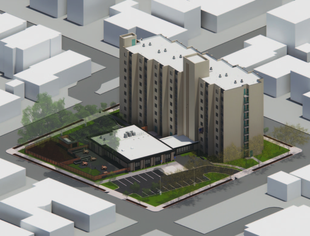
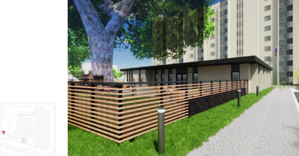
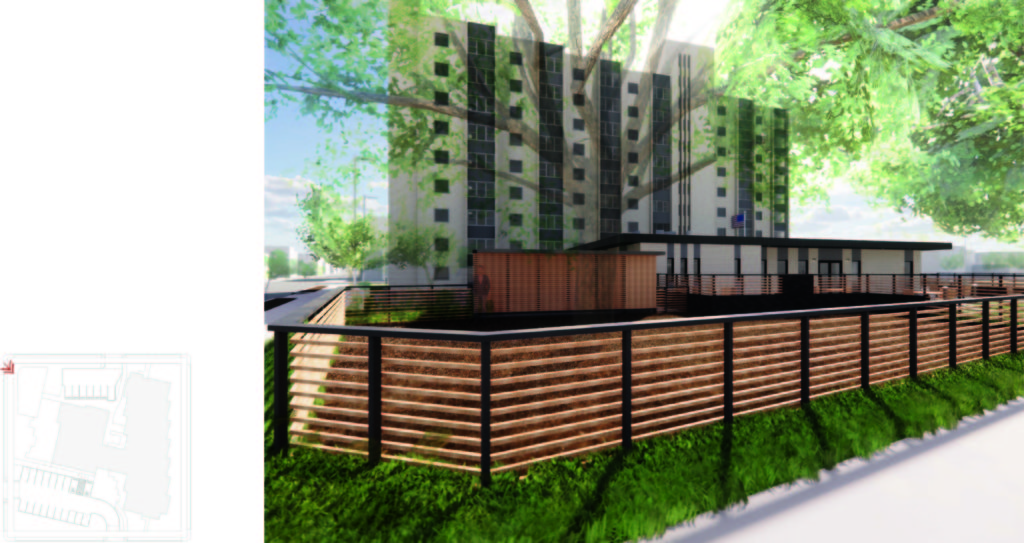
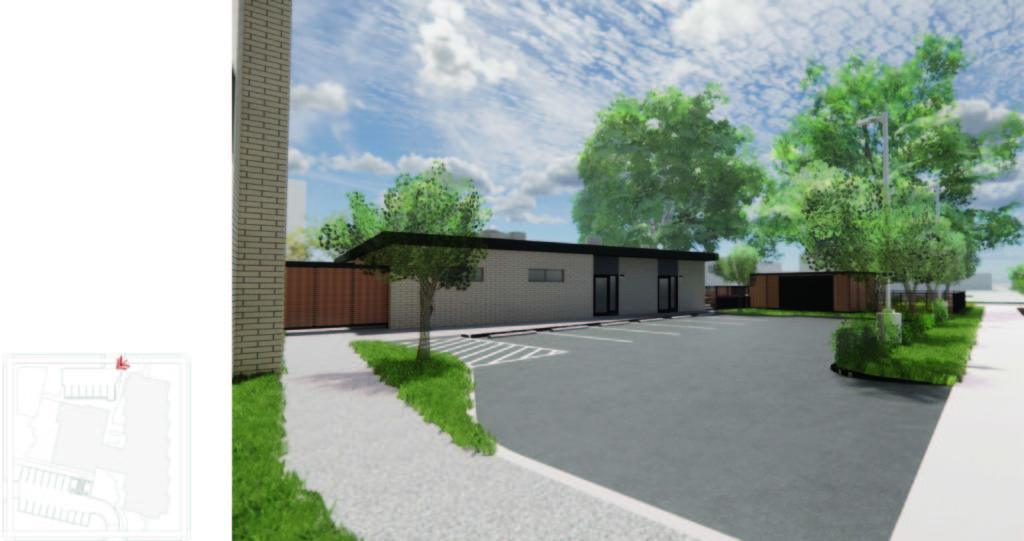
Dahlke Manor was constructed in 1971 and features a nine-story tower, housing 115 one-bedroom units, and a 1-story community space/maintenance room connected to the tower by an elongated lobby. Dahlke Manor is located in the Irvington Historic District and Albina Community Plan Area, and owned by Home Forward. The property is reserved for a community of seniors and persons with disabilities, and features a community room with kitchen, on-site laundry, and landscaped grounds. Presently, we are working with Walsh Construction on a comprehensive renovation to the property and site.

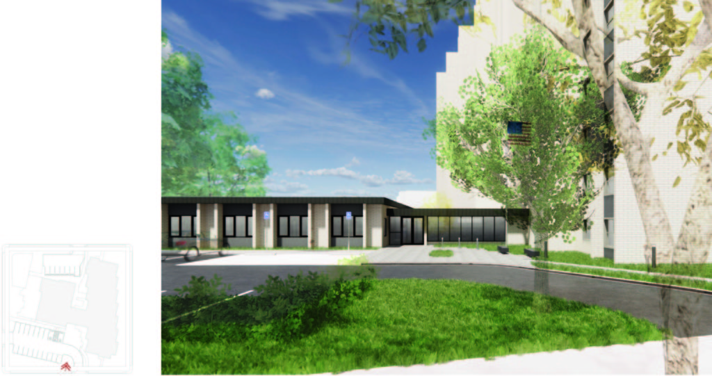
Proposed scope of work includes a variety of minor alterations to provide modern amenities to the residents of Dahlke Manor. In addition to interior renovations to the units and 1-story common area, exterior alterations include a small 725 square foot addition where the existing kitchen will be relocated to. The addition is proposed to be located to the north of the community space – and to the west of the maintenance room. The addition is slightly offset from the adjacent existing building facades to remain. The stepping serves both as a reference to the tower’s stepped footprint and to create a clean transition between existing and new materials. The addition will match the height of the adjacent community and maintenance rooms.

Project Manager Hali Knight, Assoc. AIA, and Halla Hoffer, AIA, Assoc. DBIA, sat down to discuss their design philosophy and the design process for the renovation of Dahlke Manor.

What are the steps in the design process for this project?
HK: The design process has been a collaboration with the client, Home Forward, Walsh Construction, and our subconsultants. During schematic design, the process was iterative, each week looking at several design options which were presented to address the client’s needs. The design was refined with the received feedback until a solution that met the design intent and the client/users’ needs was reached.

HH: The first step was to learn about the client and user needs. Following that we explored the existing building. Renovation projects are always unique challenges because each building has its own challenges and opportunities. Only after understanding what the clients/users need and what the building can provide is it possible to begin designing.
Dahlke-Manor-pmapdx-rendering
What are the challenges for this project?
HK: In retrofitting existing buildings, there are challenges updating program needs with in an existing structure. A challenge for Dahlke was meeting the zoning requirements for within a historic neighborhood. Like typical 1970s developments, the site plan has a low sprawling building and large tower plopped in the in middle of the site and surrounded with parking. Addressing the historic language of the neighborhood while providing required site pedestrian access, parking, stormwater management, and utility needs proposed unique design challenges.

HH: As with many projects, cost can be a challenge. With this project we are working with Home Forward and Walsh to maximize the impact of the project budget to provide continued and improved services and amenities to residents.
Dahlke-Manor-pmapdx-rendering
What is your approach for solving these project challenges?
HK: The design team has approached these challenges by proposing site upgrades that benefit both the residents and neighborhood. Currently, the site is dominated by vehicle circulation without designed outdoor space for the residents to enjoy. Our team has designed an outdoor community spaces for the residents that helps softens the site and provides a place for residents to enjoy their neighborhood. Additionally, the design brings the project up to current code compliance for many zoning regulations including landscape screening and bike parking.

HH: We often review scope with Home Forward and Walsh to determine how best to spend the project budget. We continuously discuss which elements will have the biggest impact on improving the space and usability. The collaboration feasible in a Design-Build projects allows us to hone into the most impactful scope items and prioritize those.
Dahlke-Manor-pmapdx-rendering
What do you see as important issues and/or considerations for this project?
HK: This is an affordable housing project and many of the residents are elderly or have mobility challenges. A large aspect of this project was to provide accessible units and community spaces that enhance the livability for residents. The site elements have also been designed to speak to the historic district with new site fencing that bends with new landscape, revised site lighting, and unifying addition on the ground floor.

HH: The building was constructed in the 1970’s and is quite utilitarian in style. The interior walls are constructed out of exposed CMU and structural brick. One of the challenges we have faced is how to update the interior finishes to provide spaces that are more welcoming without losing the character of the building.
Dahlke-Manor-pmapdx-rendering
What is your design philosophy?
HK: I believe as architects we have a responsibility to design our built environment in ways that provide elegant solutions for the safety, health, and wellbeing of the inhabitants. This includes designs that are accessible to all users, that speak to environmental and cultural stewardship, and that create places that enrich day to day activities.

HH: I get excited about opportunities to explore how we can update our existing buildings. Each new project is a unique challenge – that can help guide the design process. I think it is important that we find ways to ensure existing buildings remain functional for modern uses.

Research Internship Opportunity

pmapdx-research-Internship blog 2_2020From historic to existing built infrastructure, our goal is to strengthen and enhance properties and sites that already exist. We bring together people who share our vision of delivering projects that contribute to and enhance our built environments. We are looking for individuals that share in our joy of working with owners, agencies, and other consultants, in meeting the challenges of re-investing in properties to create long-term success.
POSITION OVERVIEW
Peter Meijer Architect, PC (PMA) is looking for a part-time intern. Qualified candidates will be currently pursuing a graduate degree in either architecture or historic preservation and have experience with architecture, design, intensive research and formal writing. Ideally candidates will have enthusiasm for the proposed tasks and an interest in publishing their findings at the end of their internship.

JOB DUTIES
Develop a research schedule
Complete comprehensive topical research
Synthesize research arguments with supporting evidence
Draft reports and graphic data representations
Present findings to the PMA team at regular intervals

EXPERIENCE
Comfortable working with both qualitative and quantitative data analysis
Ability to write formally and concisely on a variety of topics
Familiar with contemporary research strategies, sources, and standards
Proficient in Microsoft Word; Microsoft Excel; Adobe InDesign; Adobe Illustrator; Adobe Photoshop

TIME & COMPENSATION
~20 hours/week
Flexible schedule (choose which weekdays you want to work)
Fixed amount of hours (part-time)
Hourly Rate: $18/hour for first three months;Initial term: June/July – August/September 2022; Subsequent term: Remaining calendar year

TO APPLY
Please submit a cover letter, resume, and relevant writing samples to info@pmapdx.com
Zip files are not accepted, please keep submissions to 10MB or less.

In-Situ R-Value of Old Buildings

pmapdx-building-exterior
Architects are becoming ever more aware of their impact on the environment. The building sector is estimated to be responsible for 36% of worldwide energy use, and is responsible for 39% of energy-related carbon dioxide emissions.(1) Carbon emissions, embodied carbon, & life cycle assessments are now being studied like never before, and are becoming part of the architect’s daily lexicon. One side of this coin is research into building envelopes, insulation, and thermal resistance of building materials.

While contemporary building materials are produced under standardized, industrial manufacturing processes, and therefore have known thermal profiles; historic buildings are rather unique, with materials of unknown and inhomogeneous thermal characteristics. This presents architects and energy modelers with some uncertainty when making decisions related to insulating historic envelopes. With contradicting claims amongst professionals – some say historic exterior walls are energy hogs, while others purport many historic envelopes performing at or better than previously believed – the question that remains is, how well are historic envelopes resisting lateral heat flow?
In-Situ R-Value Blog
R=I/λ OF OLD BUILDINGS
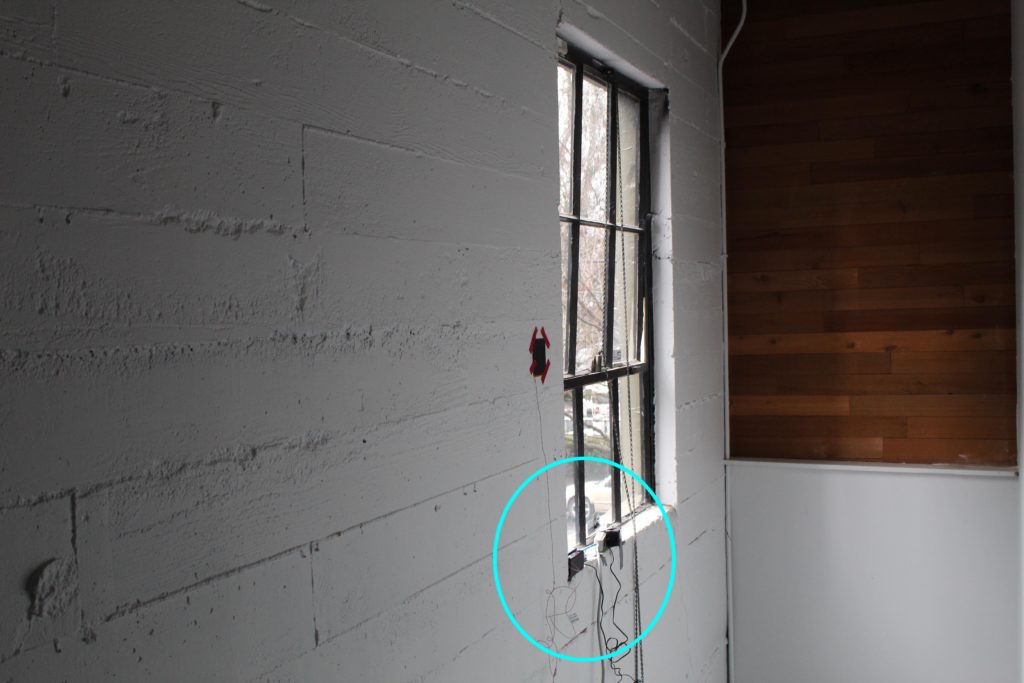
As part of ongoing research, PMA is taking it upon themselves to study and better understand this phenomenon. The set-up in the image above is a Fluxteq R-value Measurement Kit. It is capable of measuring the r-value of building envelopes in-situ. A thermocouple and surface temperature sensor are affixed to the interior face of the historic concrete envelope, and one surface temperature sensor is mounted to the exterior of the envelope, directly opposite the interior sensor. Our testing will conduct both spot R-value measurements and long duration tests, so we can get an understand how the R-value fluctuates throughout the day and in response to external climate conditions.

This research is supported by PMA’s new initiative towards net zero historic buildings and sustainability.

For inquiries related to this research please contact: danc@pmapdx.com


1. https://www.worldgbc.org/sites/default/files/UNEP%20188_GABC_en%20%28web%29.pdf
Written by Daniel Castele, Designer and Conservator.

We are Hiring!

we-are-hiringAt Peter Meijer Architect, PC (PMA), we integrate Design, Science, and Preservation. Founded in 2003, PMA provides our clients with professional architectural design, building envelope science, and preservation planning services throughout the Pacific Northwest with a core focus on existing and historic buildings.
WE’RE LOOKING FOR THE RIGHT FIT:
Our growing firm is seeking a creative, agile, authentic and collaborative architect designer to join our team. We are a firm of passionate, energetic and highly motivated individuals. We love our clients and their work! We’re a tight knit team and are looking for a candidate who shares our firm values: integrity, leadership, balance, and stewardship.

FIRM CULTURE:
Ours is an open and collaborative culture that values – and really does encourage – ideas from all corners of the office. If you desire leadership opportunities, we are open to hearing about it.

POSITION OVERVIEW:
We are searching for an aspiring Architect with a focus on technical nature of the work.

Ideally this person would be on the way to licensure and understand complex materials and detailing, contract documentation, sustainable building knowledge, and would develop strong liaisons with team members. The successful candidate will be proficient with Revit and AutoCAD software, and show strengths in developing their skills.

OTHER JOB DUTIES INCLUDE:
Ability to prioritize, manage and work on multiple projects and deadlines.

We rely on flexible, passionate and multi-talented personnel with a positive attitude and engaging personality. Candidates with great communication skills and a broad experience base are highly desired.

The ideal candidate must have a post-architectural degree, industry experience, highly motivated, have an interest in being involved in all areas of the architectural profession.

PERSONAL/PROFESSIONAL ATTRIBUTES:
Always seeking opportunities to preserve the world around them
Excellent judgment, initiates problem-solving with ease & optimism
Is highly self-motivated, completion oriented &resourceful

PROFESSIONAL EXPERIENCE:
Proficiency in Revit, Adobe, and MS Office
Experience with industry standards building rating systems

EMPLOYEE BENEFITS:
Competitive pay
Health insurance
Dental insurance
12 weeks paid paternal/maternal leave
401k plan
Paid personal time off (PTO)
Transportation incentive
Continuing education assistance
Professional development opportunities
Flexible work schedules to ensure a healthy work-life balance

TO APPLY:
Please submit a cover letter, resume, and relevant portfolio examples addressing what makes you the perfect candidate. No zip flies, and please limit items to 10MB.
Email materials to: info@pmapdx.com

We are an equal opportunity employer and welcome diversity in the workplace.

Part II: Tropical Modernism in a Multicultural Context at the Docomomo US National Symposium

In PART I we discussed the University of Hawaii at Manoa campus (especially the stunning Jefferson Hall), presentations on traditional architecture to mid-century modernism and Asian influences on the built environment in Hawaii, and the Residences of Wimberly and Cook. For Part II we are hopping back into the Aloha Spirit by discussing the regal Hawaii State Capitol Building, presentations on historic preservation and how Hawaii was influential and integral to international tropical resort design.
hawaii-state-capitol-bldg
HAWAII STATE CAPITOL BUILDING
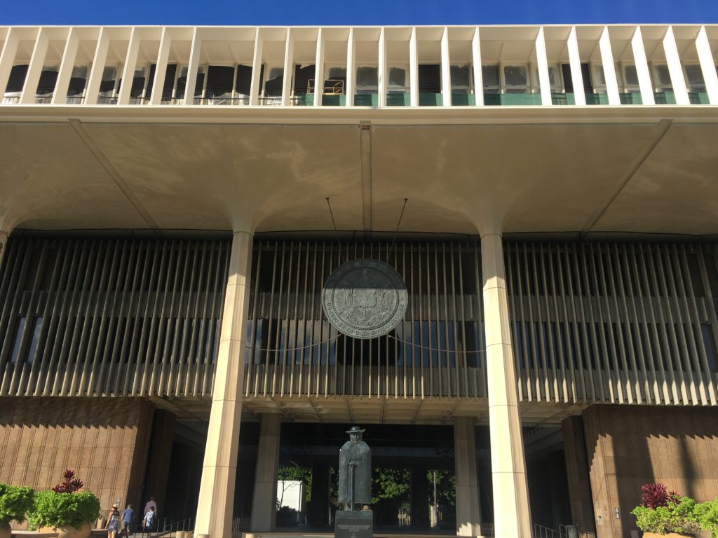
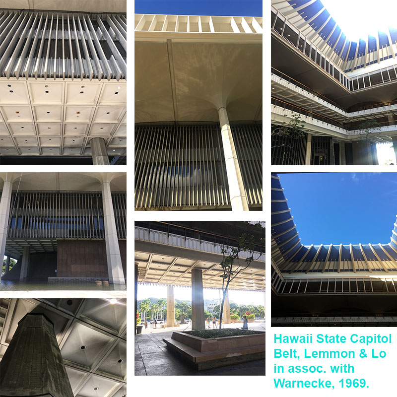
I have only been to about ten state capitols across the U.S., but the Hawaii State Capitol building is unlike any I have experience. It is a truly welcoming structure, which is something unique among monumental civic structures (looking at you Boston City Hall). The Hawaii State Capitol was designed by Belt, Lemmon & Lo in association with John Carl Warnecke. While design of the building began in 1961, construction didn’t break ground until 1965, and the building was formerly dedicated on March 15, 1969. The Hawaii State Capitol celebrated its 50th anniversary in 2019.

An excerpt from Democracy by Design. The Planning and Development of the Hawaii State Capitol, with text by Don J. Hibbard states it best:

“Monumentally presiding over an eight acre site mostly carpeted by lawn, the Capitol is surrounded by a pool of water, evoking Hawaii’s island situation. The truncated cones of the legislative chambers, clad in cast stone made of crushed lava rock, rise from the reflecting pool, reminiscent of the volcanic origins of the islands. Also rising from the water are forty columns, bereft of capitals, instead flaring out of their crown like coconut palms. Standing almost sixty feet in height, the columns form a peristyle and support the extra-large fourth story, which cantilevers out beyond the columns. Serving as a cornice, the fourth story is distinguished by its open work frieze of pre-cast fins set in groups of eight, recalling the eight major islands of Hawaii. Placed free of the windows, the fins serve as decorative elements as well as sun screens. The recessed second and third floors are suspended from the fourth story, which also serves as the roof of the capital, with the governor and lieutenant governor’s offices in penthouses on top of the roof. Rising above the penthouses, the blue crown of the central rotunda echoes a volcanic crater, a graceful interpretation of the traditional statehouse dome.” (1)

hawaii-state-capitol-building-details
PARADISE PARADIGMS
DeSoto Brown
Kiersten Faulkner

These two presentations were an interesting pair. DeSoto Brown presented in a style reminiscent of informational videos produced in the 1950’s and 1960’s that were designed to encourage travel to the islands of Hawaii by showing the Aloha Spirit and all Hawaii has to offer. All the photos presented were from the archives. It wasn’t until after his presentation that he mentioned a majority of the structures pictured have since been demolished or severely altered. Remember, Hawaii was aggressively built up only since post-World War II!
downtown-honolulu
This made for a great transition into Kiersten Faulkner’s presentation on the threats and challenges of preservation and tropical modernist design – how to preserve architecture from so recent in the past. Turns out the issues (for the most part) mainland preservationist have are the same Hawaii preservationists experience. Similar to Oregon and elsewhere, that 50 year historic threshold causes a lot of havoc at times. What happens when a resource is 46 years of age in integral to our built heritage, but threatened with demolition because, sorry it’s not 5-0 historic! Kiersten also described how there is anger and hurt around some mid-century resources (mainly spiritual structures) because they replaced older structures on the same site. Interestingly enough, Hawaii doesn’t have a leg-up on mainland solutions for the intersection of preservation, sustainability, and climate change. I was a bit surprised when I asked a colleague that worked in the preservation community in Hawaii if they did anything specific to mitigating resources going directly to the landfill from demolition since they were on an island. The full answer was “No.”

DESIGNING PARADISE
Don J. Hibbard
Ron Lindgren

Designing Paradise focused on resort design in post-war Hawaii, specifically how it influenced tropical resort design throughout the world. The design and development of the Mauna Kea Resort and Ed Killingsworth Hawaii resort designs: Halekulani, Kapalua Bay Hotel, Mauna Lani Resort, Ihilani Hotel, and renovation of the Kahala Hilton Hotel were discussed. Don and Ron explained how the distinctive and elegant approaches to resort design seen at Mauna Kea Resort and the others would ultimately set the standards for tropical resort design throughout Hawaii and the world.

The Ed Killingsworth designs discussed were divine. The attention to detail Killingsworth incorporated into his creations was phenomenal to see and learn about. Those concrete spider legs that became a staple of his residential, commercial and resort designs are stunning architectural geometries for the eyes. Killingsworth was a planner for the City and County of Honolulu pre and post-World War II. While his resorts were interesting to learn about, Ron Lindgren discussed at length his residential designs in California.
waikiki-beach-diamond-head
Killingsworth personal residence was breathtaking. If only every house was designed with the level of attention, detail, and space planning that brings the indoors out and vice versa that Killingsworth executed. What caught my attention was how Killingsworth designed the kitchen at his personal residence in California. He had floating wood lower cabinets, which looked more like beautiful pieces of furniture than storage for kitchen-wares. Also, he did not use a backsplash – genius! Behind the floating cabinets with the kitchen sink, a full ceiling-to-floor window was used, including underneath the floating cabinets. This played a trick on the eye, with the abundance of natural light flooding from above and below the cabinets the space looked larger and lighter. Also, why are we SO obsessed with back-splashes and kitchen islands? His designs make the case for neither. His interpretations of lanai living was on full display in his California residence.

The Mauna Kea Resort. Laurance Rockefeller was the developer that brought the world to Kauna’oa beach, and ushered in a new era of tourism to Hawaii. The Mauna Kea Resort opened in the summer of 1965, and was designed by SOM in the most sophisticated mid-century style. Concrete has never looked as elegant as it disappears into the surrounding natural landscapes. It was the first resort along the coastline of Hawaii’s Big Island. Mauna Kea Resort also features a prominent art and artifacts collection. The contributions to the Big Island that Rockefeller enabled in the mid-century are still thriving today.
IBM-building-honolulu
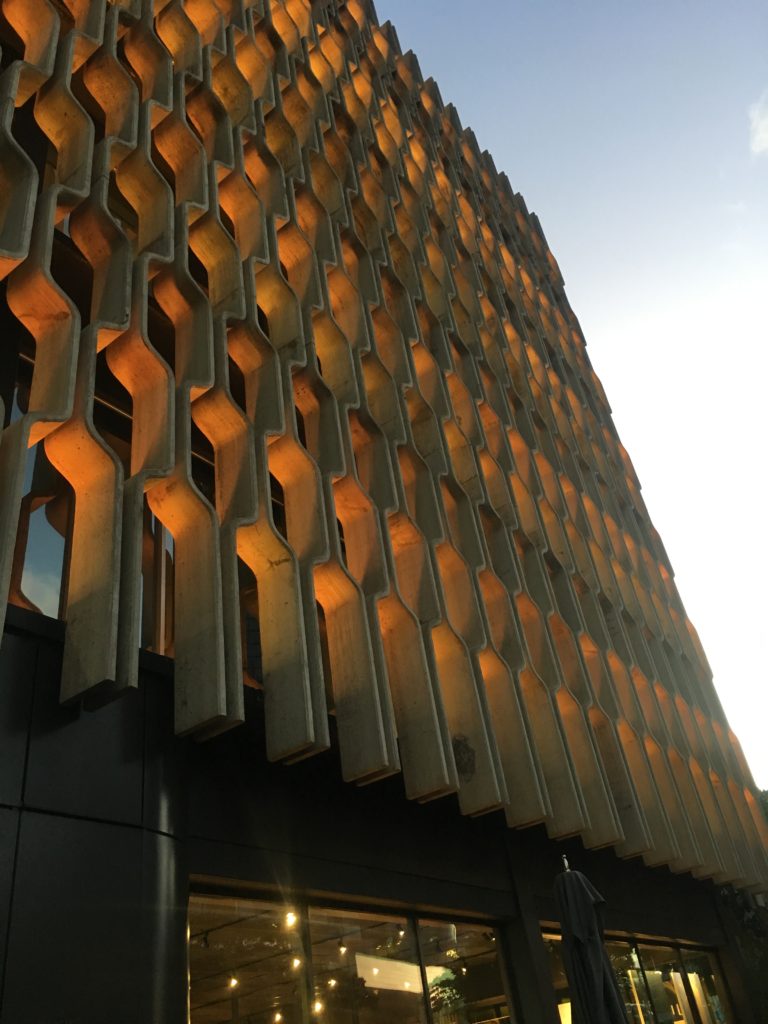
Tropical Modernism in a Multicultural Context at the Docomomo US National Symposium was a delight to experience. The closing reception was at the Ossipoff designed IBM building (1962). Talk about an iconic Honolulu mid-century building. The exterior façade grille is retro yet timeless architectural elegance. And, it was fitting to have the opening and closing receptions at two distinct mid-century buildings in Honolulu designed by one of the most prolific architect’s in Hawaii.

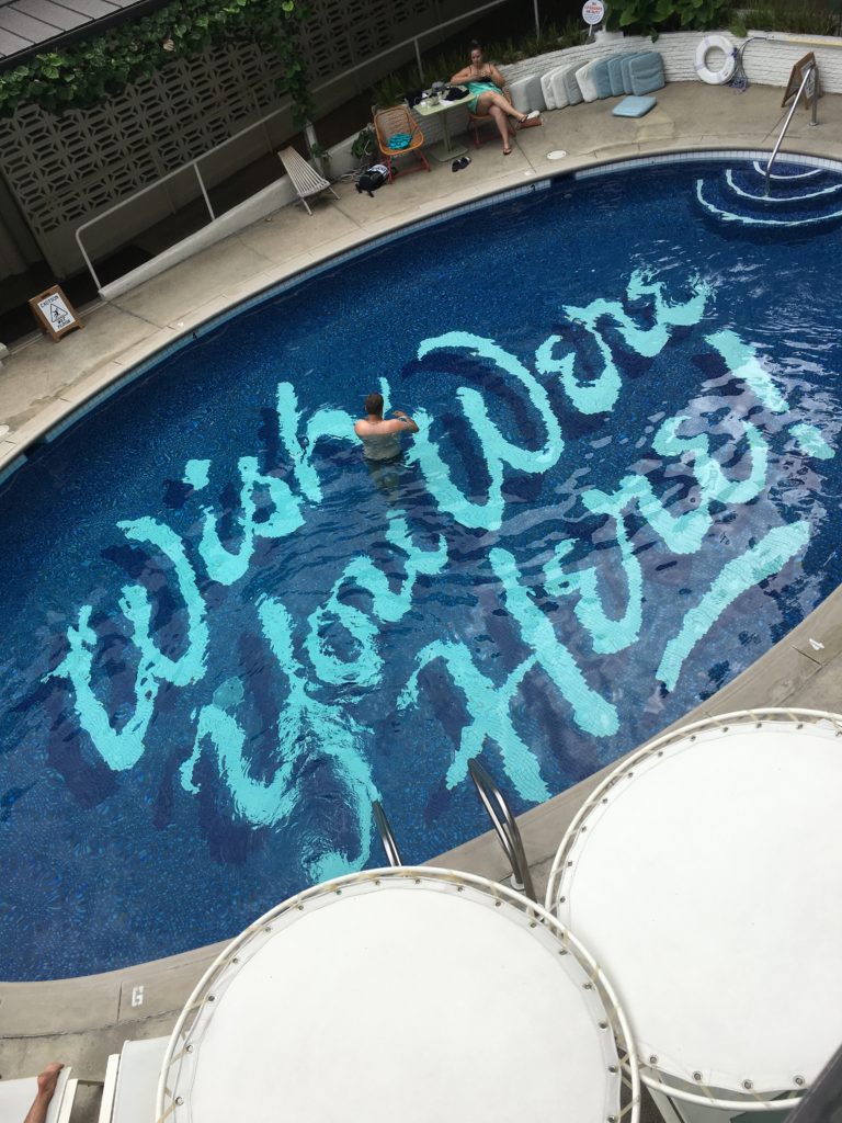
I wouldn’t be able to end this two part blog without mentioning the hotel that hosted several social events, part of the symposium programming: the Surfjack. From the beautiful lanai, delicious restaurant with fantastic mai tai’s, to the quaint yet stylish rooms, the POOL, and welcoming staff. The Surfjack felt like a home away from home in the heart of downtown Waikiki.

For designers, architects, planners, preservationists, and those generally interested in mid-century design, Docomomo US National Symposium is a MUST on your list of mid-century focused events.
surf-jack-hotel

Written by Kate Kearney, Associate.

1. The Hawaii State Foundation on Culture and the Arts in accordance with the recommendation of The Task Force to Plan and Coordinate the Celebration of the Fiftieth Anniversary of the Hawaii State Capitol. Democracy by Design. The Planning and Development of the Hawaii State Capitol, by Don. J. Hibbard. Honolulu, 2019.