Tag Archives: renovation

Project Update: Fountain Place Apartments

Progress photos from our Fountain Place Apartments project for Home Forward

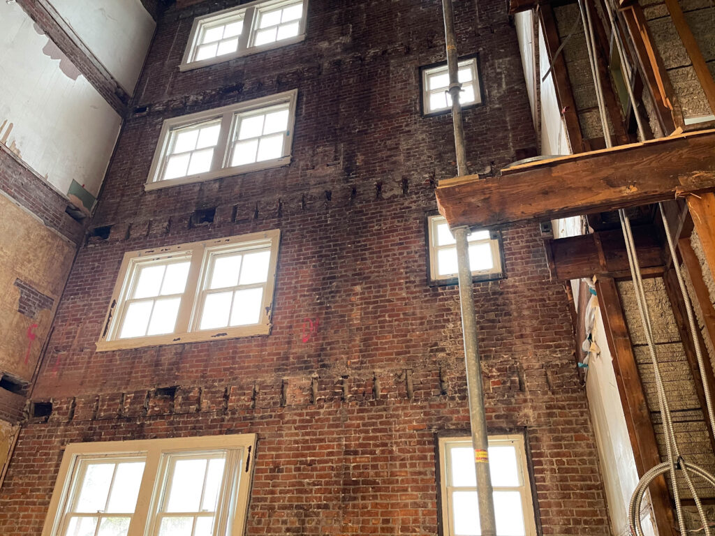
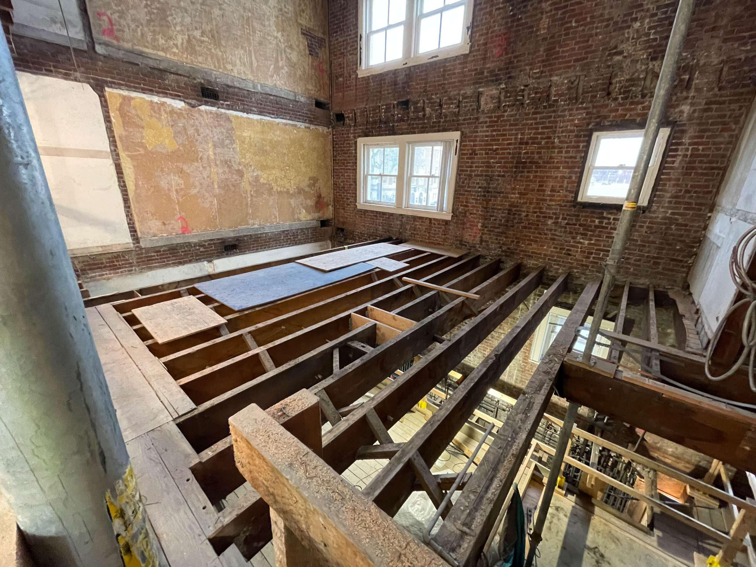
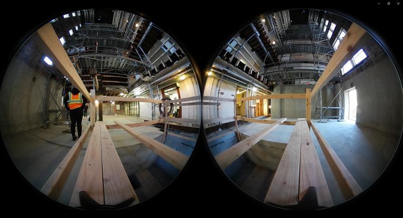
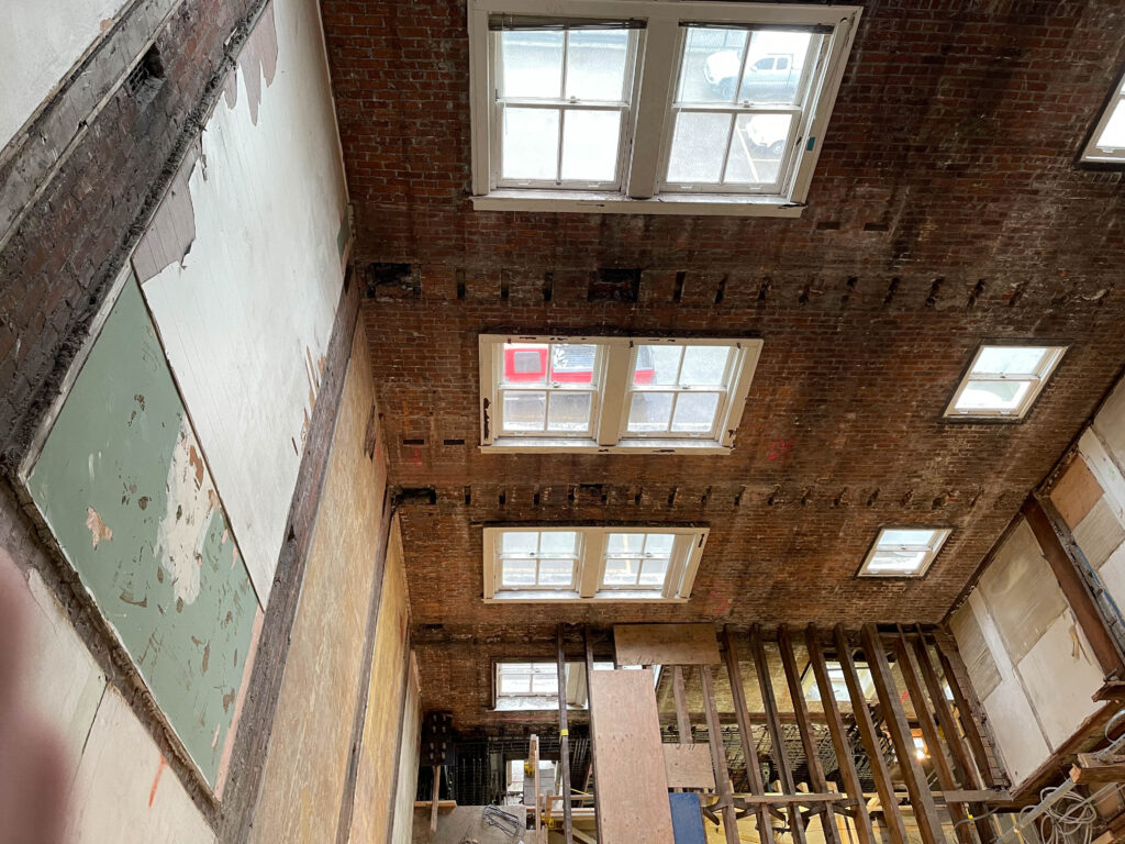
Part of extending the operational life of this existing and historic building is a seismic upgrade. Pictured is the opening up of the floor structure on Levels 1 through 5 to facilitate the installation of a new central egress stair and elevator, which will support accessibility to all levels of the building and provide additional means of egress. Two of the six proposed braced frames will be installed adjacent to this elevator and stair. The braced frames are supported by piles at the foundation and will be tied to a new plywood diaphragm at each floor and the roof which will provide most of the seismic stability required for the building, affording structural safety to future occupants and ensuring the life-cycle of this historic building is extended for another 50+ years.
fountain-place-apts-home-forward-renovation

fountain-place-apts-home-forward-renovation
SECRETARY OF THE INTERIOR STANDARDS
The project is meeting the secretary of the interior’s standards for redevelopment, reviewed and approved by the Oregon State Historic Preservation Office and the National Park Service. Federal tax incentives were used, and as part of the process the building was listed on the National Register of Historic Places.
fountain-place-apt-home-forward-renovation
LEARN MORE ABOUT THIS HISTORIC AND SEISMIC UPGRADE PROJECT
To learn more about how our team is reviving a historic building by providing critical infrastructure for current residents and new arrivals, please visit: Fountain Place Apartments.

fountain-place-apts-seismic-bracing

Written by Kate Kearney, Associate, Marketing Manger

A Practical Guide to Preservation Terminology

Lovejoy Pavillion 001

There are some instances when the English language enjoys sparking debate, confusion, and often apathy, look no further than the “10 items or less” vs. “10 items or fewer” conversation around the grocery check-out aisle. In the preservation field, we have our own niche conversation – the difference between the terms: preservation, rehabilitation, restoration, and reconstruction. Like with grocery store grammar, these four preservation terms hold undoubtedly different definitions and should be used correctly, but even when used incorrectly, we all still understand what you mean.

Let’s take a second a clarify what these four words do mean. As a preservationist, I turn to the source for these terms, the United States Department of the Interior.

Preservation is defined as the act or process of applying measures necessary to sustain the existing form, integrity, and materials of an historic property. Preservation, keeping a building at a particular moment in time.

Rehabilitation is defined as the act or process of making possible a compatible use for a property through repair, alterations, and additions while preserving those portions or features which convey its historical, cultural, or architectural values.

Restoration is defined as the act or process of accurately depicting the form, features, and character of a property as it appeared at a particular period of time by means of the removal of features from other periods in its history and reconstruction of missing features from the restoration period. Restoration, pin points a time in the building’s history and is accurate to only that time.

Reconstruction is defined as the act or process of depicting, by means of new construction, the form, features, and detailing of a non-surviving site, landscape, building, structure, or object for the purpose of replicating its appearance at a specific period of time and in its historic location. Reconstruction, recreates missing parts of a property through interpretation with plenty of research to back-up the choices.
Mercy Corps North Facade (Viewing Southeast)
PRACTICAL APPLICATION
I’ve found that the most common error is using preservation or restoration when the person almost always means rehabilitation. For me, much of my work focuses on rehabilitation, especially when a project seeks funding through local, state, or federal incentives like Historic Tax Credits. Aside from the definitions above, the most defining difference between preservation, restoration, and rehabilitation comes down to creative license.

When it comes to creativity and executing an artistic or architectural vision, rehabilitation is essentially synonymous with adaptive-reuse or repositioning. Rehabilitation, retains character but acknowledges a need for alterations in order to keep the property in use. When a building that was historically a school but is converted into a hotel or an office building becomes apartments, that’s rehabilitation. Even improving an existing use can be a rehabilitation project.

In the end, I like to associate each of these terms with what they will mean for their respective scope of work on a project. As mentioned, rehabilitation means a creative process that balances the historic character with modern needs. Preservation is essentially thoughtful maintenance so that the existing resource does not get wholly improved, but also is prevented from falling apart. Restoration and reconstruction are the most technically and scientifically involved requiring sufficient historic research and materials knowledge to justify the choices of retaining or rebuilding a resource. Unfortunately I don’t know of any mnemonic devise or other short cut to help clarify these four words, but hopefully a better understanding of their meaning will lead to fewer instances of their misuse.


Written by Tricia Forsi, Preservation Planner

Architecture from the 1970s is officially historic!

The 1970s have turned 50. Whether you love the groovy lines, metallic finishes, whimsy super-graphics, or hate the monolithic and corporate concrete facades, architecture from 1970 is officially historic. One more time for those in disbelief that 1970s era architecture has reached its golden anniversary: 1970 architecture is historic! Get ready for the National Register of Historic Places to have some righteous listings.

The Portland metro-area is rich with architectural resources from the 1970s. The Standard Insurance Center (1970), Portland Plaza (1973), Foursquare Church (1976), Union Bank of California Tower (1972), and the Wells Fargo Center (1972) to name a few. Additionally, there are several residential examples from the 1970s, including Dahlke Manor.
Dahlke-Manor-pmapdx-rendering
DAHLKE MANOR
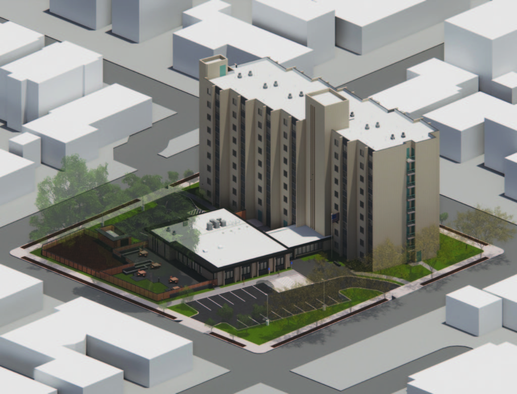
Dahlke Manor was constructed in 1971 and features a nine-story tower, housing 115 one-bedroom units, and a 1-story community space/maintenance room connected to the tower by an elongated lobby. Dahlke Manor is located in the Irvington Historic District and Albina Community Plan Area, and owned by Home Forward. The property is reserved for a community of seniors and persons with disabilities, and features a community room with kitchen, on-site laundry, and landscaped grounds. Presently, we are working with Walsh Construction on a comprehensive renovation to the property and site.

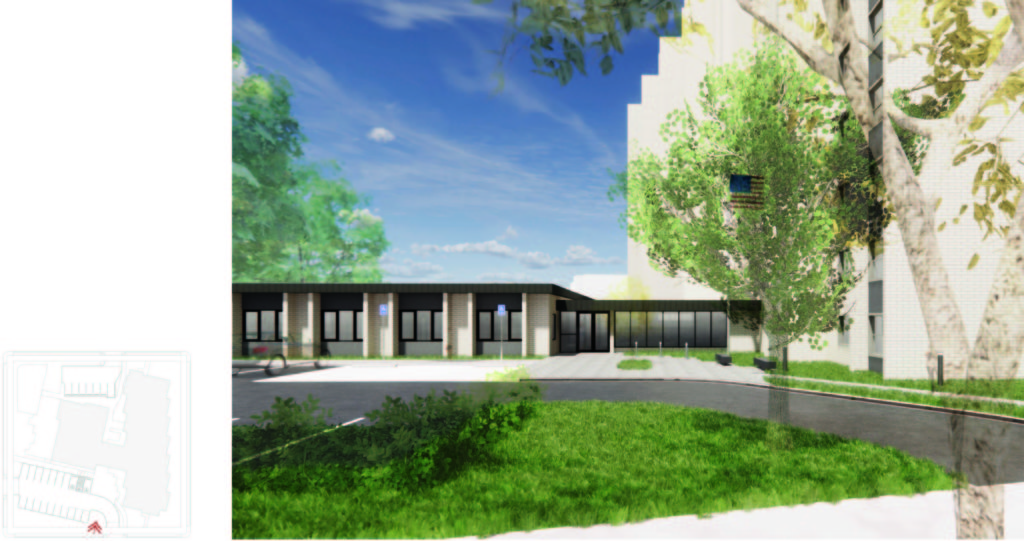
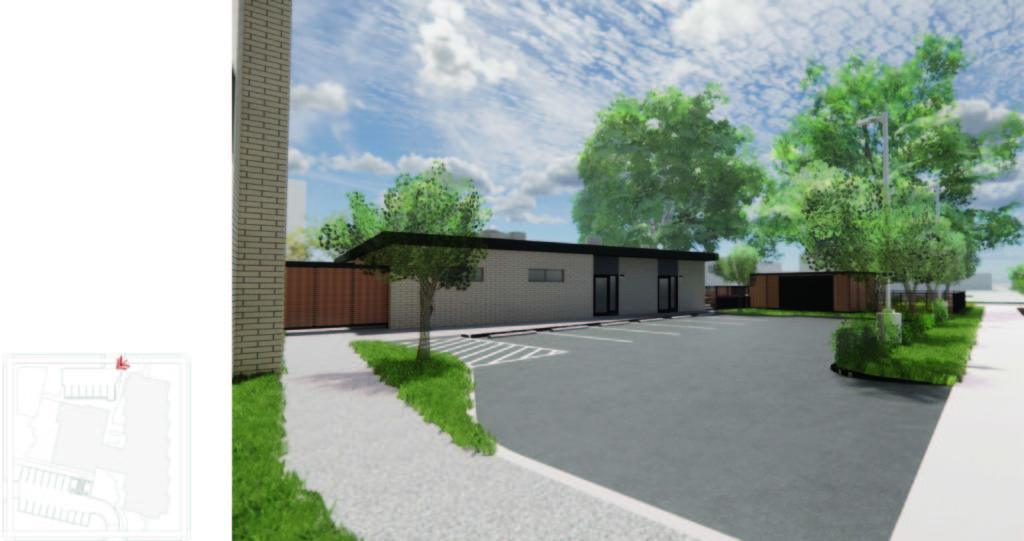
Proposed scope of work includes a variety of minor alterations to provide modern amenities to the residents of Dahlke Manor. In addition to interior renovations to the units and 1-story common area, exterior alterations include a small 725 square foot addition where the existing kitchen will be relocated to. The addition is proposed to be located to the north of the community space – and to the west of the maintenance room. The addition is slightly offset from the adjacent existing building facades to remain. The stepping serves both as a reference to the tower’s stepped footprint and to create a clean transition between existing and new materials. The addition will match the height of the adjacent community and maintenance rooms.

Project Manager Hali Knight, Assoc. AIA, and Halla Hoffer, AIA, Assoc. DBIA, sat down to discuss their design philosophy and the design process for the renovation of Dahlke Manor.

What are the steps in the design process for this project?
HK: The design process has been a collaboration with the client, Home Forward, Walsh Construction, and our subconsultants. During schematic design, the process was iterative, each week looking at several design options which were presented to address the client’s needs. The design was refined with the received feedback until a solution that met the design intent and the client/users’ needs was reached.

HH: The first step was to learn about the client and user needs. Following that we explored the existing building. Renovation projects are always unique challenges because each building has its own challenges and opportunities. Only after understanding what the clients/users need and what the building can provide is it possible to begin designing.
Dahlke-Manor-pmapdx-rendering
What are the challenges for this project?
HK: In retrofitting existing buildings, there are challenges updating program needs with in an existing structure. A challenge for Dahlke was meeting the zoning requirements for within a historic neighborhood. Like typical 1970s developments, the site plan has a low sprawling building and large tower plopped in the in middle of the site and surrounded with parking. Addressing the historic language of the neighborhood while providing required site pedestrian access, parking, stormwater management, and utility needs proposed unique design challenges.

HH: As with many projects, cost can be a challenge. With this project we are working with Home Forward and Walsh to maximize the impact of the project budget to provide continued and improved services and amenities to residents.
Dahlke-Manor-pmapdx-rendering
What is your approach for solving these project challenges?
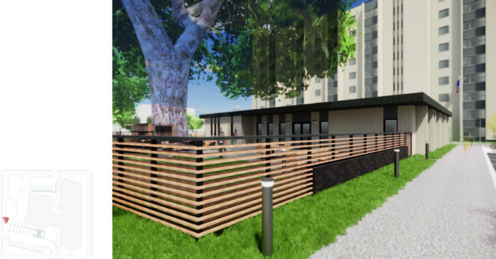
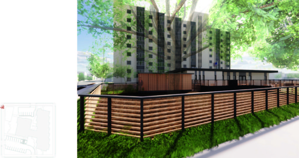
HK: The design team has approached these challenges by proposing site upgrades that benefit both the residents and neighborhood. Currently, the site is dominated by vehicle circulation without designed outdoor space for the residents to enjoy. Our team has designed an outdoor community spaces for the residents that helps softens the site and provides a place for residents to enjoy their neighborhood. Additionally, the design brings the project up to current code compliance for many zoning regulations including landscape screening and bike parking.

HH: We often review scope with Home Forward and Walsh to determine how best to spend the project budget. We continuously discuss which elements will have the biggest impact on improving the space and usability. The collaboration feasible in a Design-Build projects allows us to hone into the most impactful scope items and prioritize those.
Dahlke-Manor-pmapdx-rendering
What do you see as important issues and/or considerations for this project?
HK: This is an affordable housing project and many of the residents are elderly or have mobility challenges. A large aspect of this project was to provide accessible units and community spaces that enhance the livability for residents. The site elements have also been designed to speak to the historic district with new site fencing that bends with new landscape, revised site lighting, and unifying addition on the ground floor.

HH: The building was constructed in the 1970’s and is quite utilitarian in style. The interior walls are constructed out of exposed CMU and structural brick. One of the challenges we have faced is how to update the interior finishes to provide spaces that are more welcoming without losing the character of the building.
Dahlke-Manor-pmapdx-rendering
What is your design philosophy?
HK: I believe as architects we have a responsibility to design our built environment in ways that provide elegant solutions for the safety, health, and wellbeing of the inhabitants. This includes designs that are accessible to all users, that speak to environmental and cultural stewardship, and that create places that enrich day to day activities.

HH: I get excited about opportunities to explore how we can update our existing buildings. Each new project is a unique challenge – that can help guide the design process. I think it is important that we find ways to ensure existing buildings remain functional for modern uses.

History of Fountain Place Apartments, formerly Wheeldon Annex

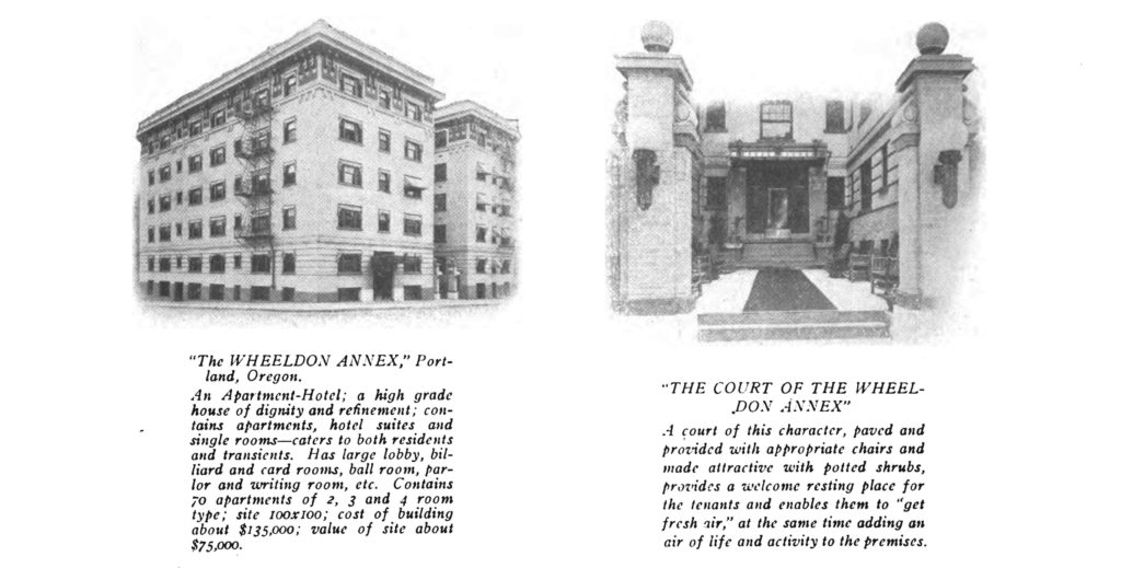
Back in April, we introduced an exciting on the boards project – Fountain Place Apartments Seismic Upgrade. Working with Lorentz Bruun Construction, we are delivering a design-build project to improve the life safety of Fountain Place Apartments, while retaining its historic character. Completed in 1914 and originally named Wheeldon Annex, Fountain Place is a five-story unreinforced brick apartment building located in downtown Portland, owned and operated by Home Forward. There are 74 total units, with studio, one-and two-bedroom homes. The unit mix is 5 at 40%, 5 at 50% and the rest restricted at 60% area median income (AMI). While the project is progressing on schedule, we will be discussing below the architectural significance of this historic resource as it relates to our built environment.
historic-1916-fountainplace-wheeldon-annex
OVERVIEW
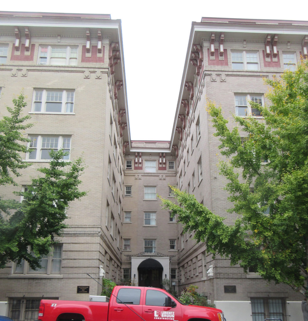
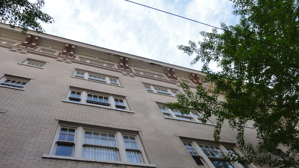
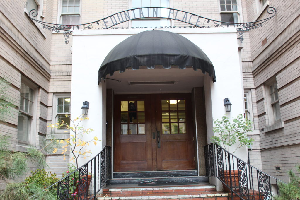
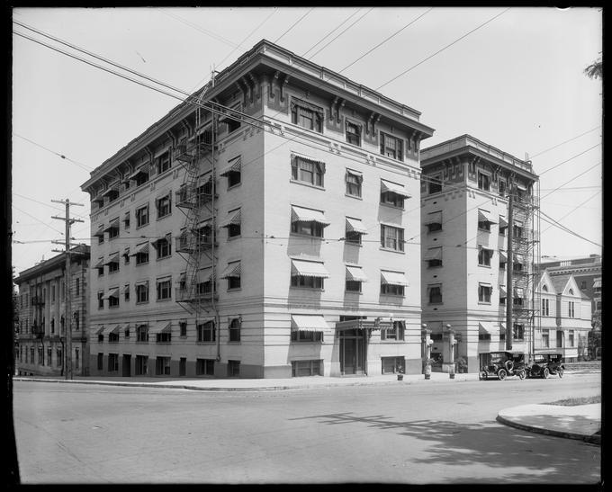
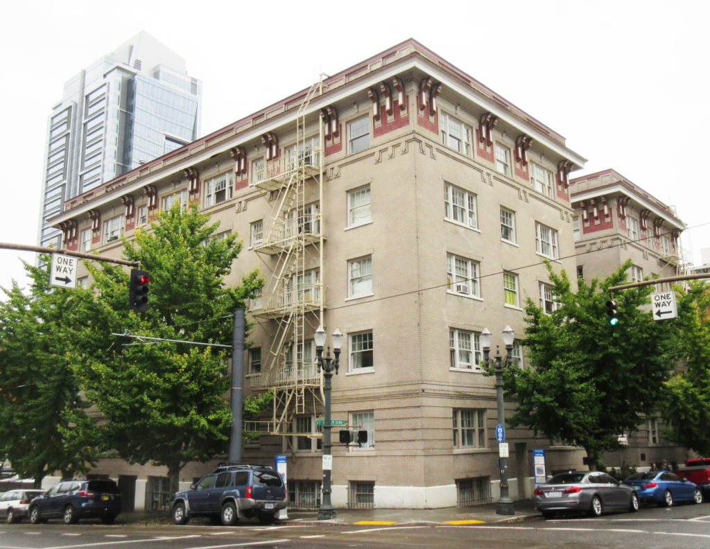
Constructed in two distinct phases in 1911, the Fountain Place Apartments were originally named the Wheeldon Annex. The building occupies a quarter-block lot in downtown Portland, Oregon, at the corner of SW Salmon Street and SW 10th Avenue. The Wheeldon Annex is one of the earliest surviving examples of a U-shaped residential apartment/hotel in downtown Portland. It is a 5-story brick structure with intact Italian Renaissance Revival features such as a decorative bracketed cornice, buff brick body with corbeled details and rusticated base, and an upper level treated as a paneled frieze. Character-defining wood double-hung multi-pane windows have been retained throughout and appear to be well maintained. Alterations to the exterior have been quite minimal.

The interior of the Wheeldon Annex has good integrity; although a number of units have been altered or divided, the general layout with U-shaped double-loaded corridors at every floor remains, and many units still contain at least some original features, materials, and layouts. These include primary rooms with original oak flooring and in some cases, the original built-in furniture with pull-out beds and fold-down desks; kitchens with wood cabinetry and trim; and bathrooms with claw foot tubs and built-in ventilation and cabinetry. While there are many units that have been divided, the alterations (primarily in the mid-1930s but continuing into the 1990s) have generally left original features in place.
detial-fountain-place-home-forward

The history of Wheeldon Annex is engrained in Portland’s and Oregon’s social history and practice of systemic racism. From Oregon’s statehood in 1859, the Black population were marginalized and segregated from the White population. Oregon’s State Constitution included Article 1, Section 35, “No free negro or mulatto not residing in this state at the time of the adoption of this constitution, shall come, reside or be within this state or hold any real estate, or make any contracts, or maintain any suit therein.” With the 14th and 15th Amendments, in 1868 and 1870, respectively, the Article should have been nullified, but the practices within restrictive covenants, discriminatory real estate sales, and racist zoning practices overwhelmingly prevented Black people in Oregon from accessing jobs, housing, and other vital resources.

In 1910, one year before Wheeldon Annex opened, the Black population in Oregon was 1,492 while the state’s total population was 672,765. In Portland, the Black population was 775 while the city had a total of 90,246 inhabitants. The legal and systemic provisions put in place by the White majority were working to the detriment of Black people in Oregon.

DESIGN OF WHEELDON ANNEX
When Ernest MacNaughton was commissioned to design an apartment building for Frank Warren, he would have been quite familiar with the large apartment blocks built for well-off tenants on the east coast. MacNaughton’s design for the 1911 Wheeldon Annex illustrates a residential apartment block form with front courtyard protected on three sides. This form created an outdoor area but with restricted access, a pragmatic response to the more urban condition in downtown Portland.

The Wheeldon Annex, with its front entry court, appears to be among the first buildings in Portland to use a residential apartment typology in the downtown setting. There are only two earlier examples of a U-shaped apartment-style building constructed closer to downtown than those listed above; one of these is now demolished: the 1910 Beaux-Arts style Rose-Friend Apartments at 1307 SW Broadway. The other comparable downtown example pre-dating the Wheeldon Annex is the 1908 Nortonia Hotel (now Mark Spencer Hotel) at 409 SW 11th Avenue. The 6.5-story building was designed by Josef Jacobberger and has, atypically for a hotel, individual rooms along the ground floor rather than storefront with more commercial or public uses. The building exhibits a U-shaped plan with a central front pedestrian entry court and has a restrained style, with some Tudor elements and some Italian Renaissance Revival decorative touches. It is worth mentioning that there was another much larger but well-known hotel that may have been inspirational in its massing and layout. The opulent full-block Portland Hotel, which opened in 1890 and was demolished in 1951, was a 6-story building with H-shaped plan including a large forecourt for carriage drop-off.
fountain-place-home-forward
SIGNIFICANCE
Designed by MacNaughton & Raymond for owner Frank M. Warren, the Wheeldon Annex is locally significant for its illustration of the newly acceptable, and even fashionable, shift towards high-end residential apartment living in downtown Portland. The building is one of the earliest downtown examples of a U-shaped residential apartment block form, which later proliferated across Portland, including in the downtown setting. It was completed in 1911, using a U-shaped layout first seen as early as 1907 in high-class apartments in the exclusive “Nob Hill” residential district to the west of downtown Portland. The Wheeldon Annex is associated with Portland’s exponential growth during the ten-year period starting with the Lewis and Clark Exposition. During this time, apartment buildings were introduced in Portland as a new type of construction and use targeted towards the wealthier class.

The Wheeldon Annex is also locally significant because it is a highly intact work of the well-regarded Portland architectural partnership of MacNaughton and Raymond. The building displays distinctive characteristics of the Italian Renaissance Revival style in its division into three parts; the rusticated base, middle, and decorative cornice. The Wheeldon Annex was conceived as a high-end venture; and its use of modern built-in, fold-away furniture, single bathrooms for every apartment, dumbwaiters, and tenant services gave the building a highly respectable and up-to-date reputation as soon as it was completed in 1911. While not all of these interior features, especially in individual units, are still present, the building still has good integrity overall. The building is still in its original and primary residential use, although it no longer has “hotel” functions. The building maintains its original location, design, setting, materials, and workmanship and still conveys its overall historic feeling and association.
1920-wheeldon-annex-oregonian
The incredible boom in apartment and hotel construction in the first decade of the 20th century in Portland took place primarily in downtown and in northwest Portland. What is significant about the Wheeldon Annex is that it was one of the first to take the new apartment building block form, the largest and newest residential typology, and put it downtown without any ground floor commercial or significant public uses. Rather, the building featured a residential-style front courtyard. Almost all earlier forecourt apartment block examples in Portland were located significantly west of downtown. The Wheeldon Annex was constructed as an apartment-hotel, offering limited services to guests who might be permanent or temporary.

The building is locally significant for its association with the period of explosive growth starting with Portland’s Lewis and Clark Exposition in 1905. It is one of the earliest existing representations of a building typology that was to become all but ubiquitous. The size, scale, and general footprint of the building spawned hundreds of structures across Portland using a similar size, scale, and front court entry well into the 1930s. The building was designed by MacNaughton & Raymond for Frank Manley Warren, a man who made his fortune in the salmon packing and canning industry and died on the Titanic in 1912; one of only two Oregon residents to perish in the disaster. The building design features highly intact Italian Renaissance Revival exterior features such as a projecting decorative cornice with grouped brackets, a rusticated brick base, and multi-pane wood double-hung windows. It is therefore also locally significant for its architecture; as a well-crafted example of the style by a highly regarded Portland architectural firm.
HF-Fountain-Place-PMAPDX-LBC
MACNAUGHTON & RAYMOND ARCHITECTS
Ernest Boyd MacNaughton was an architect in Portland who practiced successfully for several decades. However, he also succeeded in becoming, through his own efforts, one of Portland’s powerful and influential banking and civic leaders. MacNaughton was born in Cambridge, Massachusetts, in 1880. MacNaughton arrived in Portland and was employed by Edgar M. Lazarus for three years until he formed his own office in 1906 with his brother-in-law, Herbert Raymond, an engineer. In 1907, only a few years after he had arrived in Portland without appreciable money or family connections, MacNaughton began to make speculative real estate transactions, riding the incredible growth in land values at that time in Portland.

In 1913, E. B. MacNaughton’s reputation took a hit when he was fired by Henry Pittock, publisher of the Oregonian. MacNaughton had been hired to renovate the Marquam building at Sixth and Morrison, but the east wall of the building collapsed when renovations were attempted and the building ultimately had to be demolished. By some accounts, the building was poorly constructed with defective materials.

By 1928, MacNaughton became involved with the First National Bank of Portland. He became president of the bank in 1932, and by 1947 chairman of the board. MacNaughton also sat in a position of leadership with many Portland institutions.

Across his design career, MacNaughton’s work shows an excellent sensitivity to scale and composition and a propensity towards a muted, 20th Century Commercial aesthetic perhaps most evident in his later warehouses. He did not have his classmate and early partner Ellis Lawrence’s facility with asymmetrical compositions or charming English styles, but MacNaughton showed a more than competent talent for the design of urban, commercial structures. Many of his buildings use tripartite “Chicago” windows, and almost all are brick.


Written by PMA staff, edited by Kate Kearney, Associate, for clarity.
On the Boards: Fountain Place Apartments Seismic Upgrade

HF-Fountain-Place-PMAPDX-LBC

Built in 1914 and originally named Wheeldon Annex, Fountain Place is a five-story unreinforced brick apartment building located in downtown Portland, owned and operated by Home Forward. There are 80 total units, with studio, one and two bedroom homes. The residents it serves have incomes between 40% and 80% of the area median income. The building is listed in the City of Portland Historic Resource Inventory, with an III ranking for its architectural significance. Fountain Place was built in the Second Renaissance Revival style with a raised basement, bracketed sheet metal cornice, and belt course with brick corbels. The building has a basement and courtyard. Presently, PMA is working with Lorentz Bruun Construction on a design-build project to improve the life safety of the building, while retaining its historic character.

Within the need for seismic upgrade lies a number of challenges our team has the solutions to resolve. Seismic upgrades within historic buildings are disruptive to existing electrical systems, mechanical systems, plumbing systems, and impact existing resident walls and units. The design-build team understand the challenge of minimizing the disruption and how to navigate current City of Portland URM retrofit standards as they relate to potential future mandates for these types of buildings.

While the project is in its preliminary stages, the team has reviewed the existing conditions at Fountain Place, including the extensive previous documentation and visited non-occupied spaces within the building. Up next for the team are additional investigations into the existing conditions that go beyond research and visual observations.

FOUNTAIN PLACE TEAM
Lorentz Bruun
Peter Meijer Architect
KPFF
Reyes
GLUMAC
Salazar Architect, Inc.

HF-Fountain-Place-PMAPDX-LBC

Design Considerations for Accessory Dwelling Units

“The City of Portland’s Zoning Code allows Accessory Dwelling Units (ADUs) to be added to a site accessory to a house, attached house, or manufactured home in all Residential zones, all Commercial zones, and the Central Employment (EX) zone as described in Chapter 33.205 of the City Zoning Code.” [1]

Many established traditional single family neighborhoods provide opportunity for new exterior ADUs via conversion of garages or the building of a new structure. The maximum size of an ADU may be no more than 75% of the living area of the house or 800 square feet, whichever is less. Zoning limits the height and site placement, which may reduce the area to less than 800 SF. ADU roof ridges are limited to 20 feet, and if kept lower than the main house, this will help increase the compatibility of the new ADU to the existing house and regulate its form and massing.

In general, the exterior finish materials, roof pitch, trim, eaves, window orientation and dimension must be the same or visually match those of the primary house in type, size and placement. In other words, be compatible with the design and aesthetics of the main house. New ADUs can seamlessly blend into the context of the street when the scale, massing, and exterior materials reflect the neighborhood context.
Accessible-Dwelling-Unit-pmapdx-002
Creative design solutions can develop ways to maximize allowable heights and remain compatible with the main house. If an ADU shares a wall with the main house, it is considered attached and its height can exceed 20 feet depending on the zoning’s height limit. Fire codes require one hour fire separation between the units, so existing walls within the main house may need to be modified.

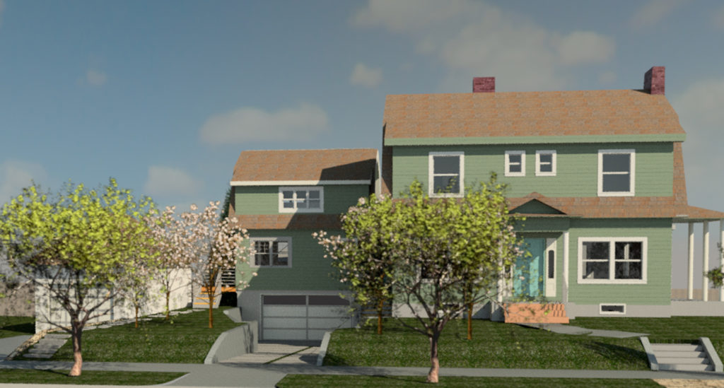
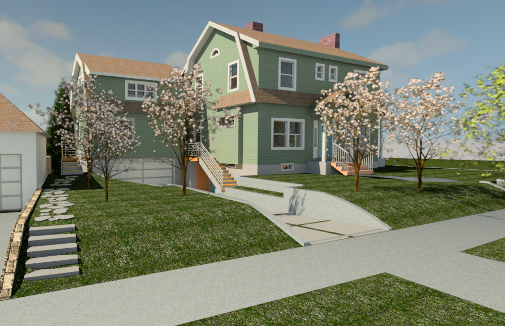
Another important design consideration is limitations on the entry sequence. Only one main entrance may be located on the street-facing facade of the house, meaning an attached ADU must have a front door on a side or rear elevation. Entry stairs, porches, or decks can extend into the side setback if not higher than 2 ½ feet, otherwise a 3 feet side yard setback is required. Detached garages are typically converted into ADUs, which can be a loss of an amenity for the main house. For the Peerless project, there was opportunity to develop a below grade garage that connects at the basement level of the house. This below grade development allowed the ADU to maintain an appropriate height, keep the homes’ garage, and provide 800 SF of living space above the garage.
Accessible-Dwelling-Unit-pmapdx
New ADUs provide great opportunity to build low energy units. Setting Net Zero or Passive energy goals increase the construction costs approximately 10% but will provide long-term utility and energy savings for both the ADU and the main house. Since an ADU cannot exceed 800 square feet in size, there is usually only small mechanical units and one bathroom, keeping utility usage at a minimum.

ADUs are permissible in residential Historic districts. Any exterior ADU will require additional design review by City of Portland staff, or possible the Portland Historic Landmarks Commission. However, if the general guidance of proper massing, scale, set-back, and material choices are followed, the compatibility of the new ADU to the historic district will likely be achieved and approval provided.

Written By Peter Meijer, AIA, NCARB / Principal, and Hali Knight / Designer

[1] Zoning code information comes from the City of Portland, Bureau of Development Services, Accessory Dwelling Units Program Guide.

Assessing Union Station to be Part of Our Future

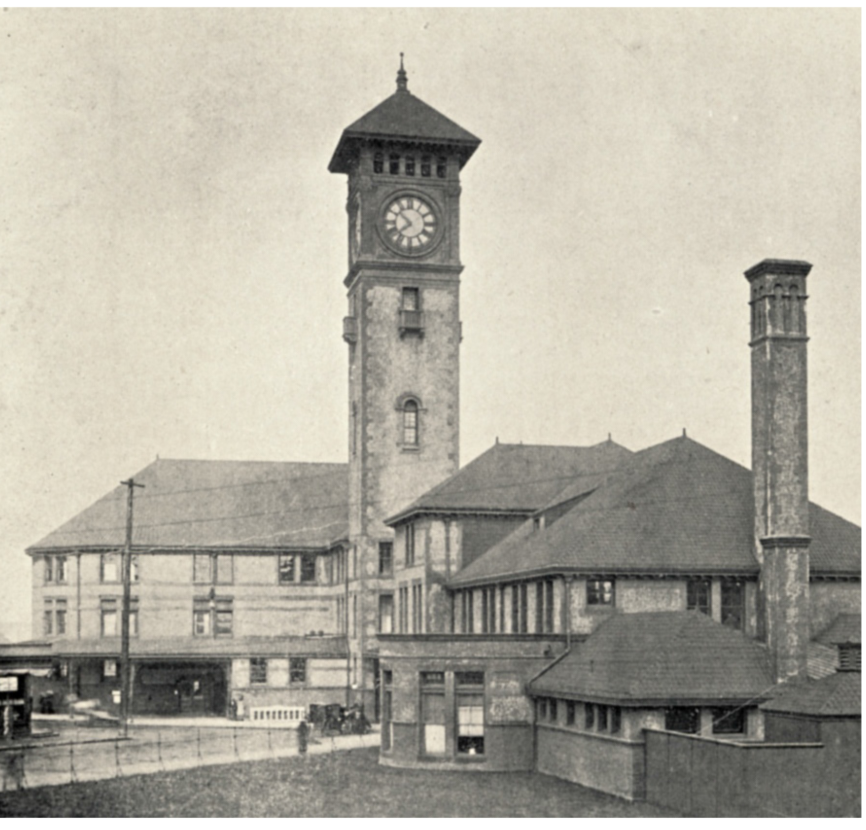
Portland’s Union Station is the only major railroad station built in Oregon, and one of the oldest major extant passenger terminals on the West Coast. From its inception, Union Station has functioned as a major transportation link to Portland and the west coast, with a continued vital role to play in future rail and multimodal transportation planning.
Union-Station-Historic-photo
A Sense of Place
Critical to adapting Union Station, and other historic structures, for current and future use is to thoroughly understand key elements and components that convey the sense of place and rich history of the structure. A deeper understanding enables informed decisions to be made about the potential of key characteristics to remain for future generations. Union Station was constructed between 1892 and 1894 and was designed by Van Brunt & Howe architects in the Queen Anne style with Romanesque detail. From 1927 thru 1930, the Main Concourse was modernized by Portland’s internationally known architect, Pietro Belluschi, to reflect the streamline era of rail technology. Like the original 1892 elements, the Belluschi modernization’s are equally important stories to tell.

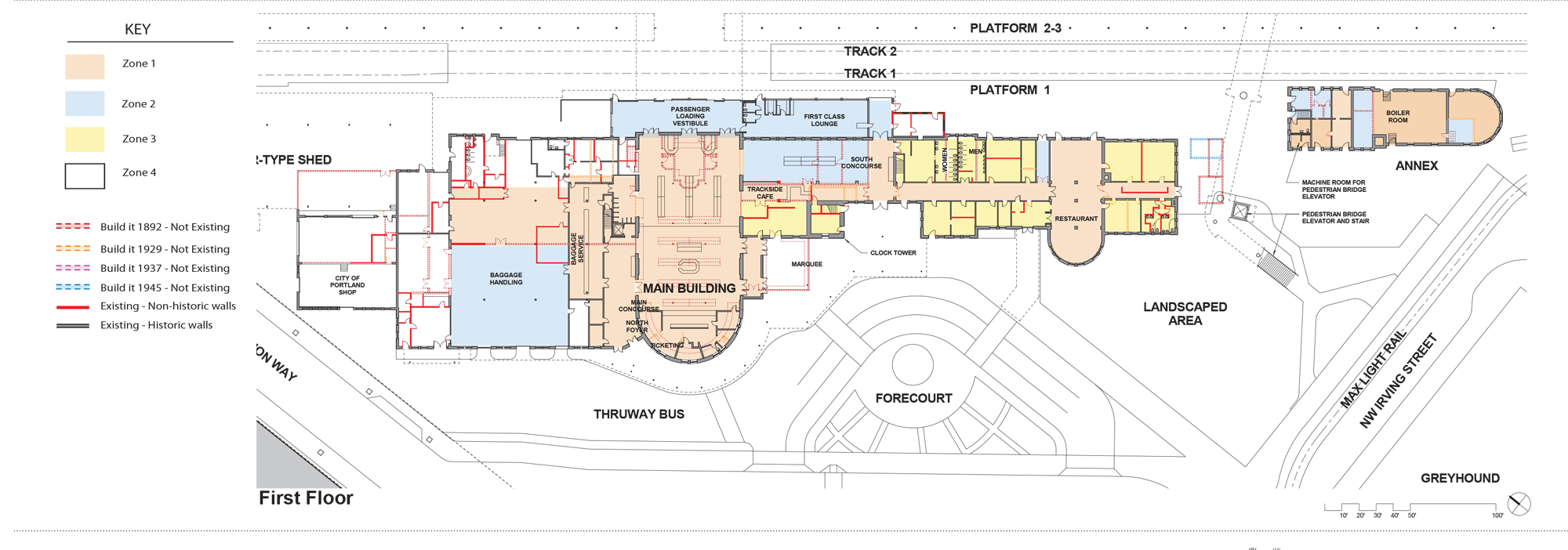
Creating a graphic document annotating “changes over time” is an essential tool for evaluating how Union Station has adapted to improvements in rail technology, fluctuations in passenger volume, cultural shifts regarding train travel, as well as modifications to specific architectural elements that impact the historic integrity and interpretation of original design intent.
Union-Station-Report-Outline-pg2
Methodology for Assessment
Our method of developing the graphic drawing is to compare historic floor plans and historic photographs to current plans and images through a process of layering plans from different eras over one another and drawing the altered, or missing, elements (e.g. walls, furniture, spaces, etc.) in different colors. This methodology provides an easily interpreted floor plan. The use of color enhances the image and creates a visual record of both changes and original historic fabric. In reading the graphic drawing, it becomes readily discernible that changes include: wood floors replaced with concrete and new floors added; openings in the main concourse were moved and enlarged; the women’s waiting room and toilet were removed to widen the south hall, the stairs were renovated, and a new baggage counter was constructed. The covered concourse was glassed in and a section was made into the First Class Lounge, which remains today. And in the 1940s, a nursery, or crying, room was added.
Union-Station-PMAPDX-drawing
What is fascinating about the history of a building like Union Station, is that the rail lines and street patterns are also integrated with the function and use of the structure and have changed over time as well. The construction of Union Station came soon after Portland was fully connected by rail in 1883 to California, Montana, and rail lines running to the East Coast across the U.S. The Spokane-Portland-Seattle rail connection was finished in 1908. In 1922, Union Station became accessible to all major passenger railroads operating through Portland.

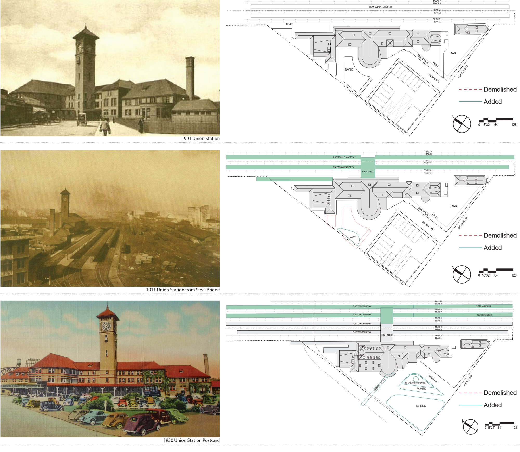
When originally constructed, six passenger car rail lines approached the rear of Union Station. The waiting platform consisted of planks on dirt with no canopy. The block across from Union Station consisted of a small restaurant, bar, other stores, and stables. A five foot iron fence bordered a large lawn and sidewalk to the south and west of the station. The High Shed, a large two-story metal shed was the first canopy built to cover the passenger platforms and extended perpendicular to the station. Under this High Shed, two smaller scale platform canopies were erected paralleling the tracks. A mail canopy was built at the north end of the building in 1915.

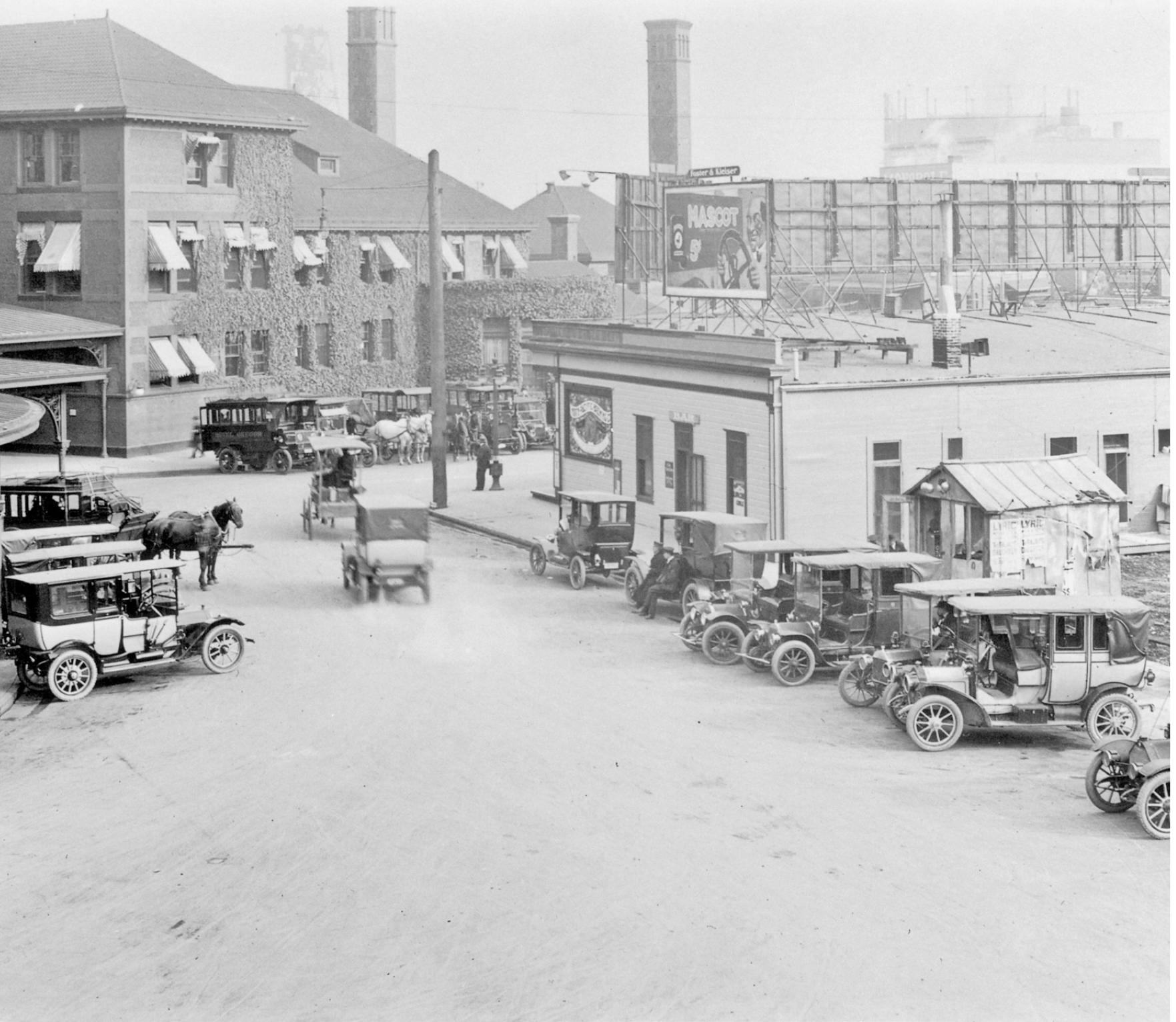
By 1920, the block across from Union Station’s main entrance had been converted to parking to relieve congestion. As automobile use increased throughout the city, parking configurations were constantly changing over the years. By 1923, an elevated walkway was built to connect the Broadway Bridge to the main entrance.
union-station-pmapdx-changes-overtime

With the introduction of larger diesel locomotives and potential for high speed rail along the northwest corridor, the track, platforms, and canopies have had to be modified. Safety and accessibility have also driven the need for changes and modernization. Documenting these alterations with graphics, provides a foundation from which to advocate for further refinement while recognizing historic precedent and protection of historic elements.

union-station-pmapdx-historic-photo

Written by Peter Meijer, AIA,NCARB, Principal

PMA is part of the DOWA-IBI Group team for this exciting PDC Union Station Renovation Project.

PMAPDX-design

Warm Springs Eco-Huts Concept

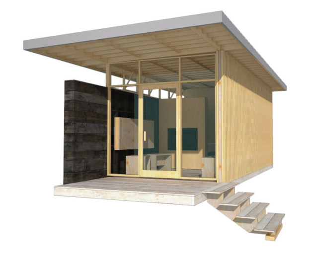
PMA was provided an opportunity to create temporary Eco-Huts nestled on the right bank along a gentle curve of the Deschutes River adjacent to the Warm Spring Tribe Reservation. Inherent in our design approach for the Eco-Huts is the creation of design solutions that emphasize the uniqueness of Place. The concept includes Land Restoration and Land Stewardship. The site topography has a shallow slope towards the river with basalt escarpments forming the river valley. PMA created a prototype model, easily constructed and assembled off site (test fit), then transported to the site and efficiently erected. The prototype was designed to be economical and conceived to have minimal footprints on the land resting on piers elevating the floor above the land and accommodating the undulating landscape. The process of assembling the Eco-Huts on-site and disassembling them in the future determined the material pallet of dimensional lumber and pre-assembled wood window walls.

A modular dimension was chosen permitting variation in the Eco-Hut sizes. The floor, walls, and roof planes are built off-site and tilted in place. Exterior stained wood material varying from plywood to sawn boards were chosen to harmonize with the High Desert landscape and be of minimal maintenance. Plywood panels are dressed with battens and sawn mill boards are stained dark desert grey and applied horizontally to create solid side walls atop of which are placed ribbon windows. The primary entry and view wall is a wood frame window and door façade. A deep roof overhang protects the interior from solar gain. Interiors are exposed panel faces or stained mill boards. Partial height walls denote areas of more privacy.

Mercy Corps North Facade (Viewing Southeast)

Mercy Corps World Headquarters Renovation

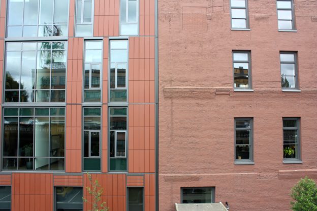
The historic Packer Scott building, now the World Headquarters for Mercy Corps, had significant damage to the original masonry resulting from inappropriate sand blasting cleaning techniques. PMA provided a complete building exterior assessment and identified areas of 50% or more cross section loss to the masonry and guided the design team towards suitable replacement material. In addition, PMA investigated foundation drainage issues during construction using non-destructive investigation techniques, and worked with the sub-contractors to provide proper techniques in the use of lime-based mortar.

Building Envelope Corrections:
• Analysis of exterior masonry and identification and specification of proper repair material and techniques.
• Analysis of the original construction means and methods of the sheet metal entablature as well as techniques for repair.
• Conducting full building window assessment and development of the drawings and package leading to support for window replacement.