Tag Archives: design

PART I: Tropical Modernism in a Multicultural Context at the Docomomo US National Symposium

Tropical Modernism was showcased, explored, and celebrated at the sixth annual Docomomo US National Symposium in late September 2019. Docomomo US/Hawaii chapter hosted, and as the current Docomomo US/Oregon chapter president I had the opportunity to experience all things tropical and modern in Oahu, Hawaii.
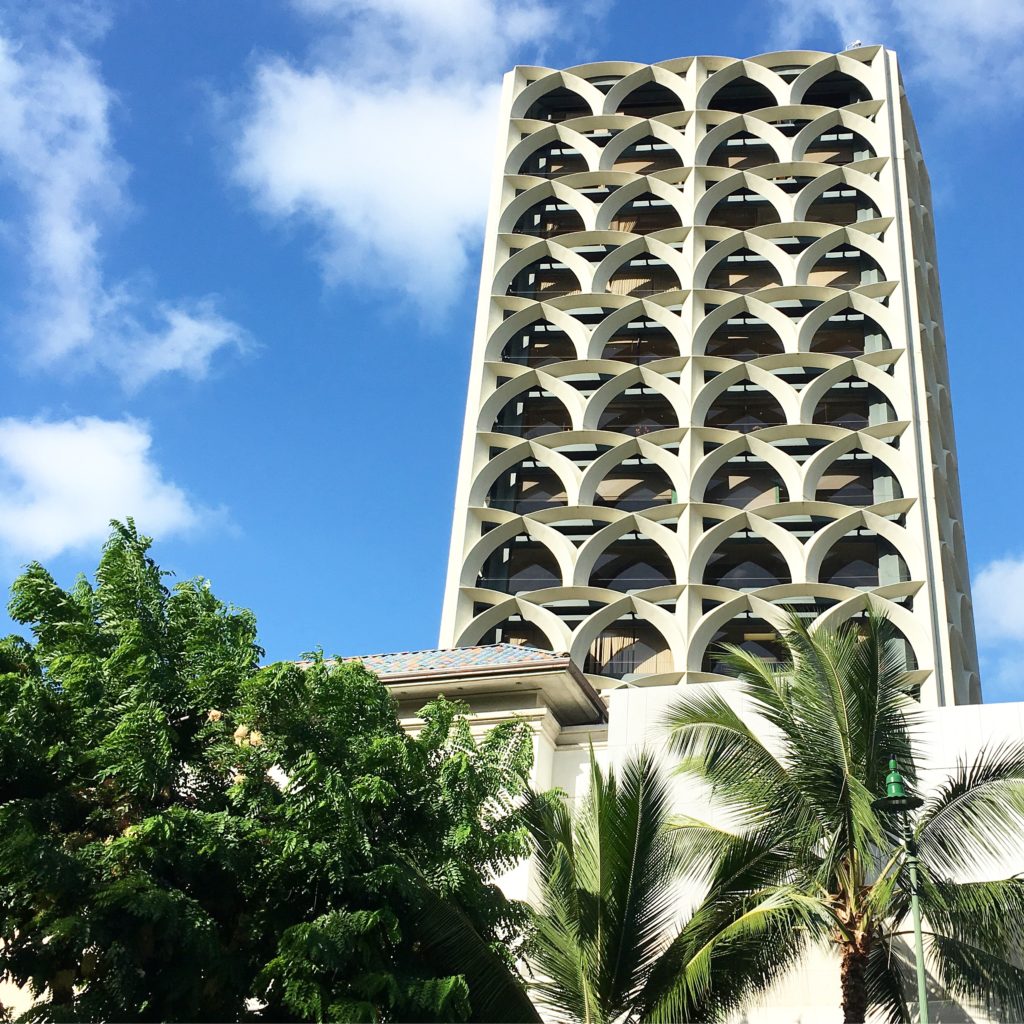
Honolulu (2)-pmapdx

For those unfamiliar with the mouthful that is Docomomo (documentation for the conservation of the modern movement), it’s a national (technically international) non-profit dedicated to the preservation of modern architecture, landscape and design. At the Oregon chapter we take this mission a bit further by including art from the core era of modernism and one of the most controversial architectural movements: post modernism. But let’s get back to the oasis that is Oahu. First, if you have the opportunity to visit this island – DO IT. It is a multicultural, dense cosmopolitan city yet rural surf-town, absolute food heaven, post-war architectural wonderland where tropical resort design began, all rolled into one island that has weather far superior than what we ever get in the state of Oregon. Why do we all live in the cold and rain?!

The symposium kicked-off with a welcome reception at the Outrigger Canoe Club. The building is situated right along the Waikiki coast and was designed by Vladimir Ossipoff in 1941. Ossipoff had a prolific Honolulu-based firm, Ossipoff Snyder Architects. A common theme I was unware would take a central role throughout the symposium was about tropical outdoor/indoor living, or better known as lanai.

honolulu-beach

UNIVERSITY OF HAWAII AT MANOA
University of Hawaii at Manoa hosted the first day of symposium presentations at Jefferson Hall. While there are several mid-century buildings across the campus, Jefferson Hall is an architectural gem among them. Completed in 1963 and designed by Chinese-American architect I.M. Pei with Young & Henderson. Jefferson Hall was the last building constructed of the East-West Center (EWC) campus. The EWC helped put Hawaii on an international stage, connecting Asia and the West. Jefferson Hall in particular “combines the austere symmetry of the New Formalism with hints of Chinese traditional architecture to convey the links between Asia and the West envisioned by the center’s multiple champions and founders.” (1.)

HAWAII OVERVIEW – from traditional architecture to mid-century modernism
Glenn Mason
Graham Hart

Bit perplexed that native Hawaiian architecture was breezed over and barely mentioned. The presentation began with thatched houses, then quickly jumped to the first Western-style frame houses being shipped to Hawaii in the 1820s. These were the type of structures the Missionaries were accustomed to. From there we learned that basalt quarries were developed in the 1880s, and the California Gold Rush really opened up west coast trade to Hawaii. For the first time Douglas Fir was shipped from the mainland to Hawaii. Mason then explained that while Hawaii had designers, they did not have architects, but architects from Australia or the mainland came to Hawaii and contributed to the beaux-arts and neo-classical styled structures. It wasn’t until the early 1900’s that a regional style began to express itself in Hawaii, and across the mainland. Hawaii regional style elements include: double pitched roof, lanai, local materials, and an overhang roof.

Towards the end of the 1930s change thinking happens and international style references begins to be expressed in architecture. Hawaii sees an influx of younger architects from Europe that were schooled in modernist design. The late 1930s had a stream of construction on military bases (several designed by Albert Kahns office), but by the time of WWII, 99% of architects on the island went to work for the military. From the 1930s through the 1960s there is a shift in the architecture vocabulary in Hawaii. It begins with regional style with a hint of modern, then modern used to reinterpret regionalism. Modern architects of note in Hawaii from that era:

Vladimir Ossipoff
Peter Wimberly
Lemmon, Freeth, Haines, and Jones
Edwim Bauer
Alfred Preis
Johnson & Perkins

The shift in the architecture vocabulary in Hawaii continues from the 1940s through the 1970s. Now we begin to see the environmental influences on modernism, even though rural landscapes are being transformed into cosmopolitan centers with smaller, steep, tight sites or housing. Materials used for modern design now includes concrete, cast concrete, lava rock, coral, local woods, and aggregates. Modern architecture in Hawaii also embraces the natural environment. This is most reflective in architect’s obsessions with lanai. This obsession found its way from residential homes to large developments. The East-West Center (1962-1963) at the University of Hawaii Manoa, designed by I.M. Pei, is a phenomenal example of a monumental, institutional piece of architecture that embraced the lanai.
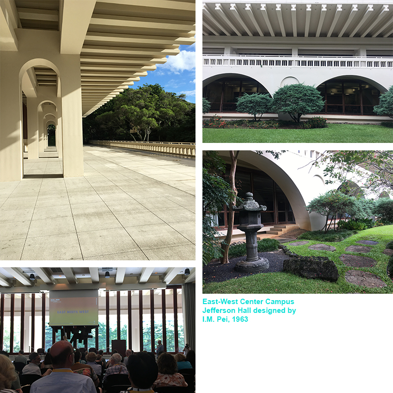
Jefferson-Hall-001

ASIAN INFLUENCES
Alison Chiu and Alissa Carson
Lorraine Minatoishi
Luca Guido

This group of presentations focused on different facets of Asian influences and how the contributions were interwoven in post-war architectural design throughout Hawaii. Lorraine Minatoishi focused on Japanese temple architecture influence of modern design post-war. There were distinct temple styles developed throughout their history in Hawaii:

Japanese Traditional Style (late 1800s – early 1900s)
Plantation Style (late 1800s – early 1900s)
Hawaii Eclectic Style (early 1900s – 1950s)
East-West Style (1918 – 1950s)
Post-War Modernism (led by second-generation Japanese architect Niser)
Post-War Traditional

Luca’s presentation took it a step further by discussing an obscure architect from the mid-century modern era, Bruce Goff, and how he also influenced local architects to Hawaii. I had not heard of Bruce Goff like most, but Luca Guido explained why this figure in the realm of modernism was obscured until now.

RESIDENCES OF WIMBERLY AND COOK
Following presentations at the University of Hawaii and a self-guided walking tour of other mid-century campus resources, I chose to attend the Residences of Wimberly & Cook Tour. Pete Wimberly of Wimberly & Cook designed two residences situated above the Manoa Valley. Wimberly designed some of the most iconic mid-century modern buildings in Hawaii. Wimberly came to Hawaii in 1940, and post-war his career flourished. His designs embodied tropical modernism, spaces that blurred indoor and outdoor living. The residential designs we toured both featured indoor/outdoor living, natural cross-ventilation, elegant interior details and finishes, and a smart use of natural light. However, they were completely different in essence, aesthetic, style, and state.
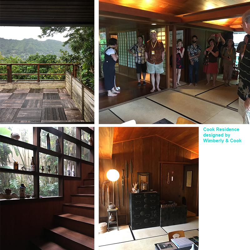
Cook-Residence-PMAPDX
The Japanese style pavilion house was like walking into a meticulously cared-for time capsule. There wasn’t even dust on the book shelves that displayed artifacts collected and arranged by the original homeowner! However, there were a few signs of wear-and-tear on the interior Japanese style floor mats, kitchen cabinets along their frames, and slight dry-rot peppered across the original wood deck. Otherwise the home was pristinely maintained. Wimberly’s private residence across the street was a different story.

Wimberly’s private residence was constructed in 1945. This is an insane date for residential construction due to World-War II ending the same year, and the majority of architects/contractors in Oahu were working on military projects. With the Japanese style pavilion home, you enter by walking down slightly winding stone steps. With Wimberly’s private residence, you enter by climbing up stone steps that deliver visitors to a small landing, and then up more exterior stairs. The second set of stairs (wood planks suspended by cables) makes for a swoon-worthy entry sequence that looks like something Dwell or Architectural Digest would gobble up for a feature article.
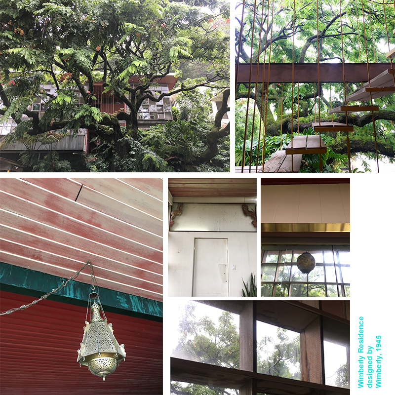
Wimberly-Residence-PMAPDX
From the now faded red door, redish-pink painted wood paneled ceilings, decorative animal sculptures situated within the header above the door that leads from the dining area into the kitchen, to ornate light fixtures and various metal finishes throughout the space, Wimberly’s private residence utilized design elements that reflected the multicultural diversity of Hawaii. The residence is also quintessential mid-century design: natural cross-ventilation, sliding wall panels to completely open up or section off the main-floor living, dining and lounge areas, and a technological savvy (for its time) kitchen. From the perspective of how we design kitchens today, it is real sad and small, save for the to-die-for view of the lush tropical garden from the kitchen window over the sink.

Wimberley’s private residence also showed signs of being well lived-in, yet not maintained with any desired vigor. The wood framed windows on either side of the structure are rotting like the planks along the entry façade deck, and there are several cracked panes of window glass. Structural settling has made itself known, and the kitchen is retro in a manner no one would want for daily use. Most of the interior painted walls or ceilings have faded into softer hues of their original bold colors. And, when we visited, it looked as though someone was living there, yet possibly setting up an estate sale for interior items. There were some true mid-century interior design gems scattered in the clutter piled up from the floor I wish I could have packed in my suitcase for the return trip.

Hope you enjoyed PART I: Tropical Modernism in a Multicultural Context at the Docomomo US National Symposium! In Part II we will discuss the Hawaii State Capitol, and presentations on Historic Preservation in Hawaii and Tropical Resort Design.

Written by Kate Kearney, Associate.

1. Shen, Haigo and Irene. Tropical Modernism At University of Hawaii At Manoa. Docomomo US National Symposium, Oahu, Hawaii, September 2019.

Hatch-PMAPDX-003

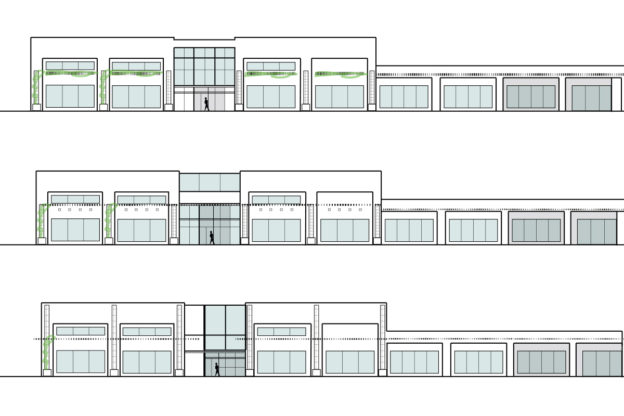
Façade Design Concepts For A Storefront Renovation

We generated design concepts for the exterior and interior renovation, and façade development studies of a previous car showroom along Sandy boulevard in Portland, OR. A goal of the renovated space was to facilitate innovation and support for small business owners.

Initial concept studies created for the client removed the awnings that disrupt the façade, while relocating the prominent skylight below the current parapet line. Detailed tile patterning in an art deco motif was used to emphasize the columns and provide a connection to the height of the building. Additional signage was designed into the façade and integrated into the column details. Structural supports for a shaded louver system protrude two-thirds up the columns, with a heavy added ledge under the windows, was created to provide seating and visually grounds the storefront façade.

Five Questions with PMA’s Summer Intern, Skyla Leavitt

This summer Skyla Leavitt had the opportunity to participate in a paid internship at PMA in our Portland office. In addition to working as an intern, Skyla is working at the University of Oregon (UO) in Portland as a Student Services Assistant. Her position at UO includes fielding emails from incoming students, organizing orientation and a field trip that the incoming class takes, and giving tours for both the architecture and historic preservation programs. Additionally, Skyla is the first and only student to pursue concurrent Masters in the Architecture and Historic Preservation programs at the UO Portland campus. She holds a Bachelors of Science in Architecture from The Ohio State University: Knowlton School of Architecture, a Masters of Architecture from the University of Oregon: College of Design in Portland, and is currently finishing her Master of Science in Historic Preservation from the University of Oregon: College of Design in Portland. It has been a delight to have Skyla working with all levels of staff at PMA on renovation projects for existing and historic properties.
Describe something new you learned while at PMA during your internship?
I came to PMA with some professional experience in architecture and a fundamental knowledge of historic preservation. However, in the 7 years since I have started this career path, I have somehow never learned Revit, let alone how Revit is used in conjunction with an existing building. I have been developing my Revit skill-set during my internship, and I think it has been particularly helpful to learn this program through the lens of preservation, as this is how I will continue to use it throughout my career. The use of 3D laser scans and point clouds, technology I had never previously been exposed to, has not only been interesting, but also eye opening to the ways this field is effectively utilizing technology.

What have you enjoyed working on while at PMA?
I have been allowed the opportunity to partake in a variety of work in my short time at PMA, which I am very grateful for! The process of carrying out condition assessments and documenting the current state of a historic building, as well as how we might address its issues, is very satisfying to me. I have also enjoyed developing enclosure details, which has exposed me to the numerous and specific challenges architects face when working on historic buildings.

Has your internship changed your perspective on historic preservation, or working with existing resources?
I wouldn’t say my perspective has changed, rather that it has been validated. My internship has confirmed for me that I am in the right field and that I have found my niche, so to speak. I have always wanted a specialization, and new construction has never appealed the same way adaptive reuse or renovation work has. Preservation was a natural fit for me and sits well with my tendencies towards the nostalgic.

How will your internship experience influence your studies when you return to school?
When I return to school this autumn, I plan to write my Master of Science in Historic Preservation thesis about the intersection of architecture and historic preservation in practice, specifically the interdisciplinary negotiations and compromises that allow a building to maintain its historic integrity, while also achieving improved technical functionality and code compliance. I believe our ability as architects to successfully facilitate these conversations is integral to sustaining not only the physical longevity of a historic site, but also the relevance and importance it holds within the community by allowing it to serve users in new or improved capacities.

Do you have a favorite aspect about architecture or historic preservation?
I am very interested in building enclosures and how we marry modern concepts with historic practices when we make an intervention in a historic building envelope. Masonry in particular, as opposed to wood, fascinates me as it is both fragile and enduring.

BONUS: Anything fun you did in PDX this summer?
The highlights of my summer have been tubing down the Clackamas River, berry picking at Sauvie Island, attending a few concerts at the Moda Center, and hiking the Tom, Dick, and Harry Trail on a clear day when I could see Mt. Hood, Mt. Adams, Mt. Rainier, Mt. St. Helens, and Mt. Jefferson all at once. But I also just hang out with my cat, Olive, a lot!

PM DOCO OR Award Announcement

2019 Modernism in America Awards

DOCOUS-Modernism-In-America-2019-Award

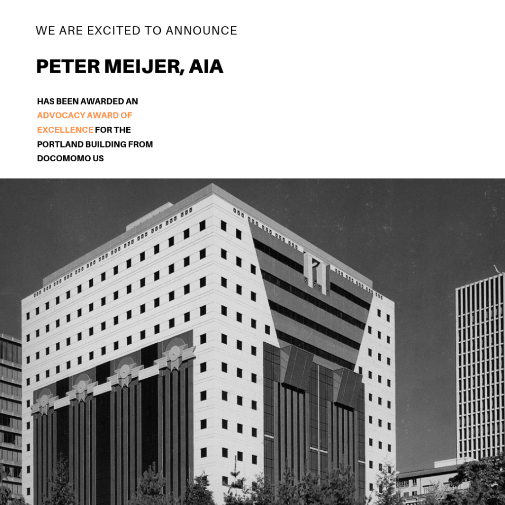
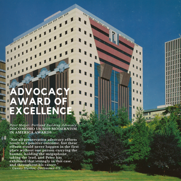
“Not all preservation advocacy efforts result in a positive outcome, but these efforts would never happen in the first place without one person carrying the banner, holding the megaphone, taking the lead, and Peter has exhibited that strongly in this case, and throughout his career.”
– Gunny Harboe, Docomomo US Director

Via DOCOMOMO US
An Advocacy Award of Excellence is given to Peter Meijer, AIA, NCARB, for his leadership and advocacy work related to the Portland Public Service Building (the Portland Building). As the founding President of DOCOMOMO US/Oregon, Peter and his architectural practice Peter Meijer Architect, PC (PMA) played a pivotal role in speaking up and advocating for the sensitive preservation of the Postmodern icon, designed by Michael Graves and completed in 1982.

In 2011, PMA wrote the nomination to add the building to the National Register of Historic Places, a serious undertaking, without being contracted to do so. Shortly thereafter the city began to consider making improvements after years of deferred maintenance and chose to move forward with a reconstruction plan that disregarded the Secretary of the Interior’s Standards.

Despite opposition from PMA, local and national advocates, and a letter from the National Park Service stating the building would be “de-listed” from the National Register, the Portland Landmarks Commission nevertheless voted to approve the reconstruction plan. Faced with significant alteration of arguably Portland’s most important architectural icon, Peter pushed forward individually and appealed the decision. Portland City Council denied the appeal, essentially ending the effort. Peter remained dedicated to the cause throughout the entire process, despite substantial local professional risk.

Although the fight is now over, DOCOMOMO US/Oregon has not let the story go out of the headlines, continuing to document the ongoing dismantling of the Portland Building’s façade.

For the full list of 2019 MODERNISM IN AMERICA award winners, please visit DOCOMOMO US.

The History of PPS McDaniel (formerly Madison) High School

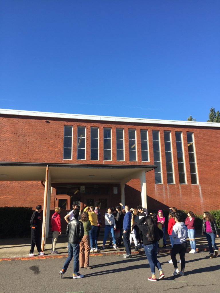
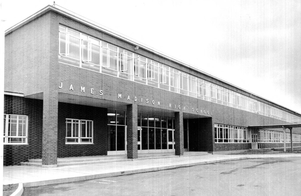
At the end of January, PMA was invited to give a presentation to students at Portland Public Schools McDaniel (formerly Madison) High School. “The History of Madison High School” turned out to be engaging for many of the students in two back-to-back social studies classes taught by Mr. Jason Miller, and fun for the presenter from PMA (Kristen Minor) as well. PMA is part of the multi-disciplinary team for the PPS McDaniel High School Modernization project.

Below are highlights from the presentation illustrating changes over time in the vicinity of the school, an area that is quite familiar to the students. Old photographs of a place remind us how radically our environment changes, even though it feels (especially to a high school student) that change is s-l-o-w. The presentation also covered basic facts about the school, including its design in the International Style, a subset of Modernism, and what that means in comparison to pre-war “traditional” architectural styles. Madison was constructed in 1957 and designed by the firm of Stanton Bowles Maguire & Church, who also designed Marshall High School in SE Portland a few years later in 1960.
PPS-Madison-HS-PMAPDX-Lecture
PRE-SETTLEMENT HISTORY
Much of East Portland, especially the northerly portions along the Columbia, was Chinook tribal territory. These peoples were decimated by diseases from contacts with European and American exploration, colonialization and fur trappers in the period between the 1780s and the 1850s. Oregon Trail pioneers began to come to the area to settle by the early 1840s. The Donation Land claim act of 1850 divided the western territories into quarter mile grid sections and deeded the land to individuals (up to 320 acres) and couples (up to 640 acres), as long as you would live on and farm the land. That’s why the distribution of land by the federal government is clearly visible in the grid pattern of streets of our western cities, with anomalies like Sandy Boulevard and Foster usually being remnants of older tribal pathways.

TRANSPORTATION
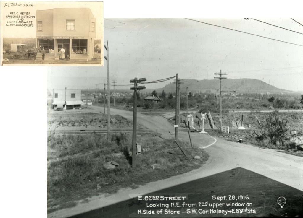
This image shows 82nd Avenue where it crosses Halsey in 1916, when the train tracks crossed the roadway at grade. This location is a little more than half a mile south of the school. In 1916, people were getting around by horse and carriage, streetcar, train, walking, bicycling, and for a lucky few, driving (Model T’s went on the market in 1908). By the mid-1920s most families were able to purchase a car, but people didn’t take them everywhere like they do today.

PPS-Madison-HS-PMAPDX-Lecture

– Transportation –


LAND USE
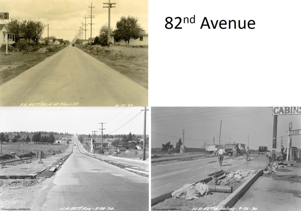
These three photos, all looking north on 82nd Ave, are from the early 1930s. The lower right photo illustrates the 1934 construction of a viaduct for the train line, so 82nd could finally extend over the train lines. The upper photo shows early development along a segment of 82nd in the Montavilla area, with mostly houses visible along the roadway in 1932. By 1937, Portland re-zoned the entire 82nd corridor to be commercial or industrial, so all of these houses were later demolished or heavily altered. Finally, the lower left photo shows 82nd being widened in 1934, with the Madison school site at the left at the very top of the hill on the horizon. Large areas of land were still completely rural, either undeveloped or producing crops. By the 1920s and 1930s, most of the farms that had once been in this area (many originally owned by Japanese immigrant farmers around Montavilla) had given way to increased development.
PPS-Madison-HS-PMAPDX-Lecture

– Land Use –


HOUSING BOOM
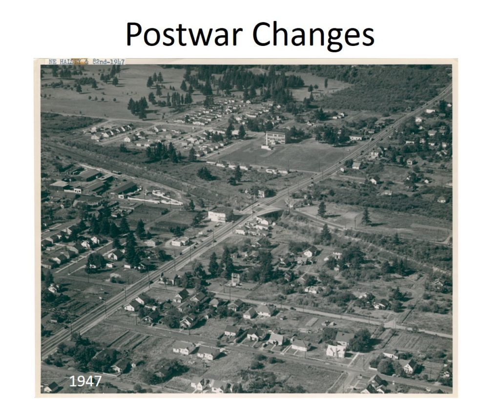
The same Halsey Street intersection in 1947 is shown at the center of the photo, with 82nd Avenue stretching almost up to the Madison school site (just off the upper right of the image). None of the major freeways had been constructed yet, so the gully still only carried long-distance train tracks. After the war, housing development really took off, which resulted in an immediate need for schools in the area.
PPS-Madison-HS-PMAPDX-Lecture

– Housing Boom –


SCHOOL DESIGN AND EFFICIENCY
From 1945 to 1970, Portland Public Schools constructed 51 new schools! The district had to be efficient and smart about costs under all the pressure to create schools in such a short period of time. Modernism as a style, with its emphasis on functionality, repetition, and horizontality, worked well for the district to ensure that they could construct the most building area for the least cost. Schools were designed in standardized materials and in expandable forms, allowing maximum flexibility.
PPS-Madison-HS-PMAPDX-Lecture

– School Design and Efficiency –


As McDaniel High School moves closer to its construction start date for the PPS Modernization project, it is worth remembering that the school is a highly intact example of the mid-century International Style design aesthetic, but that the new iteration of the school will preserve portions of this design. Students in the updated school will hopefully have an appreciation for both the changes and the past design, with a glimpse into the history of change at the school and in the area surrounding the school.


Written by Kristen Minor, Associate / Preservation Planner

Five Questions with Halla Hoffer, AIA, Assoc. DBIA

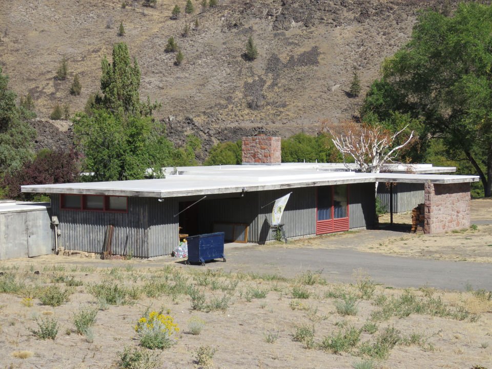
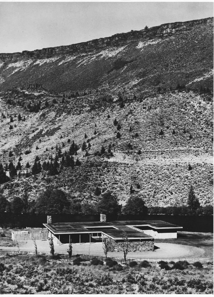
This fall, Halla Hoffer, AIA, Assoc. DBIA and Peter Meijer, AIA, NCARB, had the opportunity to teach a course in the Historic Preservation Program at the University of Oregon, School of Architecture & Allied Arts: Field Recording Methods. The course is designed for students to learn and practice the methods and strategies for conducting physical site, structure, building, and object investigation using professional practice standards. The case study for learning these methods and strategies included the Belluschi designed Robert and Charles Wilson Homes situated along the Deschutes River. The homes are included in Restore Oregon’s 2019 Most Endangered Places list.
belluschi-wilson-homes
1. How does your architect’s mindset influence your role teaching a historic preservation class?

Historic Preservation and Architecture are very closely tied together – and yet there can be a disconnect between the two fields. As architects, we are taught to think creatively about problems and develop design solutions, while also understanding building constructions and materials. I believe our background in architecture gives us a unique perspective on not only on the construction of historic buildings but also allows us to creatively find ways to preserve those structures. In this course, we’ve been able to share our architectural experience through discussions on building observations/assessment, drawing conventions, building materials, and more.

2. What is your favorite aspect of working with students interested in learning about how to conduct site-specific observation/assessments for historic structures?

We’ve had the opportunity to take two field trips out to the Wilson Homes in Warm Springs, Oregon. Each visit has been a really fun experience for the entire class. When learning how to conduct a building assessment – there is only so much information that can be communicated through a lecture. The experience of being in the field and observing a structure in person cannot compare to photographs. I’ve had a lot of fun looking at the Wilson Homes with the class – and making observations with them about the condition of the homes, original constructions/materials, existing conditions, etc.

3. Do you have a favorite aspect of the Belluschi designed Wilson Homes? [layout; relation to the land; opportunity for rehab; etc…]

One of the most unique aspects of the Wilson Homes is their location on the Deschutes River. The homes are located directly on the river – and deeply connected to the landscape. It is difficult to explain the experience of being within a canyon along the Deschutes River and within one of the Wilson Homes. The views and sounds of the landscape are completely intertwined with the experience of the Homes.

4. Why is it important to rehabilitate these structures? What stories will be lost if they disappear?

Few intact examples of northwest mid-century modern homes remain. As a culture – our preferences for interior finishes, appliances, spatial layouts, etc have changed over the last half-century. Many mid-century homes have retained their exterior appearance, yet significant interior alterations have altered the original design intent. The Wilson Homes are unique in that minimal interior renovations have taken place. In both homes, the original spatial arrangements remain in-tact and many of the finishes are unaltered. The Robert Wilson home is particularly unique in that the original kitchen remains, dishwasher included. A rehabilitation would preserve these unique examples of mid-century architecture in the Pacific Northwest.

5. If you could give one piece of advice to graduate students (or recent graduates), what would it be?

Take the time to form relationships with both professors and people outside of school you can learn from. School is a wonderful, structured way to gain knowledge. But… that structure falls away once you graduate – and the need to continue learning doesn’t. Having people you can reach out to for guidance can be a valuable tool!
historic-belluschi-wilson-homes


Halla Hoffer, AIA, Assoc. DBIA
Associate / Peter Meijer Architect, PC

Halla is passionate about rehabilitating historic and existing architecture by integrating the latest energy technologies to maintain the structures inherent sustainability. Halla joined PMA in 2012 and was promoted to Associate in 2016. She is a specialist in energy and environmental management, as well as building science performance for civic, educational, and residential resources. Halla meets the Secretary of the Interior’s Historic Preservation Professional Qualification Standards (36 CFR Part 61).
Recycling Steel Windows: Is there a process?

PMA is leading the discussion to find a process to recycle steel windows.

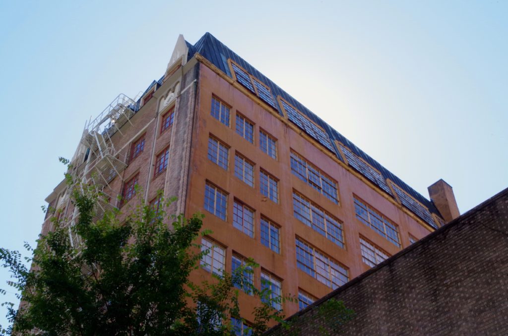
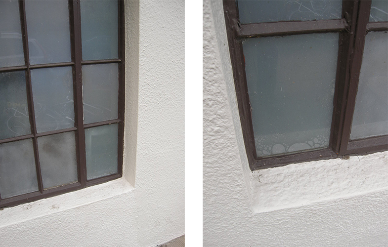
Through our work of existing building restoration, PMA often encounters older properties with original steel windows. And more likely than not, we receive a request from the property Owner to upgrade those existing steel windows. Rarely does the request result from degradation or damage of the window system. Most often the Owners desire thermal and energy improvements.In order to achieve the desired improvements, while meeting code upgrades and other tenant improvements, replacement of the original steel windows is often the option of choice. And that is when the difficulty of recycling existing steel windows begins.
existing-steel-windows
STEEL WINDOWS 1920s – 1940s
In the 1920s through 1940s, there were a number of local and national steel window manufacturers. Steel windows were the preferred window system in both commercial and industrial buildings because of the simplicity of components, ease of installation, availability of product, size of window openings, and affordability of the product. Steel windows from every manufacturer typically used the same readily available extruded steel bar profiles: the “T” & “h” cross sections. The entire window assembly is characteristically composed of three materials: the frame, the glass, and glazing compound. Operable windows have added hardware. The steel sections of historic windows are still in use on today’s steel windows.

With such sparsity of components, and availability of an industrial steel recycling industry, why are steel windows not recycled? The answer is hazardous materials: lead paint and asbestos containing putty. Creating clean steel for recycling involves a two-step process. Once removed from the building, the steel windows must have the glass and glazing removed and the paint removed. Both the glazing and the paint must be disposed following hazardous material regulations. And that is the primary block to recycling. There are very few business established to remove hazardous waste from windows.
typical-steel-windows
CURRENT INDUSTRIAL PRACTICES
However, if we look at two current industrial practices, wood window restoration and carpet tile manufacturing, there is a basis for introduction of steel window recycling. Wood window restoration processes include the removal of lead paint and asbestos containing glazing putty. The industry has the capacity to use dipping tanks to remove the paint and putty on a large quantity of windows and then properly dispose of the waste. Modify the existing process to accommodate steel windows could be readily achievable. Manufacturers of carpet tiles revolutionized the industry by owning the recycling process from cradle to grave. Carpet tile manufacturers take back the tiles they manufactured for recycling and reuse. Steel window manufactures could do the same.

Currently steel window manufacturers purchase the cross sections from steel producers and do not become involved in the life span of the products they produce. If the steel window industry reassessed and evaluated their role in sustainable products, an opportunity to recycle existing steel windows would become available.

Here at Peter Meijer Architect, we are committed to lead the discussion with the design, build, and manufacturing community to find an economical solution to recycling steel windows. We believe that existing industries can be adapted to keep steel windows out of the waste stream and better utilize existing resources for reuse.

Written by Peter Meijer, AIA, NCARB / Principal

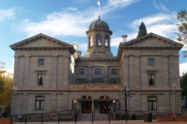
pioneer-courthouse-portland

Pioneer Courthouse Seismic and Historic Renovation

As the second oldest federal building on the west coast and the third highest ranked historic structure in the General Service Administration’s portfolio, Pioneer Courthouse is a significant historic sandstone structure. Peter Meijer Architect, PC (PMA) acted as the Preservation Conservator hired directly by the General Service Administration to consult the construction team engaged in the base isolation seismic upgrade and historic renovation of the circa 1875 Pioneer Courthouse. PMA revised the means and methods associated with the preservation specifications, represented the Owner, and provided CA services on issues affecting the historic property.

AWARDS & RECOGNITION
Preservation in Action Award Pinnacle Award
Architectural Heritage Center/Bosco-Milligan Foundation, 2008

Craftsmanship Award
AIA Portland Chapter, 2006

Top Project
Daily Journal of Commerce (DJC Oregon), 2005

Transforming the Built Environment: What are our ethical responsibilities to communities as architects?

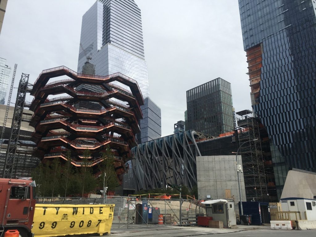
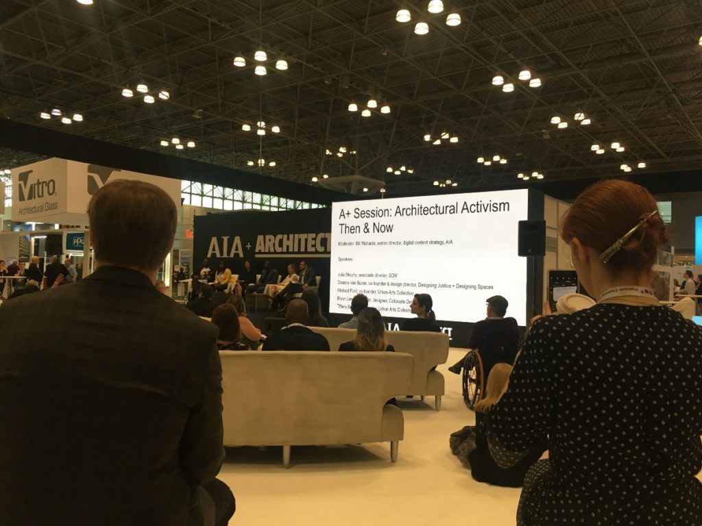
When stepping into the AIA Annual Conference at the Javits Center in NYC this year, I began to question the theme of the conference, a “Blueprint For Better Cities.” The expansive expo center sprawled out on three levels with thousands of booths promoting their products, from software to interiors to exteriors, but the one thing missing was representation from community groups or visible connection to the place of NYC.

Of course, the Javits Center adequately represents the grand nature of NYC amidst the building boom currently happening in Hudson Yards. It is hard to imagine anything but extravagant wealth when passing by the $150 million stairway to nowhere, aka the “Vessel” being constructed across the street. In a time of such great wealth disparity, what role do architects play in gentrifying our cities and creating safe public spaces for those without wealth and privilege? I believe architects continue to have a large impact on the growth of our cities and it is important to check our ethics as professionals on the impacts made in communities that may not be represented. The AEC industry seems to be expanding in exponential ways and defining our cities at a faster and faster pace, so conversations on equity and inclusion need to be brought to the forefront. Even though my first impression walking into the AIA conference at the Javits Center was not one of equity and inclusion, there were some great speakers bringing the conversation back to these important topics.

DESIGNERS ADDRESSING EQUITY IN THE BUILT ENVIRONMENT
One session on Architectural Activism included a panel with Deanna Van Buren of Designing Justice + Designing Spaces, Bryan Lee of Colloqate, and Michael Ford of Hip Hop Architecture. These designers are addressing equity in the built environment and setting new standards for the profession.

Byran Lee reminds architects to think about the communities’ cultures when designing and not to perpetuate systems of oppression. Architects have the ability to change the built environment and also be advocates for the communities in which they work. Laws that allow the victimization of marginalized communities need to be challenged. Public spaces which should be the democratic spaces available to all people are made unsafe to communities of color because of ambiguous laws around vagrancy and other systems of oppression. Understanding the needs of communities in which you are working in paramount. Architects can start by supporting marginalized communities through youth education, advocacy for groups with less priviledge, and equitiable policy and placemaking.

Michael Ford has been working on the youth education component of architectural activism. Hip Hop Architect facilitates youth camps that introduce design, architecture, place making through the expression of hiphop culture. The camps provide an opportunity for youth of underrepresented populations to learn about the architectural practice and reinvision the future of our built environment. A factor in the lack of diversity in architecture is lack of accessiblity to the field, and this program strives to provide that support to youth.

Deanna Van Buren talked of her work around restorative justice and restorative economics, exploring alternative to prisons and addressing the root causes of mass incarceration. Restorative justice is statistically proven to build empathy and decrease recurring offenses by 75%, while allowing for reconciliation and healing. Deanna reiterated that prisons are the worst form of architecture, created to express the harm that we are doing on another. Altnernatives presented were popup resources villages that provide services to isolated communities and peacemaking centers that use Native American practices for healing communities that have experience the trauma of violence and racial oppression.

Many speakers recalled quotes from Whitney Young Jr when talking about equity in the architecture profession, especially from his poignant speech regarding equity at the 1968 American Institute of Architects Conference in Portland. A well quoted statement was “[A]s a profession, you are not a profession that has distinguished itself by your social and civic contributions to the cause of civil rights, and I am sure this has not come to you as any shock. You are most distinguished by your thunderous silence and your complete irrelevance.”

LANGUAGE AROUND ETHICAL AND EQUITABLE DESIGN
I would argree that the profession as a whole still struggles with its social and civic contributions, even though there are some great leaders as mentioned previously. Currently, the trend in most large cities is gentrification resulting in loss of community connections and a huge housing crisis. Do the ethics of architecture speak towards our professional responsibilty to provide for the well being and safety for all within the communities in which we design for? In the AIA Code of Ethics, the only somewhat relevant bylaw I found was “In performing professional services, Members should advocate the design, construction, and operation of sustainable buildings and communities.” Perhaps the lack of language around ethical and equitable design is why it seems so lacking within the built environment. There needs to be a shift.

Large firms may promote their community work by supporting employees to volunteer a couple days of the year, or provide pro-bono design services. This approach is too compartmentalized and does not build the disruptive change needed to challenge systems of oppression in our built environment. These one-off gestures of pro-bono work can easily be perceived by communities as a savior complex instead of community building. The factors that push architects to design without community in mind needs to be resisted by the industry. Rather, more efforts need to be made so our ethical responsibilities to the public outweigh the profit driven interest groups’ needs that are currently prevalent in our industry. The sustainability movement has started to touch on some of our ethical responsibilities for healthier spaces, but these efforts are not preventing people from losing their homes, connection to place, civic amenities, and much more. There is much work to be done. To promote equity and inclusion for all when designing spaces, I believe we must work on our role as architects to listen, learn, be humble, engage, teach, and provide support and advocacy that serves the communities in which we are working.


Written by Hali Knight Assoc. AIA, Designer

Design Considerations for Accessory Dwelling Units

“The City of Portland’s Zoning Code allows Accessory Dwelling Units (ADUs) to be added to a site accessory to a house, attached house, or manufactured home in all Residential zones, all Commercial zones, and the Central Employment (EX) zone as described in Chapter 33.205 of the City Zoning Code.” [1]

Many established traditional single family neighborhoods provide opportunity for new exterior ADUs via conversion of garages or the building of a new structure. The maximum size of an ADU may be no more than 75% of the living area of the house or 800 square feet, whichever is less. Zoning limits the height and site placement, which may reduce the area to less than 800 SF. ADU roof ridges are limited to 20 feet, and if kept lower than the main house, this will help increase the compatibility of the new ADU to the existing house and regulate its form and massing.

In general, the exterior finish materials, roof pitch, trim, eaves, window orientation and dimension must be the same or visually match those of the primary house in type, size and placement. In other words, be compatible with the design and aesthetics of the main house. New ADUs can seamlessly blend into the context of the street when the scale, massing, and exterior materials reflect the neighborhood context.
Accessible-Dwelling-Unit-pmapdx-002
Creative design solutions can develop ways to maximize allowable heights and remain compatible with the main house. If an ADU shares a wall with the main house, it is considered attached and its height can exceed 20 feet depending on the zoning’s height limit. Fire codes require one hour fire separation between the units, so existing walls within the main house may need to be modified.

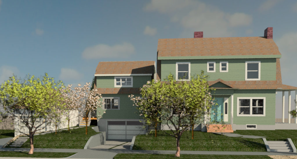
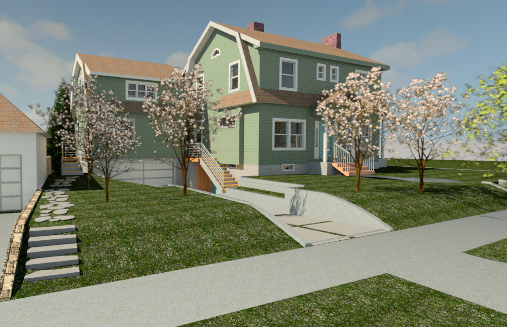
Another important design consideration is limitations on the entry sequence. Only one main entrance may be located on the street-facing facade of the house, meaning an attached ADU must have a front door on a side or rear elevation. Entry stairs, porches, or decks can extend into the side setback if not higher than 2 ½ feet, otherwise a 3 feet side yard setback is required. Detached garages are typically converted into ADUs, which can be a loss of an amenity for the main house. For the Peerless project, there was opportunity to develop a below grade garage that connects at the basement level of the house. This below grade development allowed the ADU to maintain an appropriate height, keep the homes’ garage, and provide 800 SF of living space above the garage.
Accessible-Dwelling-Unit-pmapdx
New ADUs provide great opportunity to build low energy units. Setting Net Zero or Passive energy goals increase the construction costs approximately 10% but will provide long-term utility and energy savings for both the ADU and the main house. Since an ADU cannot exceed 800 square feet in size, there is usually only small mechanical units and one bathroom, keeping utility usage at a minimum.

ADUs are permissible in residential Historic districts. Any exterior ADU will require additional design review by City of Portland staff, or possible the Portland Historic Landmarks Commission. However, if the general guidance of proper massing, scale, set-back, and material choices are followed, the compatibility of the new ADU to the historic district will likely be achieved and approval provided.

Written By Peter Meijer, AIA, NCARB / Principal, and Hali Knight / Designer

[1] Zoning code information comes from the City of Portland, Bureau of Development Services, Accessory Dwelling Units Program Guide.