As historic architects we find window replacement projects to be particularly challenging — removing original materials from a structure can fundamentally change the design aesthetic. Our built environment must evolve to support more sustainable living, but finding the best way to achieve this goal for historic structures, while minimizing any aesthetic impacts, is an ongoing challenge.
When looking to improve energy performance the first inclination is often to replace the component with the lowest thermal resistance – the windows. Single pane historic windows provide minimal thermal resistance and contribute to heat loss through the building envelope. But is window replacement really the best option for reducing the carbon footprint of a historic building – how does it compare to other strategies?
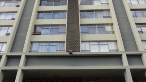
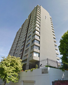 PMA recently performed an energy analysis study to answer that question. The project was to provide quantitative data on the energy savings associated with window replacement versus insulating exterior walls. We choose to study a structure on the brink of historic status – a 1960’s multi-story residential structure with large character defining view windows. The structure is composed of concrete walls, beams, floors, and columns with single pane aluminum windows. The existing building has approximately 36% glazing and no insulation.
The analysis we performed compared seven retrofit strategies ranging from minimal code compliance to super insulated walls and windows. Details on the specific constructions, r-values, and glazing properties are outlined below.
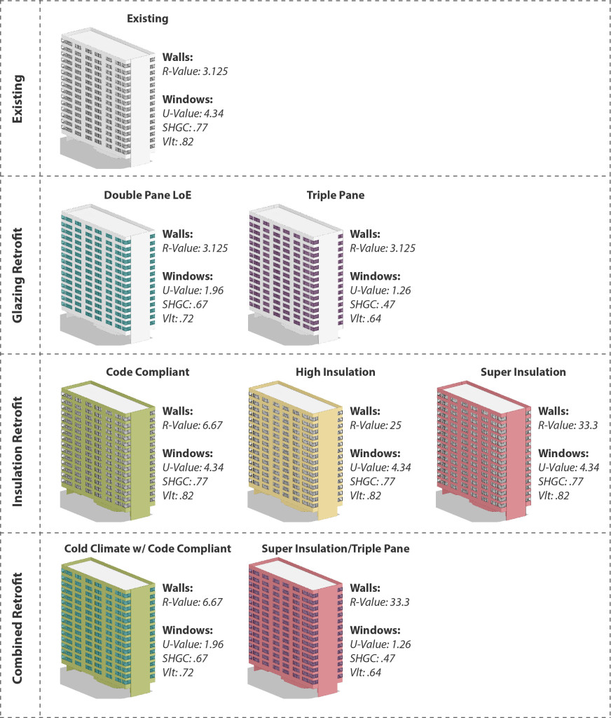 A wide range of constructions were chosen in order to see the full range of possible results. Future studies may focus on more refined material choices and a narrower set of parameters. The analysis was run in Autodesk Green Building Studio which is an excellent tool to perform basic energy models. While GBS does not allow for complex simulations it can quickly and accurately compare a variety of different design alternatives.
We chose to look at four different indicators to compare the results:
• Energy Use Intensity (EUI) indicates how much energy is used per square foot per year and is a very common way of comparing how different buildings perform.
• The quantity of electricity used per year indicates how much energy is used on cooling loads, heating loads, interior loads, and lights.
• The quantity of fuel used per year indicates primarily energy used for heating.
• The annual peak demand indicates the maximum amount of energy used at any single time over the course of a year.
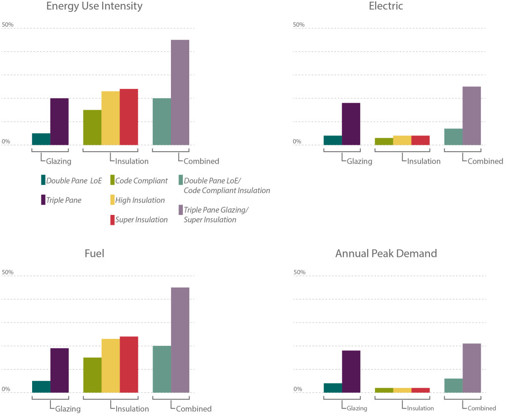
We assessed the data in terms of percentage improvement over the Existing scenario. The charts below provide a comparison of the seven different retrofits.
The Results
What is intriguing in the results is the large difference in performance within the glazing retrofits options between the Double Pane LoE Glazing and the Triple Pane Glazing. While the Double Pane Glazing provides a notable improvement to the building’s energy performance it is still surpassed by all of the other retrofits. Conversely the Triple Pane Glazing far out performs all of the insulation retrofit strategies. The range between the two glazing retrofits indicates that new windows have the potential to have a substantial impact on energy performance. Unfortunately triple pane glazing is typically cost prohibitive and the LoE coatings applied to achieve maximum efficiency are incongruent with historic buildings. As technologies change and improve it is possible that these obstacles will be overcome – potentially making window replacement for energy efficiency purposes a more viable option.
 With current technologies the results indicate that adding insulation to a building has the most cost effective impact on energy performance. Installing new insulation is typically less expensive than window replacement and the results of this study show that Code Compliant (R-~7) insulation can have a significant impact on overall energy usage, outperforming Double Pane window replacement. Interestingly, the results also indicate that a High Insulation (R-25) retrofit performs better than a Combined Retrofit with Code Compliant Insulation (R-~7) and Double Pane Glass.
The results clearly indicate that adding insulation is an excellent way to improve energy performance without impacting the exterior façade of a historic building. Like any retrofit, insulation poses its own challenges: can it be installed on the interior without affecting historic finishes? Will changes in the temperature of the wall cause deterioration?, etc. Conversely, there are instances where window replacement is the right choice (when the existing windows have reached the end of their lifespan) and in this instance choosing a double pane glazing option can improve energy performance. In most cases, if you are looking to improve the energy performance of your building – it is more effective to explore insulation retrofit options rather than window replacement.
Written by Halla Hoffer, Architect I

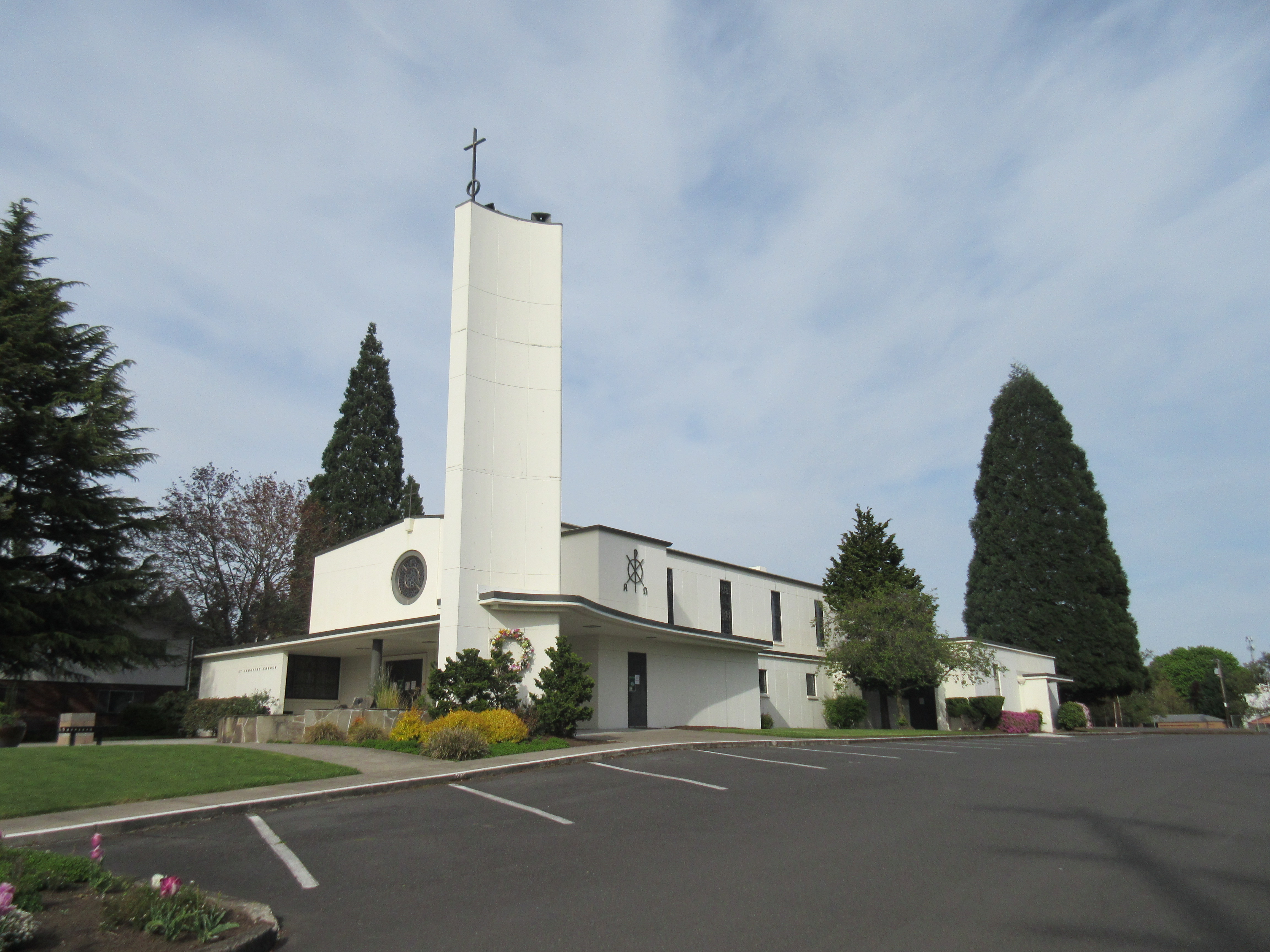
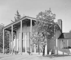 Greatly influenced by the 1936 publication of John Yeon’s Watzek House, Oregon architects began to experiment with wood skins and “Mt. Hood” entry facades reminiscent of Yeon’s design. The idea that wood was symbolic of Northwest character continued through the 1950s and 1960s mid-century modern aesthetics. Local architects like Francis Jacobberger, McCoy & Bradbury, Pietro Belluschi, and others crafter their designs from outside to inside using local species of wood while simultaneously using wood to express the structural elements.
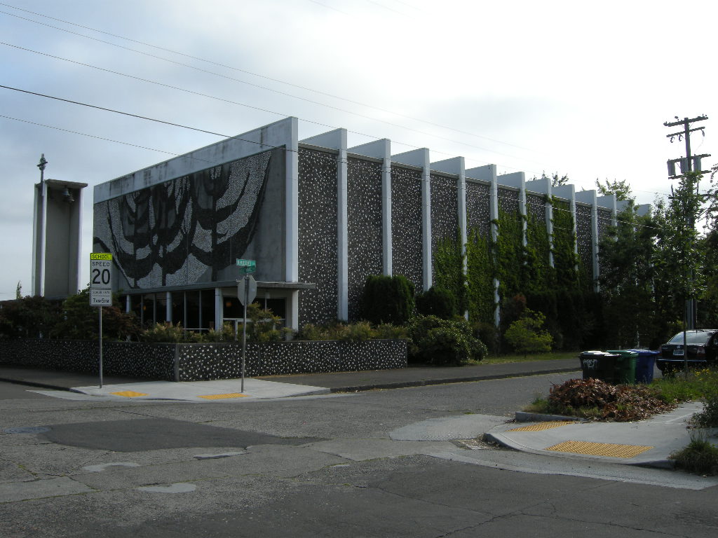
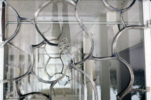 Well known Oregon artists, including Ray Grimm, a ceramists, created the dominating Tree of Life mosaic on the west façade. LeRoy Setziol, the “Father of Wood Carving in Oregon,” created the wood Stations of the Cross and baptismal font. Surprisingly Setziol was commissioned to execute the stained glass windows as well. And Lee Kelly, one of Portland’s best known metal sculptors, enriched the church with delicate displays of metal work both on the interior and exterior. Queen of Peace is a marvelous collaboration of architecture, art, and technical daring creating a wonderful display of Oregon indigenous mid-century religious architecture.
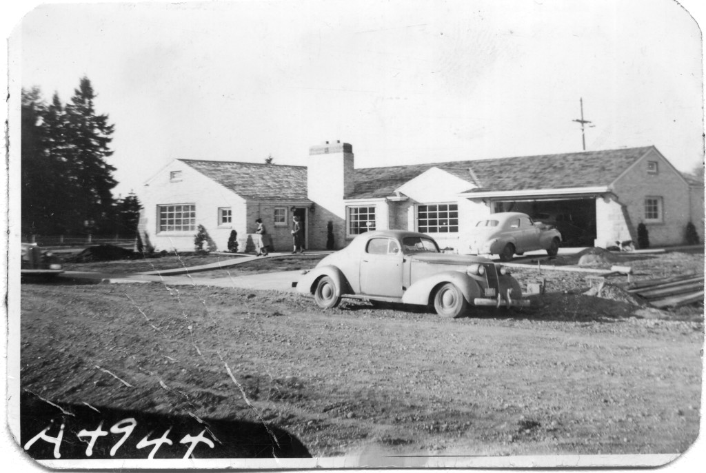 Buildings constructed before 1965 have reached the age of eligibility for being considered historic by the standards of the National Register. That means that much of Modern Architecture, the general period ranging from 1950 through 1970, is historic, or soon will be considered historic as the 50-year mark is crossed. As historians assess and study Modern Architecture, we provide ever more precise descriptions and terms to describe the sub-styles and variations within the large umbrella term, “Modern.” As in taxonomy, which classifies and categorizes living organisms, we can recognize and assign groups of similar resources together for study.
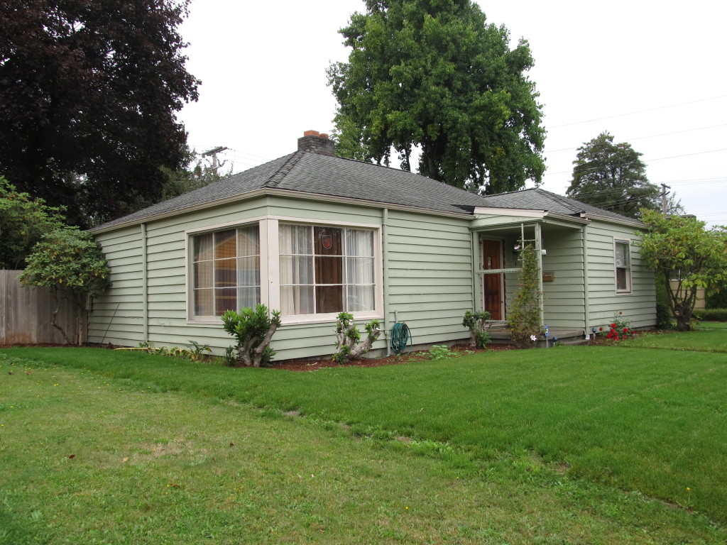
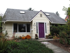 The Olympia survey classified the first grouping of styles as those that are transitional. Transitional Modern styles have some elements of Modern and some elements of more traditional architecture. Windows might be vertically-oriented, double-hung wood windows (traditional) rather than having horizontal proportions (Modern). A roof might be a moderate pitch, with minimal overhangs (traditional), rather than a shallow pitch with outwardly-extending gables (Modern). In Olympia, 37% of the houses surveyed were Modern Minimal Traditional, by far the most prevalent Transitional Modern style.
 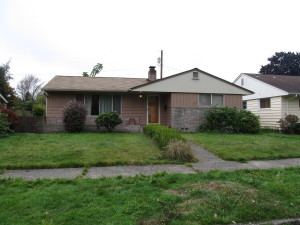 Ranch style architecture is the style that architecture critics have generally spurned, since houses were often constructed by contractors without architect’s involvement. Ranch buildings are broad, one-story, and horizontal in overall proportion. They have an attached garage which faces the street and is part of the overall form of the house, and almost always a large picture window facing the street as well. Cladding is used to accentuate the horizontal lines of the house, so there is often a change in material at the lower part of the front façade- brick veneer was a popular choice. Many of the sub-styles of Ranch architecture are “styled” Ranch houses, meaning that elements from another style of architecture were placed on a Ranch form building. One example is Storybook Ranch, which uses “gingerbread” trim, dormers or a cross-gable, and sometimes diamond-pane windows. Are these decorated sub-styles still part of the canon of Modern Architecture? In many ways, they are more Post-Modern than Modern, but that distinction is worthy of an involved discussion of its own.
 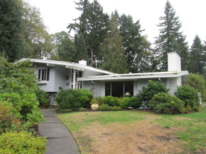 The Olympia Mid-Century Residential survey found over half the resources surveyed to be Ranch or variants of Ranch style. 31% of the surveyed homes were identified as simply Ranch, with another 11% Early Ranch, 9% Contemporary Ranch, 4% Split-Level or Split-Entry, and 4% one of the “Styled” Ranch variations. Sheer numbers alone remind us that the Ranch is deserving of study and shows us how the majority of middle-class Americans lived. As Alan Hess writes in his book Ranch House,
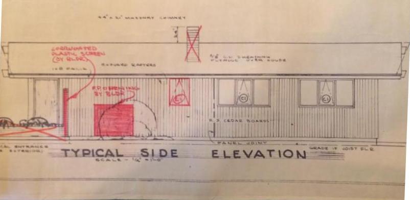

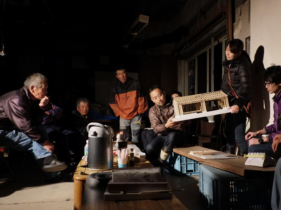
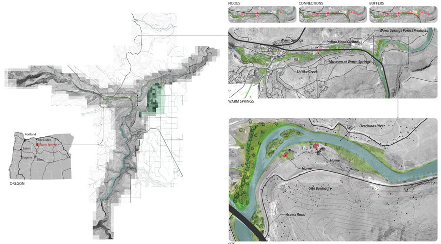 Projects that integrate building science, stewardship planning, and place design are simultaneously exciting and challenging. Any one of the three core concepts can drive the decision making process resulting in a number of solutions. Our current concepts for minimalist eco structures, or “Huts” in the beautiful High Desert of Eastern Oregon are a fantastic challenge.
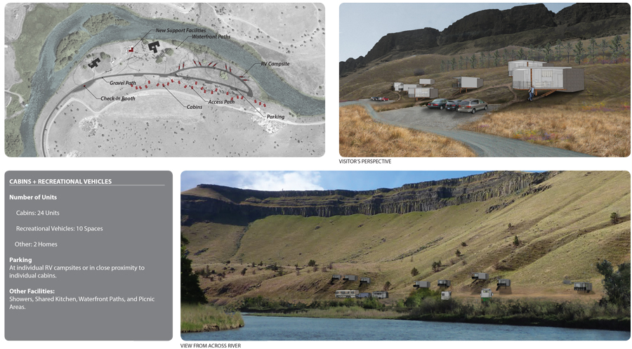 Working with the The Confederate Tribes of Warm Springs, PMA created a prototype model, easily constructed and assembled off site (test fit), then transported to the site and efficiently erected. The prototype was designed to be economical and constructed from lumber from the local lumber mill that produces products from high desert pines. A contemporary design style was chosen to harmonize with existing mid-century Belluschi homes on the property. Both the Belluschi homes and the Eco-Huts stand in contrast with the landscape and topography.
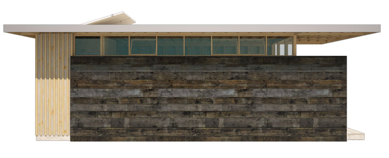
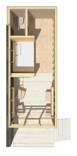
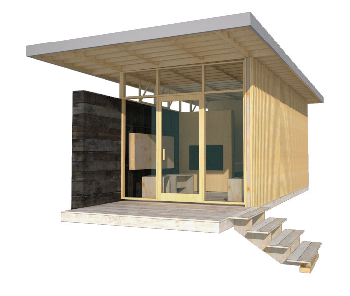 Conceived to have minimal footprints on the land, the Huts rest on piers elevating the floor above the land and accommodating the undulating landscape. A modular dimension was chosen permitting variation in the Eco-Hut sizes. The floor, walls, and roof planes are built off-site and tilted in place. Exterior stained wood material varying from plywood to sawn boards were chosen to harmonize with the High Desert landscape and be of minimal maintenance to the Tribes. Plywood panels are dressed with battens and either in-set from the wood framing or installed flush to the exterior. Sawn mill boards are stained dark desert grey and applied horizontally to create solid side walls atop of which are placed ribbon windows. The primary entry and view wall is a wood frame window and door façade. A deep roof overhang protects the interior from solar gain. Interiors are exposed panel faces or stained mill boards. Partial height walls denote areas of more privacy. The process of assembling the Eco-Huts on-site and disassembling them in the future determined the material pallet of dimensional lumber and pre-assembled wood window walls. The prototype incorporates modular concepts enabling variation in floor plan and amenities in direct response to the Owner’s request for market flexibility.
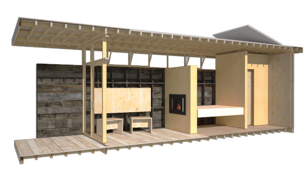 Inherent in our design approach for the Eco-Huts is the creation of design solutions that emphasize the uniqueness of Place. The concept includes Land Restoration and Land Stewardship. PMA’s goals when designing the prototypes was to help enhance the natural beauty of the river edge by integrating a built structure into the landscape that has minimal disturbance to the site and will leave no footprint when removed. Willows, sedges, and juniper will be planted to provide riparian cover along the Deschutes River in an effort to increase fish habitat and mitigate flooding. The plantings will also help mitigate visual impact from the river. The lumber mill site’s river edge offers an opportunity to create an employee park and river restoration replacing equipment storage and log staging. The Eco-Huts offer an opportunity to test the integration of stewardship planning and place design.
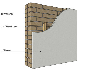
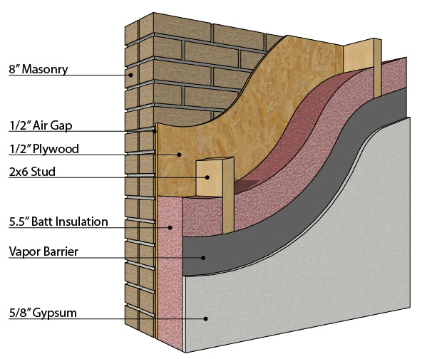
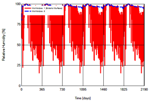
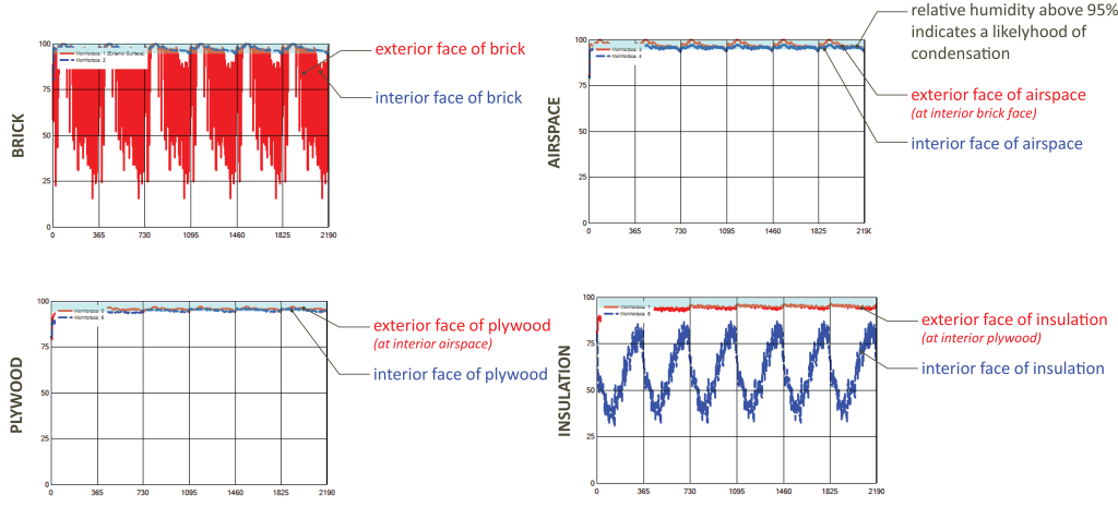
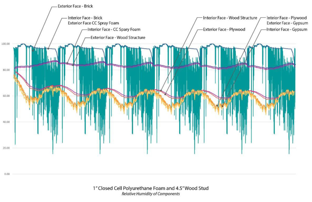
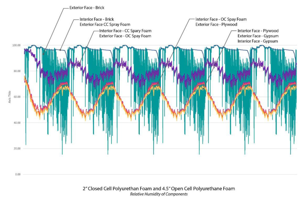
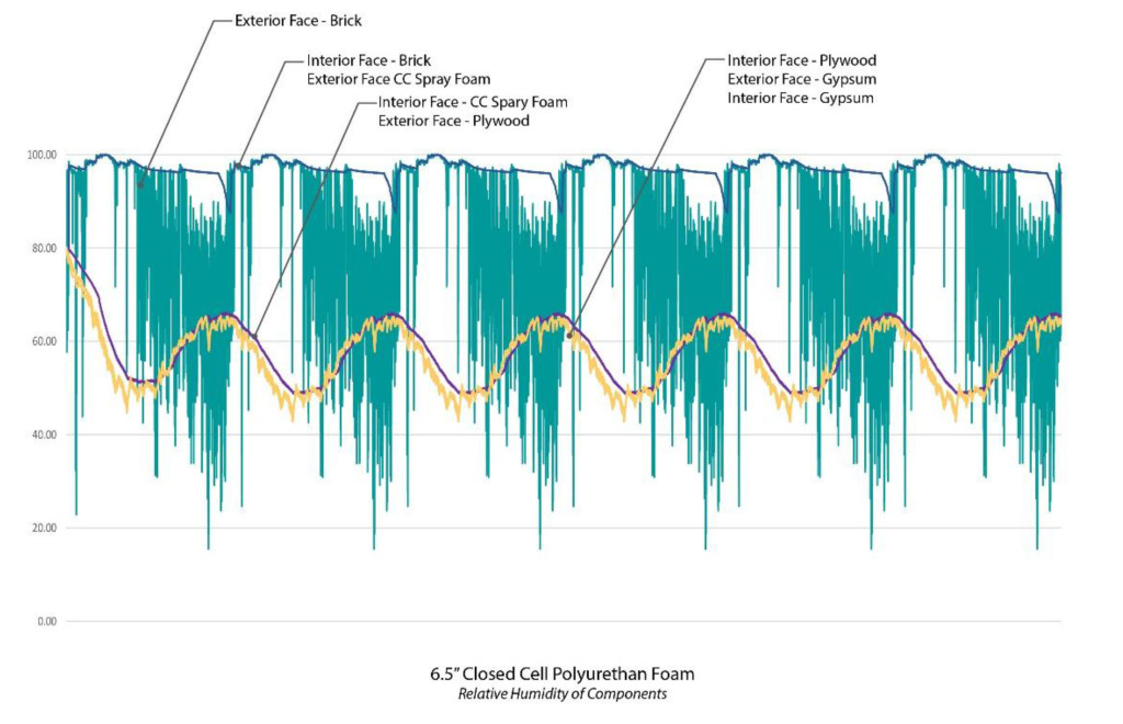
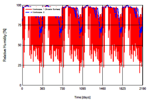 The results of the initial analysis indicated that as might be expected the masonry was not only exposed to longer periods of cool temperatures, it rarely was capable of fully drying. The two charts at the right show the relative humidity in the original construction and the proposed construction where each vertical line marks a calendar year. Note that a relative humidity above 95% indicates a likelihood of condensation. As can be seen in the original construction, during the wet months the relative humidity hovers at about 95%, but drops off significantly during the warmer months. Alternately in the proposed construction the relative humidity rarely drops below 95%, indicating that moisture is present in the masonry almost year round. When the individual layers are examined it becomes clear that in addition to considerable moisture in the masonry itself, water is likely to condense within the wall cavity. As seen in the series of charts below the relative humidity remains high through the airspace and plywood only dropping off between the exterior and interior face of the insulation.
  Given these initial results we suggested a redesign of the insulation system. The existing two wythe wall was not capable of adequately protecting the interior of the building, and the redesign had to accommodate for water infiltration through the masonry. Two options were discussed A) treat the masonry as a veneer wall and install waterproofing to the exterior face of the plywood as a drainage plane or B) install insulation that could be exposed to moisture and water. The constructability of Option A was significantly more complex than that of Option B so our initial analysis focused on Option B.
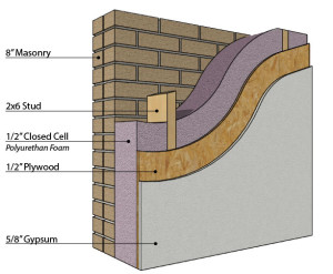
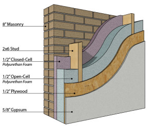 Spray foam was identified as an alternative to the original batt insulation because it can both serve as a vapor retarder and insulate even when exposed to moisture. Two design options were investigated to determine the extent of closed cell foam necessary to adequately protect the interior surfaces from moisture. As can be seen to the right we investigated a construction filled entirely with closed cell polyurethane foam vs. a cavity filled with a combination of closed and open cell polyurethanes. Additionally we looked at the condition of moisture/heat transfer at the perceived weakest point in the structure, where the structural framing was only barely (1/2”) separated from the masonry. The structural integrity of the seismic upgrade depended on a minimal distance between the framing and the existing masonry, but concerns existed as to whether the wood would be exposed to enough moisture to cause mold.
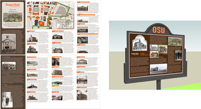
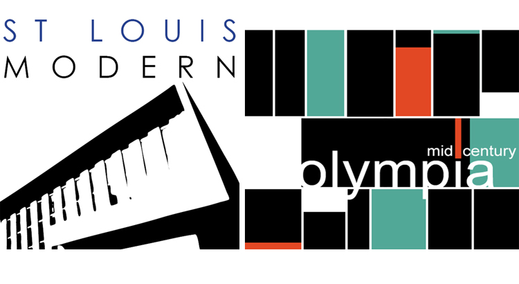 PMA has been involved with several architectural planning projects that center on significant structures from the Mid-Century Modern era. These projects surveyed and documented hundreds of architecturally significant structures that revolutionized architecture and design throughout the 20th century. On the surface such planning projects can be difficult for a wide audience to understand and appreciate because the final project is not a new or renovated building(s). What better opportunity then, for graphic design to communicate and connect the significance of the project and its structures. For these projects, project logos and marketing collateral were designed as the visual symbols that communicate the entire identity of the projects. While both projects surveyed Mid-Century structures one focused on residential structures while the other did not. Both logos use form with text and color to help shape the sense of which type of mid-century modern structures were surveyed.
 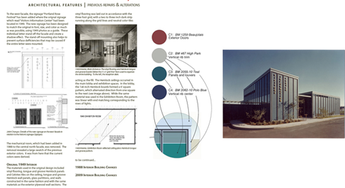 Following our planning projects centered on Mid-Century Modern architecture, PMA provided graphic design services for the renovation of the John Yeon designed Rose Festival Headquarters building (former Visitors Information Center). For this project, typography and color were the focal points for communicating the next chapter in this buildings life-cycle. The new graphics, color, and signage produced pay homage to the original design, while being entirely their own.
