Tag Archives: design

Assessing Union Station to be Part of Our Future

Portland’s Union Station is the only major railroad station built in Oregon, and one of the oldest major extant passenger terminals on the West Coast. From its inception, Union Station has functioned as a major transportation link to Portland and the west coast, with a continued vital role to play in future rail and multimodal transportation planning.
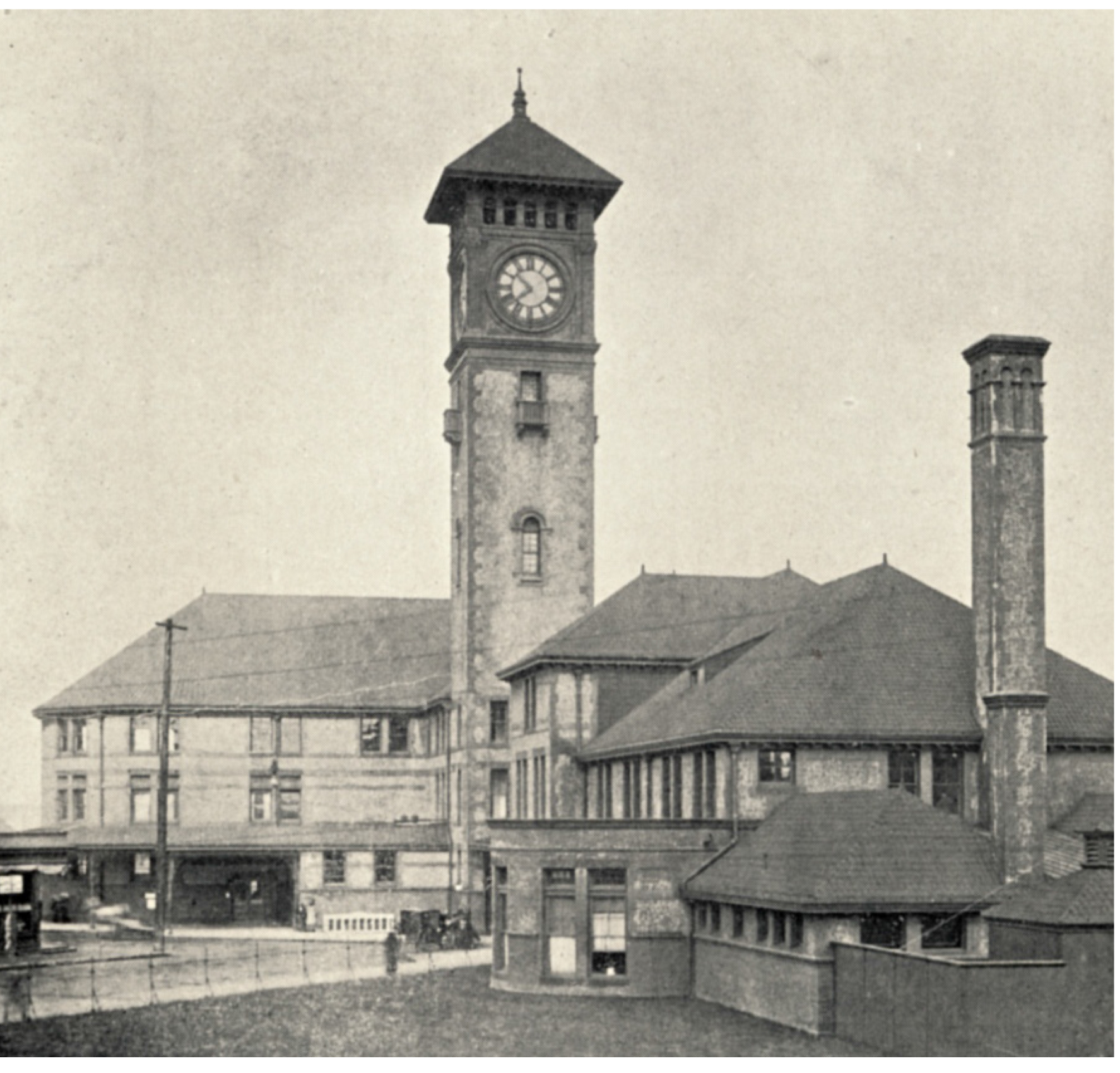
Union-Station-Historic-photo
A Sense of Place
Critical to adapting Union Station, and other historic structures, for current and future use is to thoroughly understand key elements and components that convey the sense of place and rich history of the structure. A deeper understanding enables informed decisions to be made about the potential of key characteristics to remain for future generations. Union Station was constructed between 1892 and 1894 and was designed by Van Brunt & Howe architects in the Queen Anne style with Romanesque detail. From 1927 thru 1930, the Main Concourse was modernized by Portland’s internationally known architect, Pietro Belluschi, to reflect the streamline era of rail technology. Like the original 1892 elements, the Belluschi modernization’s are equally important stories to tell.

Creating a graphic document annotating “changes over time” is an essential tool for evaluating how Union Station has adapted to improvements in rail technology, fluctuations in passenger volume, cultural shifts regarding train travel, as well as modifications to specific architectural elements that impact the historic integrity and interpretation of original design intent.
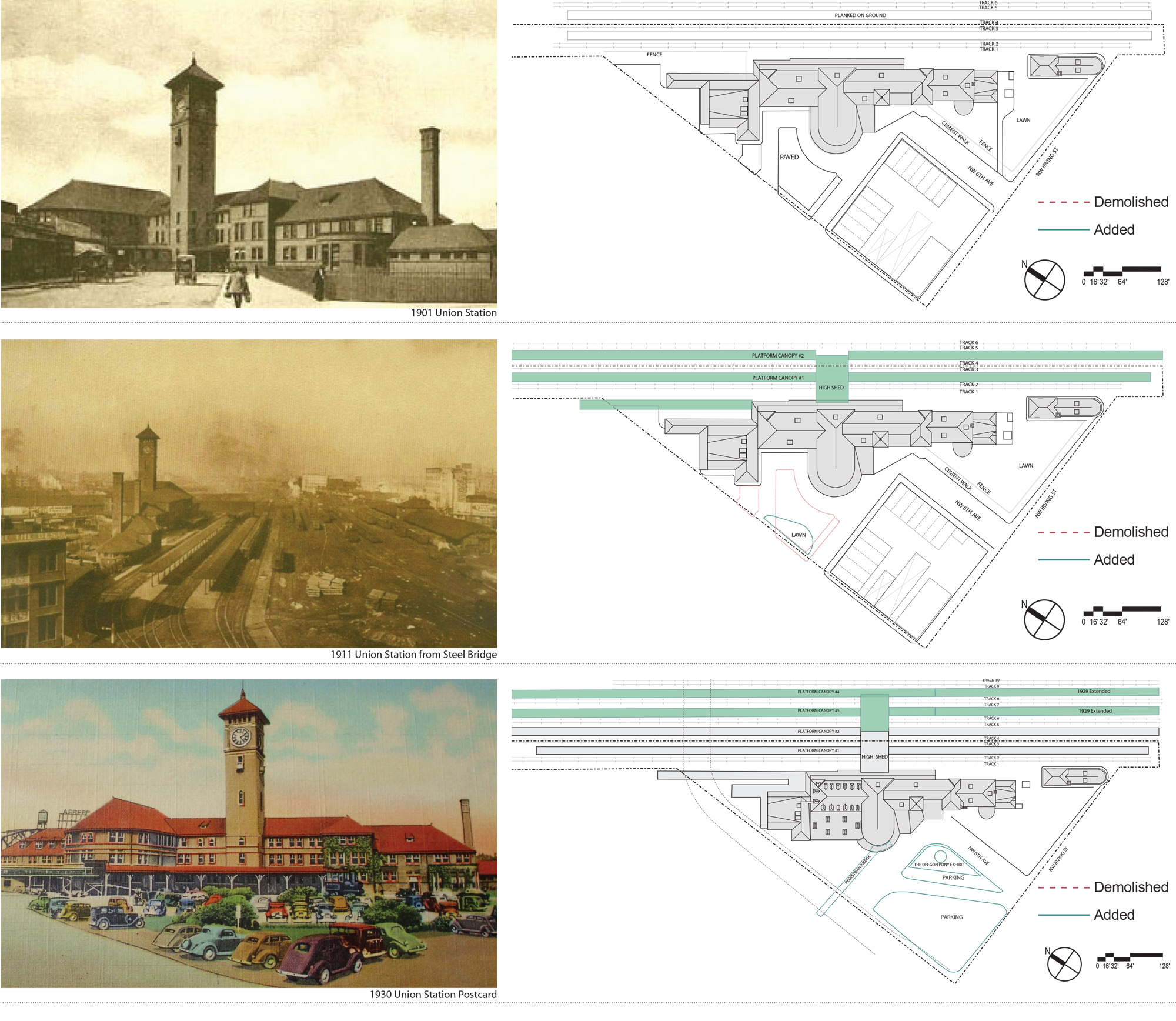
Union-Station-Report-Outline-pg2
Methodology for Assessment
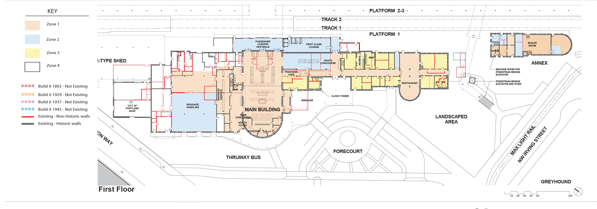
Our method of developing the graphic drawing is to compare historic floor plans and historic photographs to current plans and images through a process of layering plans from different eras over one another and drawing the altered, or missing, elements (e.g. walls, furniture, spaces, etc.) in different colors. This methodology provides an easily interpreted floor plan. The use of color enhances the image and creates a visual record of both changes and original historic fabric. In reading the graphic drawing, it becomes readily discernible that changes include: wood floors replaced with concrete and new floors added; openings in the main concourse were moved and enlarged; the women’s waiting room and toilet were removed to widen the south hall, the stairs were renovated, and a new baggage counter was constructed. The covered concourse was glassed in and a section was made into the First Class Lounge, which remains today. And in the 1940s, a nursery, or crying, room was added.
Union-Station-PMAPDX-drawing
What is fascinating about the history of a building like Union Station, is that the rail lines and street patterns are also integrated with the function and use of the structure and have changed over time as well. The construction of Union Station came soon after Portland was fully connected by rail in 1883 to California, Montana, and rail lines running to the East Coast across the U.S. The Spokane-Portland-Seattle rail connection was finished in 1908. In 1922, Union Station became accessible to all major passenger railroads operating through Portland.

When originally constructed, six passenger car rail lines approached the rear of Union Station. The waiting platform consisted of planks on dirt with no canopy. The block across from Union Station consisted of a small restaurant, bar, other stores, and stables. A five foot iron fence bordered a large lawn and sidewalk to the south and west of the station. The High Shed, a large two-story metal shed was the first canopy built to cover the passenger platforms and extended perpendicular to the station. Under this High Shed, two smaller scale platform canopies were erected paralleling the tracks. A mail canopy was built at the north end of the building in 1915.

By 1920, the block across from Union Station’s main entrance had been converted to parking to relieve congestion. As automobile use increased throughout the city, parking configurations were constantly changing over the years. By 1923, an elevated walkway was built to connect the Broadway Bridge to the main entrance.
union-station-pmapdx-changes-overtime

With the introduction of larger diesel locomotives and potential for high speed rail along the northwest corridor, the track, platforms, and canopies have had to be modified. Safety and accessibility have also driven the need for changes and modernization. Documenting these alterations with graphics, provides a foundation from which to advocate for further refinement while recognizing historic precedent and protection of historic elements.
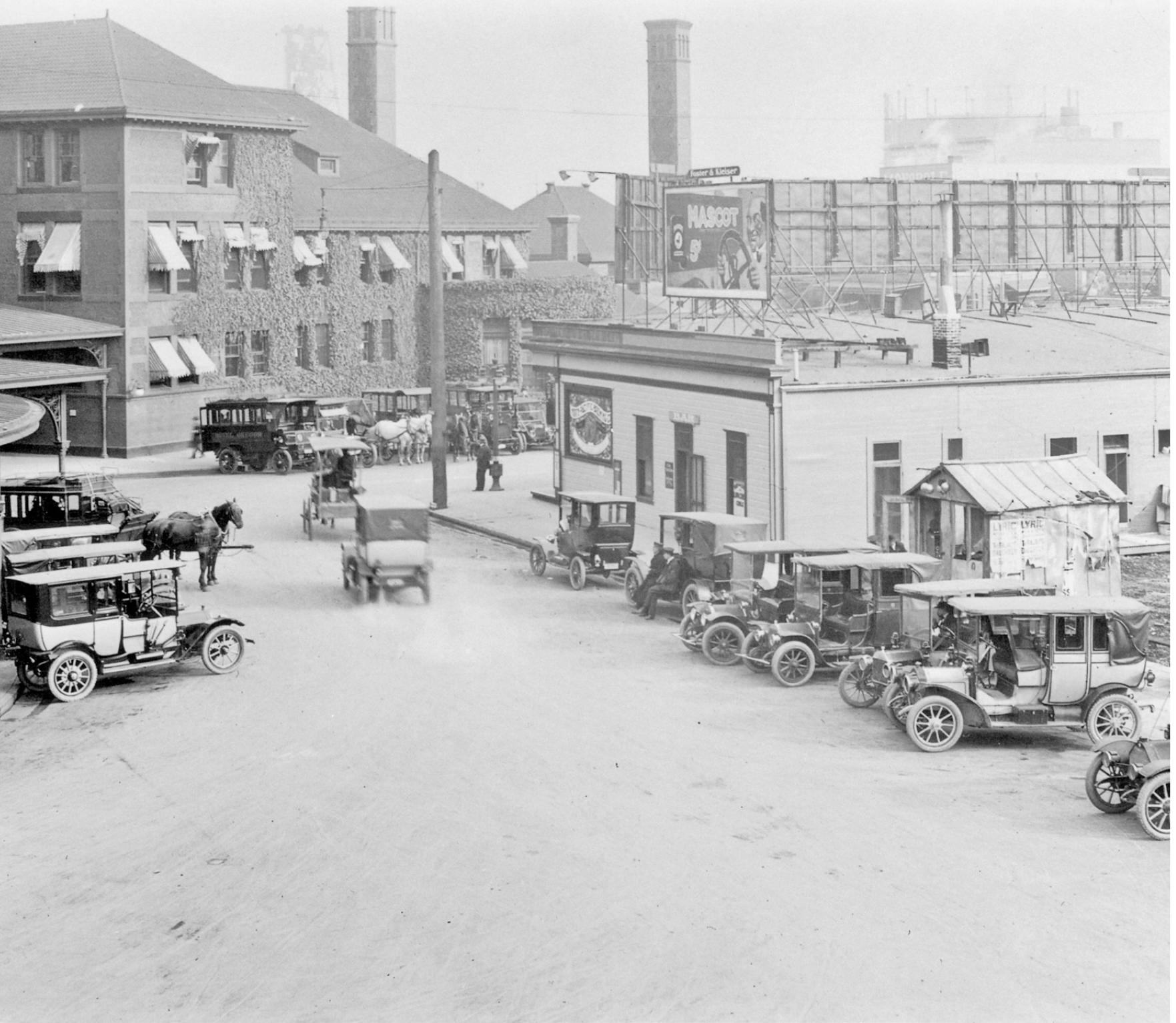
union-station-pmapdx-historic-photo

Written by Peter Meijer, AIA,NCARB, Principal

PMA is part of the DOWA-IBI Group team for this exciting PDC Union Station Renovation Project.

Indigenous Mid-Century Religious Architecture of Oregon

During the 1960s Oregon architects, led by the Portland Archdiocese, created significant examples of unique mid‐century churches and religious structures in collaboration with local craftsman, artists, and influenced by European examples, resulting in a unique indigenous religious Modern Oregon style.

Indigenous Mid-Century Religious Architecture of Oregon

Oregon has several examples of unique mid-century churches and religious structures. Oregon is also rich in mid-century religious architecture that are unique examples of the community and/or church leadership’s interest in combining modern architecture with modern art.
During the late 1930’s Oregon architects were seeking ways to meet both the liturgical programs of their clients yet express the architecture using materials evocative of the Northwest.

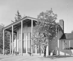
Watzek-houseGreatly influenced by the 1936 publication of John Yeon’s Watzek House, Oregon architects began to experiment with wood skins and “Mt. Hood” entry facades reminiscent of Yeon’s design. The idea that wood was symbolic of Northwest character continued through the 1950s and 1960s mid-century modern aesthetics. Local architects like Francis Jacobberger, McCoy & Bradbury, Pietro Belluschi, and others crafter their designs from outside to inside using local species of wood while simultaneously using wood to express the structural elements.
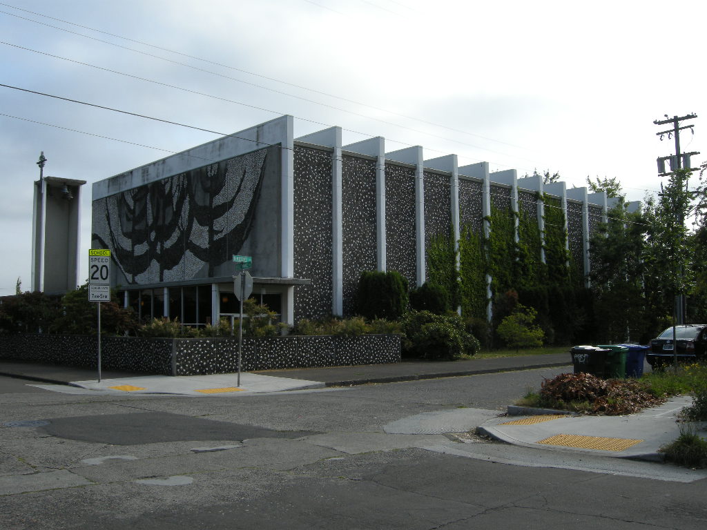
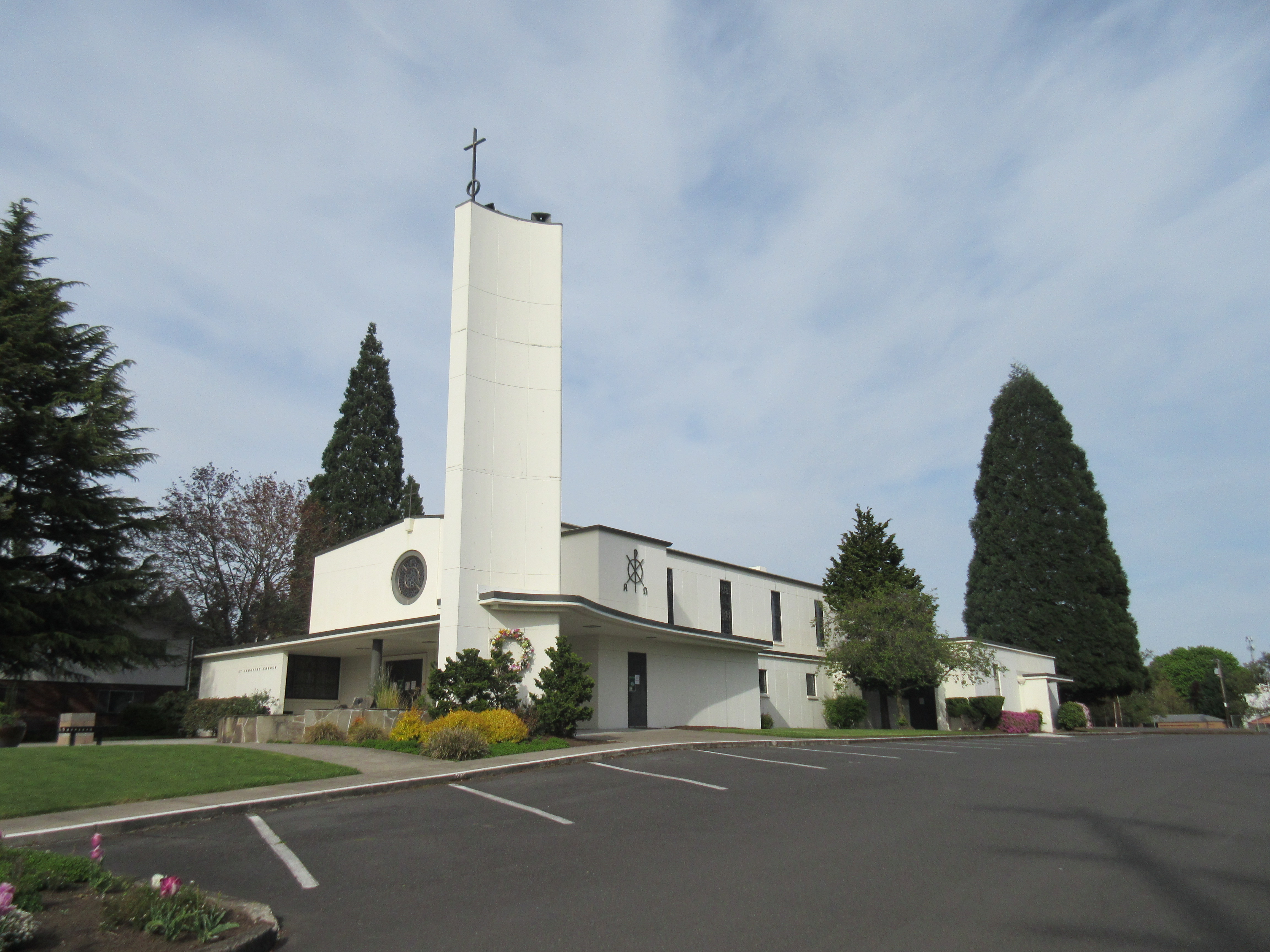
During the 1950s and 1960s, architectural journals devoted pages and images to the increasingly innovative use of concrete as both a structural element and aesthetic material. Local Oregon firms too experimented with concrete. John Maloney’s 1950 design for St. Ignatius is executed entirely of formed concrete. The exterior, interior, and the bell tower are unabashedly presented as an aesthetic material worthy of religious structure. Maloney deliberately painted the interior white to match the exterior and emphasize the versatility and economy of concrete, the new material of choice.

Queen of Peace
One of the most unique indigenous examples of Oregon religious architecture is the Queen of Peace in north Portland. Queen of Peace combines both the engineering daring of concrete with the creative influences from local artists. Queen of Peace is created with clay, river stone, and stunning minimalist concrete structure.

120715 N Portland Church 001

Queen of Peace was influenced by Friar John Domin who served the Portland Archdiocese as a priest for 57 years, as a pastor of several parishes, a high school art teacher, and volunteer at the Art Institute of Portland. As Chairman of the Sacred Art Commission of the Archdiocese of Portland, he actively engaged in the design process of churches and chapels. He worked with architects and hired ingenious liturgical artists who worked in a variety of media to enhance churches with stunning sacred art. ” (Sanctuary for Sacred Arts website)

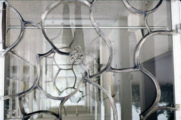
bronze-entry-doors-queen-of-peaceWell known Oregon artists, including Ray Grimm, a ceramists, created the dominating Tree of Life mosaic on the west façade. LeRoy Setziol, the “Father of Wood Carving in Oregon,” created the wood Stations of the Cross and baptismal font. Surprisingly Setziol was commissioned to execute the stained glass windows as well. And Lee Kelly, one of Portland’s best known metal sculptors, enriched the church with delicate displays of metal work both on the interior and exterior. Queen of Peace is a marvelous collaboration of architecture, art, and technical daring creating a wonderful display of Oregon indigenous mid-century religious architecture.
Written by Peter Meijer AIA, NCARB, Principal. This post is an excerpt from Peter’s presentation at this year’s DoCoMoMo_US National Symposium: Modernism on the Prairie. Peter is the President and Founder of DoCoMoMo_US Oregon Chapter. For more information, please visit: DoCoMoMo-US

Design Through Nonprofits

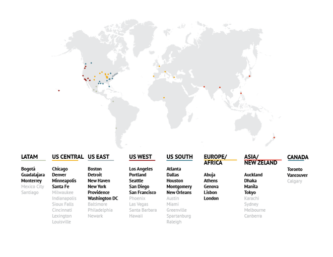
1.	Architecture for Humanity Chapter Network – 30 remaining chapters after the bankruptcy

Architecture for Humanity Chapter Network – 30 remaining chapters after the bankruptcy

There are several non-profit organizations that provide pro bono design and architectural services to communities through volunteer networks. All have the common goal of breaking down the barriers to accessing design. As a volunteer for Architecture for Humanity (AFH), I continually ask myself, how can these organizations better serve the community? What can we do to provide incentives for architects to do pro bono design or become volunteers? And, how can we differentiate these similar non-profits to cater to specific causes and volunteer groups? In addition to these important questions, Architecture for Humanity has recently filed for bankruptcy, and the even bigger question is what is next for AFH? And does this foreshadow the unfeasibility of non-profit design?

The answer is there is much to come! If anything it foreshadows a new beginning!
In the wave of the bankruptcy, all intellectual property including the name Architecture for Humanity and slogans like Design Like You Give a Damn, and the website including the Open Source Network have all become property of the bank. I will speak about the organization in past tense because technically it no longer exists. For those who are unfamiliar, Architecture for Humanity’s core mission was “[AFH] believes everyone deserves access to the benefits of good design.” Their publication Design Like You Give a Damn popularized pro bono work and disaster relief design efforts. Architecture for Humanity promoted a unique idea of crowd sharing design ideas for disaster relief through their Open Source Network, which could then be accessed by communities in need. The goal was to provide design solutions to communities in need that couldn’t afford the time and energy required to solve rebuilding design problems. Reconstruction projects after disasters are typically poorly designed and don’t respond to community socio-cultural and economic needs. Architecture for Humanity strove to solve this dilemma through a worldwide network of designers volunteering their time and ideas. Architecture for Humanity had local chapters that addressed local communities’ efforts instead of global disaster relief. Local chapters focused on creating the resiliency within communities.

My involvement in Architecture for Humanity started with the Hurricane Katrina disaster when our Clemson University studio began designing and fabricating a disaster-relief housing prototype in New Orleans. This was added to the Open Architecture Network (OAN) with the hope that the prototype could be a solution to the rebuilding effort. Like most of these projects, efforts were stifled by the bureaucracy of disaster relief. Since then, I have been volunteering for the past four years on small community projects through the AFH Portland Chapter.

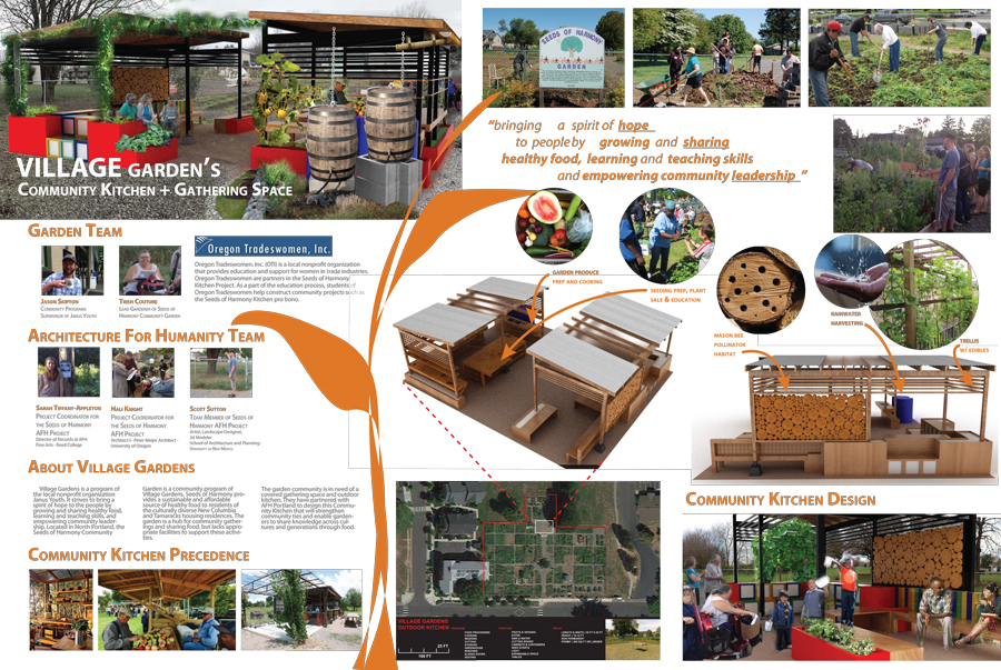
Janus Youth’s Village Garden pavilion – Designed and built by AFH PDX Chapter in collaboration with Oregon Tradeswomen

Janus Youth’s Village Garden pavilion – Designed and built by AFH PDX Chapter in collaboration with Oregon Tradeswomen


As a result of the AFH filing for bankruptcy, the AFH core headquarters has collapsed leaving the chapter network to reorganize and create a new identity. The intellectual property of AFH, including the name and website and the OAN are all property of the bank. Of the 57 original chapters, 30 chapters are moving forward to continue on AFH’s path. A transitional steering committee has been formed with representatives from every region and will form an advisory board that will set the stage for self-governance and strategic partnerships. It is also interesting that AFH originally never intended to have a chapter network. Those who were inspired by the cause took it upon themselves to create local chapters and AFH agreed to allow these satellite chapters to become part of the organization. As one of the directors of the Portland chapter, I have been participating in re-imagining our mission statement and goals, looking for new opportunities to connect with other non-profits, and reaching outside of architecture to include all design fields. We can also learn from other design non-profits such as Public Architecture and Architects without Borders.

Non-profit design work has received some skepticism of whether a sustainable business model can be reached surrounding the bankruptcy of AFH. AFH’s vision was so powerful, that the non-profit grew exponentially in its original years. For an organization that relied heavily on donations to keep running, the stability was compromised when donations waned and AFH struggled to keep the headquarters office funded. The rapid growth seemed to be a large cause of the sudden deficit. Many contribute the downfall to an unsustainable business model, increased competition for financing, and the founders not being able to adapt their vision to a changing market. The press skeptics raise the question of whether donors will be reluctant to contribute to similar non-profits after the collapse of AFH. Cameron Sinclair, AFH’s founder, responds to this criticism well by saying “I don’t think the idea of architects doing humanitarian work is a failure because AFH ended, I think it will be a failure if architects realize they don’t care.” The committed 30 chapters are determined to carry on with or without support for large donors because they have support of their dedicated volunteers.

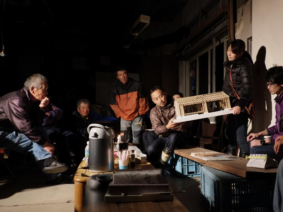
AFH Headquarters project - Maeami-hama Community House, 2012 – Community design input for post-disaster rehabilitation

AFH Headquarters project – Maeami-hama Community House, 2012 – Community design input for post-disaster rehabilitation


There are many lessons to be learned as the remaining volunteers of AFH move forward to re-envision the organization. The future is still unclear, but the chapter network will learn from headquarters’ shortcomings. The business model will be changed, the organization of the network will no longer rely on a head chapter, and the projects might become more localized and financially sustainable. The bankruptcy has made the network of chapters stronger and our communication with each other has enabled continued enthusiasm for the cause. It is an exciting future for everyone involved because we are all included in the organization’s recreation. The Portland Chapter hopes to explore ways we can best connect communities to design. We want to provide the guidance and knowledge of design language and mediums to enable community visions.

I hope this can be a reminder on how important design and architecture are to creating vibrant communities. Organizations like AFH, Public Architecture, and Architects without Borders are all striving to bring greater accessibility to design. These organizations bring professionals closer to their community, give students and emerging professionals design and management experience, and help communities solve their design needs. The remaining chapters, consisting of thousands of volunteers around the world, are committed to providing pro-bono design services, advocacy, and training within our local communities. The next question to be asked is how can the AEC community be supported in ways that enable more professionals to provide accessible design?

Written by Hali Knight, Architect I

Sustainable Housing: High Desert Design

Eco-Huts for Warm Springs Tribes

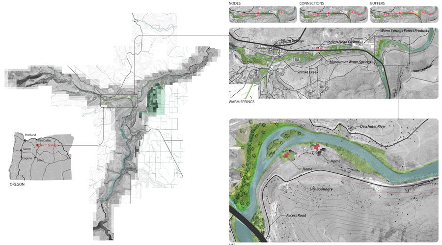
Warm-Springs-ProForma-pmapdx-designProjects that integrate building science, stewardship planning, and place design are simultaneously exciting and challenging. Any one of the three core concepts can drive the decision making process resulting in a number of solutions. Our current concepts for minimalist eco structures, or “Huts” in the beautiful High Desert of Eastern Oregon are a fantastic challenge.
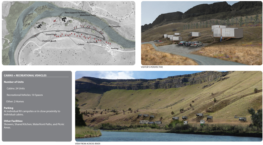
PMA was provided an opportunity to create temporary Eco-Huts for both the avid fly fishing community and also the vacationer seeking solitude and natural beauty. The site is nestled on the right bank along a gentle curve of the Deschutes River adjacent to the Warm Spring Tribe Reservation. The site topography has a shallow slope towards the river with basalt escarpments forming the river valley. Landscape species include juniper, white pines, native grass, lavender, and wild flowers.

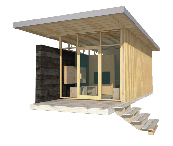
Warm-Springs-ProForma-pmapdx-designWorking with the The Confederate Tribes of Warm Springs, PMA created a prototype model, easily constructed and assembled off site (test fit), then transported to the site and efficiently erected. The prototype was designed to be economical and constructed from lumber from the local lumber mill that produces products from high desert pines. A contemporary design style was chosen to harmonize with existing mid-century Belluschi homes on the property. Both the Belluschi homes and the Eco-Huts stand in contrast with the landscape and topography.
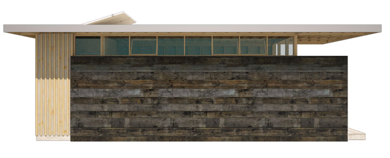
Elevation-pmapdx-design

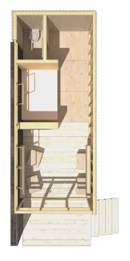
Perspective-pmapdx-designConceived to have minimal footprints on the land, the Huts rest on piers elevating the floor above the land and accommodating the undulating landscape. A modular dimension was chosen permitting variation in the Eco-Hut sizes. The floor, walls, and roof planes are built off-site and tilted in place. Exterior stained wood material varying from plywood to sawn boards were chosen to harmonize with the High Desert landscape and be of minimal maintenance to the Tribes. Plywood panels are dressed with battens and either in-set from the wood framing or installed flush to the exterior. Sawn mill boards are stained dark desert grey and applied horizontally to create solid side walls atop of which are placed ribbon windows. The primary entry and view wall is a wood frame window and door façade. A deep roof overhang protects the interior from solar gain. Interiors are exposed panel faces or stained mill boards. Partial height walls denote areas of more privacy. The process of assembling the Eco-Huts on-site and disassembling them in the future determined the material pallet of dimensional lumber and pre-assembled wood window walls. The prototype incorporates modular concepts enabling variation in floor plan and amenities in direct response to the Owner’s request for market flexibility.
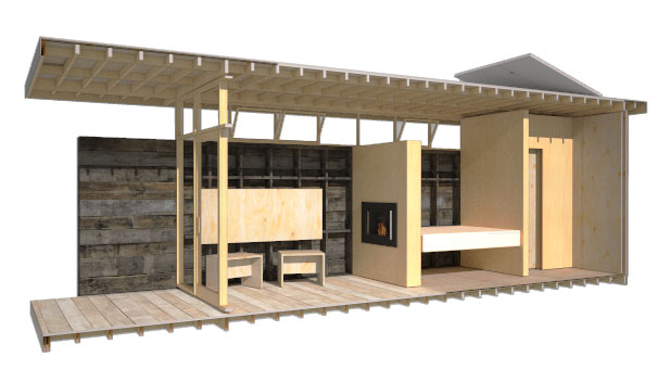
Section-pmapdx-designInherent in our design approach for the Eco-Huts is the creation of design solutions that emphasize the uniqueness of Place. The concept includes Land Restoration and Land Stewardship. PMA’s goals when designing the prototypes was to help enhance the natural beauty of the river edge by integrating a built structure into the landscape that has minimal disturbance to the site and will leave no footprint when removed. Willows, sedges, and juniper will be planted to provide riparian cover along the Deschutes River in an effort to increase fish habitat and mitigate flooding. The plantings will also help mitigate visual impact from the river. The lumber mill site’s river edge offers an opportunity to create an employee park and river restoration replacing equipment storage and log staging. The Eco-Huts offer an opportunity to test the integration of stewardship planning and place design.
Plan-pmapdx-design

Written by Peter Meijer AIA,NCARB, Principal

Graphic Design and Architecture

Graphic design is a communication tool that plays an important role in architectural design. At its most fundamental level, graphic design visually communicates information with typography, color, and form. It also, and perhaps more importantly, influences our interaction with and the identity of place and space. From way-finding signage, supergraphics, branding, material and texture, to motion-graphics, graphic design helps integrate word and content with architecture.

Graphic design is used to visually communicate and reinforce the sense of identity for architectural projects – including both new design, renovation, and planning projects. From logo design, visitor orientation and infographics, graphic design is an integral part to the sense of place. It affects the overall experience with the visitor, public, or inhabitant. It is also dependent on the architectural design. Think of the range of materials and its finishes used through-out a building. Graphic design must be intentional, otherwise chaos results in color, type, and form within the design struggling against the architectural design, materials and texture.

OSU-Example-pmapdx-graphic-design
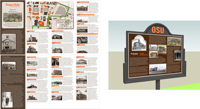
PMA has had the pleasure of incorporating graphic design into projects. The most notable projects have included graphic design for way-finding signage and project branding. For Oregon State University (OSU) PMA created a campus-wide Historic Preservation Plan which included a Historic District, and the design of historic district signage, interpretive panels, and a campus walking tour brochure. We use way-finding signage daily to quickly distinguish different spatial areas, direction, and to distinguish landmarks. The way-finding signage produced for OSU was created to distinguish the campuses Historic District from other campus areas, which included a walking tour of its historically significant campus buildings. Color was utilized as the mnemonic devise to distinguish the Historic District, while also seamlessly integrating with existing OSU colors.

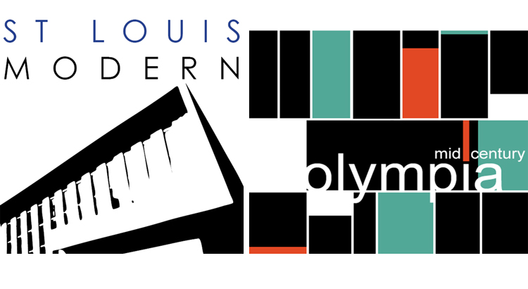
MCM-Logos-Example--pmapdx-graphic-designPMA has been involved with several architectural planning projects that center on significant structures from the Mid-Century Modern era. These projects surveyed and documented hundreds of architecturally significant structures that revolutionized architecture and design throughout the 20th century. On the surface such planning projects can be difficult for a wide audience to understand and appreciate because the final project is not a new or renovated building(s). What better opportunity then, for graphic design to communicate and connect the significance of the project and its structures. For these projects, project logos and marketing collateral were designed as the visual symbols that communicate the entire identity of the projects. While both projects surveyed Mid-Century structures one focused on residential structures while the other did not. Both logos use form with text and color to help shape the sense of which type of mid-century modern structures were surveyed.
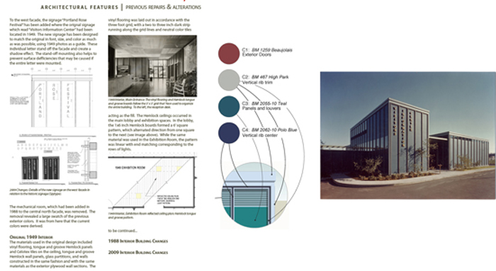
John-Yeon-Example-pmapdx-graphic-design Following our planning projects centered on Mid-Century Modern architecture, PMA provided graphic design services for the renovation of the John Yeon designed Rose Festival Headquarters building (former Visitors Information Center). For this project, typography and color were the focal points for communicating the next chapter in this buildings life-cycle. The new graphics, color, and signage produced pay homage to the original design, while being entirely their own.
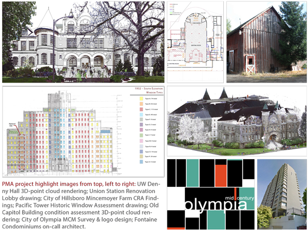
Graphic design is an essential component to architectural design. It is a visual communication tool that utilizes typography, color, and form as a way to influence our interaction with and provide a sense of identity of place and space. Graphic design can solve important issues such as spatial orientation within a space, or by using graphic tools to communicate story-telling and identity. For a more in-depth look at our projects incorporating graphic design, please visit our OSU and STL Modern project pages.

Written by Kate Kearney, Marketing Coordinator

Practices for Preserving Post Modernism

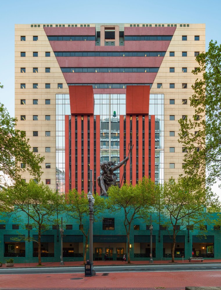
Post Modernism, a style of architecture beginning in 1965 with the publication of Robert Venturi’s Complexity and Contradiction in Architecture and extending to 1989, has always elicited great public debate on the architectural merits of its built works perhaps best exemplified in the controversy over one of the most iconic Post Modern buildings, Michael Graves’ Public Service Building (aka the Portland Building).
portland-building-NR-nom-pmapdx

Whether or not Post Modern architecture is considered merely flamboyant superficial decoration or serious building design and genuine work is greatly debated. The debate, beginning a mere thirty years after the apex of the style, has arrived sooner than expected and focuses on the distinction between design and architecture. Whether or not the materials and assemblies used to construct the buildings are impermanent remain to be assessed, understood, and judged over a longer duration of time. Therefore, are material conservators and preservation technologists ready (and willing) to contribute a scientific approach and unbiased assessment to a controversial debate over a design style?

Post Modern design was broadly practiced in both the United States and internationally. Large and small firms were attracted to the stylistic incorporation of classical western design vocabulary in stark juxtaposition against the plain, unadorned, square box that many argued architecture had become. Design magazines published examples of Post Modern buildings ranging from the academic and scholar approach by architects like the Italian Aldo Rossi to the flamboyant American style creator Philip Johnson, as well as, buildings by architects only known on local and regional levels.
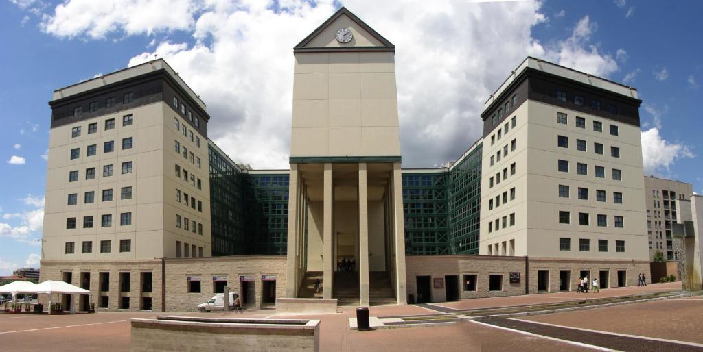
panorama

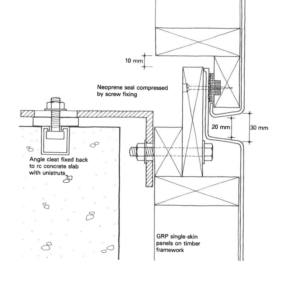
Architects, engineers, and material suppliers were pushing new materials and innovative construction technologies as a way to create Post Modern design elements. Continuous innovation in building skins reintroduced porcelain enamel panels, a product brought by Lustron to the building industry during the housing boom following World War II. New skins made from Glass Fibre Resin (GFR) capable of being molded in classical curves and ornamental shapes favored by Post Modern design were created. Innovations in brick technology including large scale brick panels made from a single wythe of masonry to panels whose outer face was only one half inch of masonry, or thin bricks. Improvements in resins created new wood or simulated wood products and adhesives for mounting faux finishes to structural systems. Perhaps one of the more ubiquitous new materials used in the creation of Post Modern architecture was the faux stucco product Dryvit, and Exterior Finish Insulation System (EIFS). Like porcelain enamel panels, EIFS were introduced as insulated wall assemblies as a means to improve energy performance during the world’s energy crisis of the 1970s.
141013 APT Assemblies 2

As Post Modern buildings reach thirty and fifty years, systems and products are aging and, like all older buildings, significant investments or improvements to infrastructure systems are often needed. Compared to more recent material innovations, Post Modern building performance levels are low and some of the innovative materials resulted in long-term material failures. As it is with any building skin, often the deficiencies of one material are in combination with more robust materials or the failing components are critical to the character defining features of the Post Modern design. And when material failure is coupled to design aesthetics and those aesthetics do not offer universal appeal, questions arise as to the merits of retaining the component. But should subjective opinions about design, a very personal matter compared to one’s appreciation of art, drive decisions to preserve or demolish a building? And when the building carries international recognition as a work of architecture, or as a work that defines the Post Modernism, should more resources be given to its preservation? Does the inherent impermanence of the original materials justify an approach of non-preservation as preservation? Many Post Modern buildings incorporate systems or components that are neither produced nor currently assembled in similar manners due to improvements in technology and building envelope science. Therefore, the process and method of building envelope repair could dramatically impact the exterior character of Post Modern structures.
Ext Ceramic tile
Is the proper approach to retain the essence of criticism towards Post Modernism by preserving the appearance of insubstantial material installed incorrectly? Proposals to improve envelope performance of both the individual components and building systems are challenged in finding products that will both improve performance and retain the aesthetics of a Post Modern building. Like previous building styles and periods, the preservation of character defining elements that were originally inadequately or incorrectly produced or assembled has always been a source of preservation controversy. In preservation and the undersized windows of the Portland Building are defining elements of the Post Modern design. The preservation community should be prepared to participate in discussing the merits of Post Modernism. The conversation has begun.

Written by Peter Meijer AIA, NCARB, Principal.

Veterans Memorial Coliseum: Portland’s Architectural Jewel

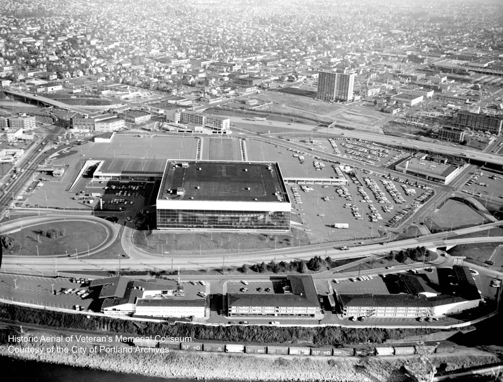
Historic Aerial of Memorial ColiseumPresently, the City of Portland awarded a contract for Spectator Facilities Construction Project Management Services for a yet unnamed Veterans Memorial Coliseum project. The city is preparing for potential renovation scenarios. The uncertain future of the Coliseum feels like déjà vu.
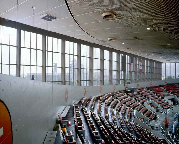
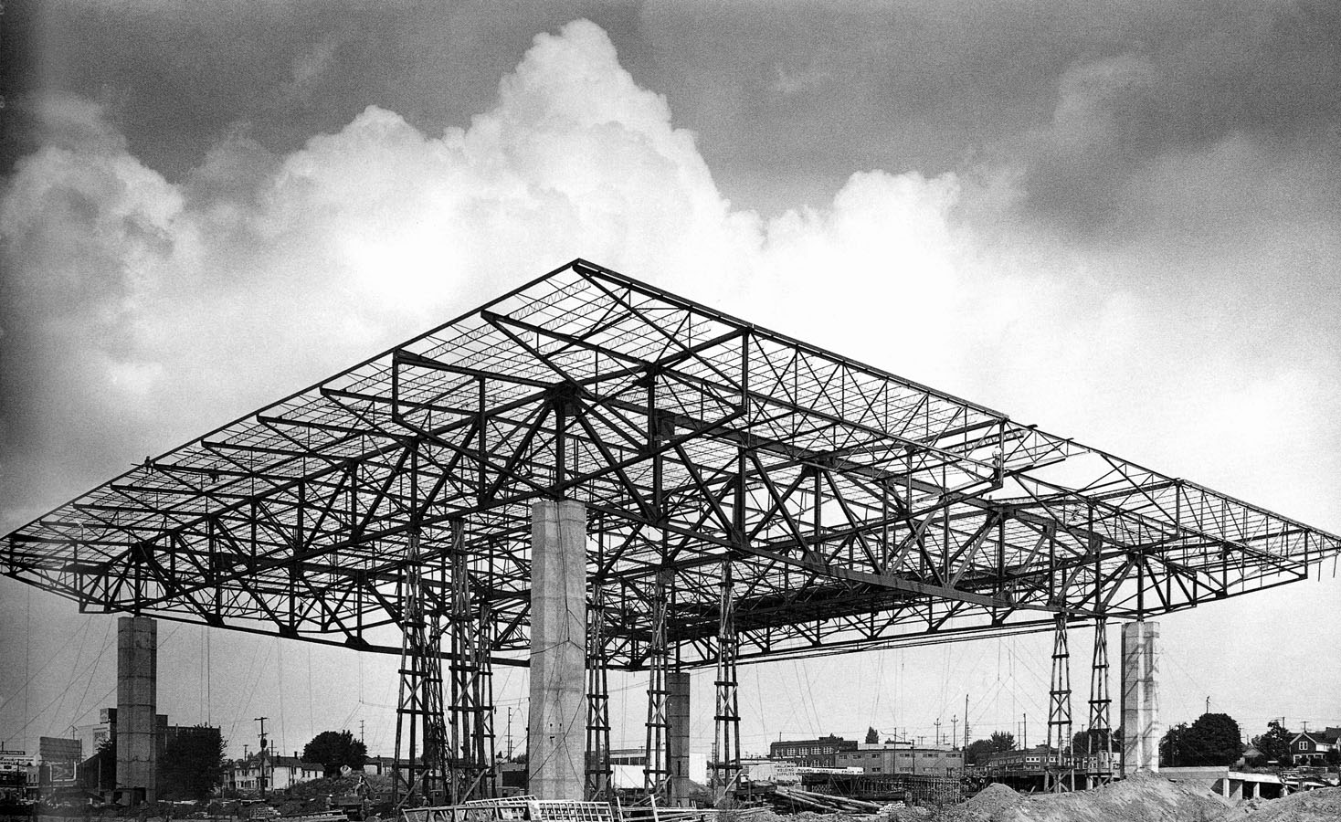
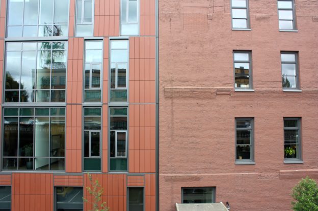
Portland’s Veterans Memorial Coliseum, designed by Skidmore, Owings & Merrill (SOM) and built between 1960 and 1961, is a premier jewel of International Style modernism in the city. The structure consists of glass and aluminum, a non-load-bearing curtain wall cube with a central ovular concrete seating area. It is a true engineering and architectural masterpiece that offers uninterrupted panoramic views of Portland from the seating area. The Veterans Memorial Coliseum is also a war memorial, featuring exterior sunken black granite walls inscribed with the names of veterans in gold paint.

At its completion it was the largest multipurpose facility in the Pacific Northwest. And a significant structure within the larger urban planning Rose Quarter Development project. In 2009 the city of Portland proposed to demolish the Coliseum to make way for a new sports facility. The greater community of Portland, including architectural preservationists and historians, successfully applied for National Register of Historic Places status for the building. In 2011 it was placed in the National Register.

Portland’s Veterans Memorial Coliseum is a phenomenal renovation opportunity from both historic and economic perspectives.
VMC-preservation-pmapdx

Despite being listed in the National Register, built during an era of urban and planning reform that advocated for the latest in building technologies, and designed by one of our countries leading modernist firms, many challenge its architectural value. The Coliseum shows the remarkable and collaborative approach towards design and construction by SOM. It is also the only arena world-wide with a 360-degree panoramic view from the seating area. Consider the inability to experience this modern architectural marvel and war memorial firsthand. Simply put, the demolition of the Veterans Memorial Coliseum would be a loss to the city.

Concerns regarding its deferred maintenance and historic materials are often attached to the illogical demolition conclusion because the building does not meet specific 2014 building codes. It is possible to integrate new building technologies while retaining the building’s exterior and interior character defining features. Unfortunately, significant modernist architecture designed by influential architects in the 1950s-1970s have not been regarded with proper facility maintenance. Deferred maintenance has its price. Regardless of building age, if a structure is not properly maintained it will fall into disrepair. Thankfully, Portland has a robust AEC industry dedicated to solving design challenges.

As a city, Portland boast’s its commitment to living green and investing in sustainable practices throughout the greater community. The renovation of the Veterans Memorial Coliseum is exactly the type of project that would highlight our city’s commitment to sustainability. There is no greener option than renovating and reusing existing architectural resources. This renovation would also economically benefit the city by boosting investment around the Rose Quarter area. Potentially extending and overlapping with the renewed development interest in the Lloyd District. Portland could have two premier sports facilities, doubling the city’s ability to provide world-class sports and entertainment events. It is a renovation project with long term urban renewal benefits.
VMC-construction-preservation-pmapdx
Veterans Memorial Coliseum is an internationally recognized architectural masterpiece. Its architectural legacy is deeply intertwined within Portland’s socio-economic and cultural heritages. Portland must learn from the recent demolitions of modernist architectural marvels like Prentice Women’s Hospital, several Paul Rudolph buildings, and the forthcoming Astrodome. Threats to our modern architecture is a threat to our architectural heritage. It is time to celebrate the last fifty years of Portland’s international jewel with a thoughtful renovation that looks ahead to the city’s next fifty years of architectural history.

Written by Kate Kearney, Marketing Coordinator

Mercy Corps North Facade (Viewing Southeast)

Mercy Corps World Headquarters Renovation

The historic Packer Scott building, now the World Headquarters for Mercy Corps, had significant damage to the original masonry resulting from inappropriate sand blasting cleaning techniques. PMA provided a complete building exterior assessment and identified areas of 50% or more cross section loss to the masonry and guided the design team towards suitable replacement material. In addition, PMA investigated foundation drainage issues during construction using non-destructive investigation techniques, and worked with the sub-contractors to provide proper techniques in the use of lime-based mortar.

Building Envelope Corrections:
• Analysis of exterior masonry and identification and specification of proper repair material and techniques.
• Analysis of the original construction means and methods of the sheet metal entablature as well as techniques for repair.
• Conducting full building window assessment and development of the drawings and package leading to support for window replacement.